What Is Bermuda Blue?
Bermuda Blue sits between baby blue and teal. Think clear ocean water on a calm day or the kind of light that spills through a window just before dusk. Technically, this color blends soft cyan with a gentle gray undertone, creating a balanced pastel with both warmth and coolness.
It carries the hex code #8CB1C2, placing it firmly in the lighter spectrum of blue hues. Not too icy, not too tropical. Just… mellow.
Designers often describe it as “ocean-washed” or “sun-faded blue.” But there’s more going on here than just beachy vibes.
Color Science Behind Bermuda Blue
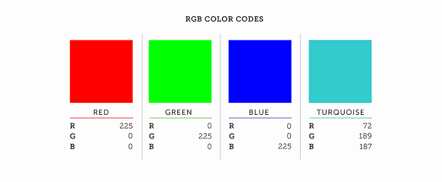
Let’s get nerdy for a second. Bermuda Blue’s RGB values break down as:
- Red: 140
- Green: 177
- Blue: 194
Converted to HSL, that gives us:
- Hue: 197° (a cool blue with a whisper of green)
- Saturation: 35%
- Lightness: 65%
So what does that mean? You’re dealing with a muted, mid-tone cool color. It avoids the harshness of pure cyan, and it’s lighter than steel blue.
It also performs well digitally because it stays within the sRGB gamut, which keeps it stable across most screens. That’s useful for consistent branding or web-safe design.
How Bermuda Blue Color Works Emotionally
Blue, by default, is linked with calm, trust, and dependability. Bermuda Blue softens that. It’s not the stern navy of a boardroom or the sterile blue of a hospital wall. Instead, this color feels approachable. Peaceful.
It’s got a touch of melancholy, like old Polaroids or the soundtrack of a rainy Sunday. That’s probably thanks to its low saturation and mid-lightness, which make it feel faded and nostalgic.
But Bermuda Blue isn’t sad. Just soft-spoken. Like a quiet friend with great taste.
Cultural and Visual Meaning
Bermuda Blue evokes the Caribbean. Sure, but also retro Americana, weathered beach cabins, and travel posters from the 1960s.
In some cultures, blue wards off evil or brings protection. In branding, light blues tend to be gender-neutral and youthful, unlike the old-school gender-coded baby blue.
The color also reflects eco-consciousness and cleanliness, making it popular in wellness products, clean beauty, and sustainable fashion.
Who Should Use Bermuda Blue?
It works almost anywhere if used right. But here’s who really benefits from using it:
- Graphic Designers who need a background shade that won’t steal the show but still looks styled.
- Web Designers looking for accessible contrast. Especially for light themes with a clean, coastal feel.
- Interior Designers creating restful bedrooms, beachy kitchens, or hygge-style reading nooks.
- Brand Designers working with products tied to skincare, calmness, mental health, or ocean-related products.
It’s also a hit in product packaging. Especially when paired with natural textures like kraft paper or matte white.