536 Shades of White Color
White is never just white, which is probably the most annoying and most important thing about it. Every shade carries an undertone. Warm yellow, cool blue, green, sometimes even pink. That tiny difference shifts the entire mood of whatever you are designing.This guide breaks down the full range from warm ivory to clinical pure white. Pick the right white and everything else falls into place. Pick the wrong one and you will wonder why the room feels cold.
#ffffff

White Color
The reference point every other color answers to. On screen, white color (#ffffff) is the maximum amount of light a monitor can throw, which is why pure white backgrounds can feel harsh next to darker UI elements. In the physical world, there’s no such thing: paper reflects a little cream, plaster reflects a little grey, snow reflects a little blue.
#e1e2eb

White Lavender Color
Lavender’s palest buds cool toward grey-blue before the purple deepens through July. White Lavender color takes that soft herbal tint from a Provencal field. Bedrooms facing morning sun gain calm here.
#e2e3e9

Violet White Color
The palest violet cools toward a soft grey-blue at its lightest tint on the color wheel. Violet White color (#e2e3e9) holds that faint lavender. Bedrooms calm down under this shade.
#cfe9dc
Turquoise White Color
Turquoise White is a pale aqua-green white, the palest hint of a tropical lagoon. It cools down a bright bathroom and pairs with white subway tile. The turquoise stays a suggestion, never a full note.
#ebf6f7
Indigo White Color
Pale off-white with a faint cool cyan-blue breath, fresh and airy. Indigo white color (#ebf6f7) lands clean and cool. Coastal and minimal design find natural use for it.
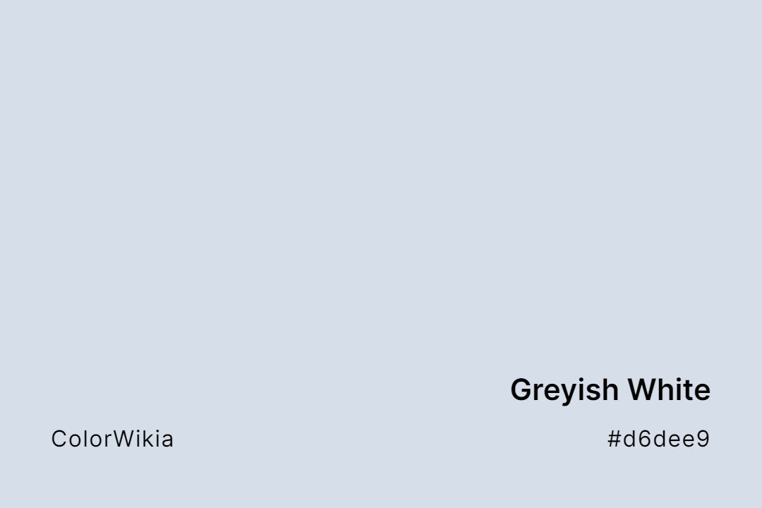
#d6dee9
Greyish White Color
Greyish White is a pale cool white with a clear grey-blue lean, exactly as its plain name promises. It reads like frost on a windowpane. The Greyish White color brings a crisp, cool calm to a palette.
#dee6ec
White Frost Color
Window frost etches pale blue-grey ferns on cold glass by January morning. White Frost color (#dee6ec) captures that icy tint. Bright bathrooms cool down under this shade.
#fbeee8
Rose White Color
A white rose petal is never flat white; its base blushes pink where sunlight thins the tissue. Rose White color (#fbeee8) captures that warm petal edge. Bedrooms painted this shade soften at dawn without the sweetness that pure pink brings.
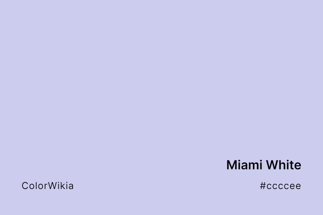
#ccccee
Miami White Color
Miami White carries a faint lilac-blue tint that recalls the pastel Art Deco facades of South Beach, restored in the 1980s in sunset pinks and sky blues and made famous by “Miami Vice.” It’s a white with a whisper of neon dusk. The Miami White color makes a cool, playful backdrop.
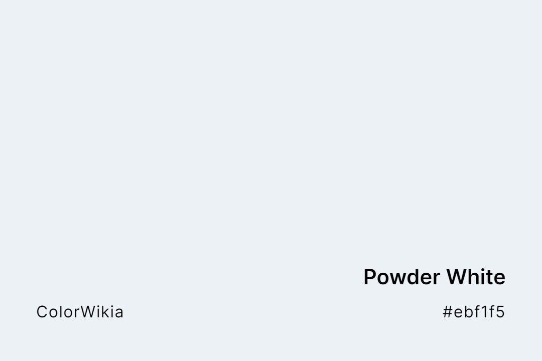
#ebf1f5
Powder White Color
A pale, cool blue-white that reads as fresh snow rather than paper. Powder white color (#ebf1f5) belongs in ski resort branding, athletic wear packaging, and dental interiors. The blue undertone keeps it bright even in low light.




#f7c380
White Elf
#83ccd2
White Ultramarine
#e5c28b
White Raisin
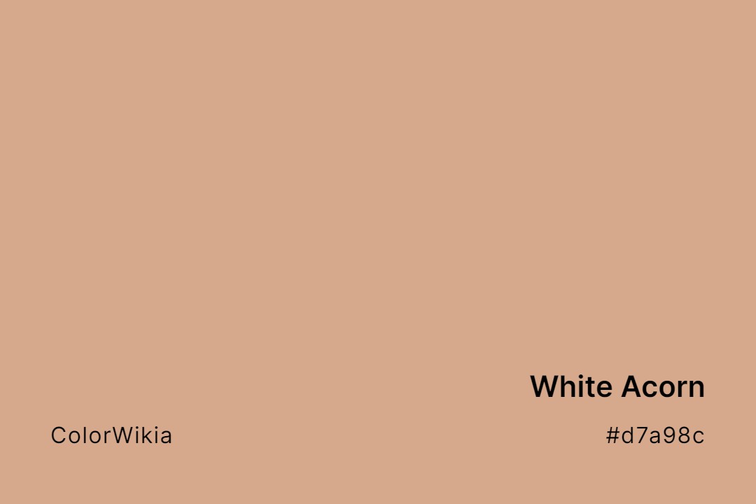
#d7a98c
White Acorn
#d5d0cb
Light Taupe White
#ead8bb
White Hot Chocolate
#ffc196
Wispy White
#d0d8cf
Wind Fresh White
#ce9f6f
White Oak
#bbcc99
White Grape
#c2dce3
Washing Powder White
#dbd5ce
Light Limed White
#9fbdad
White Spruce
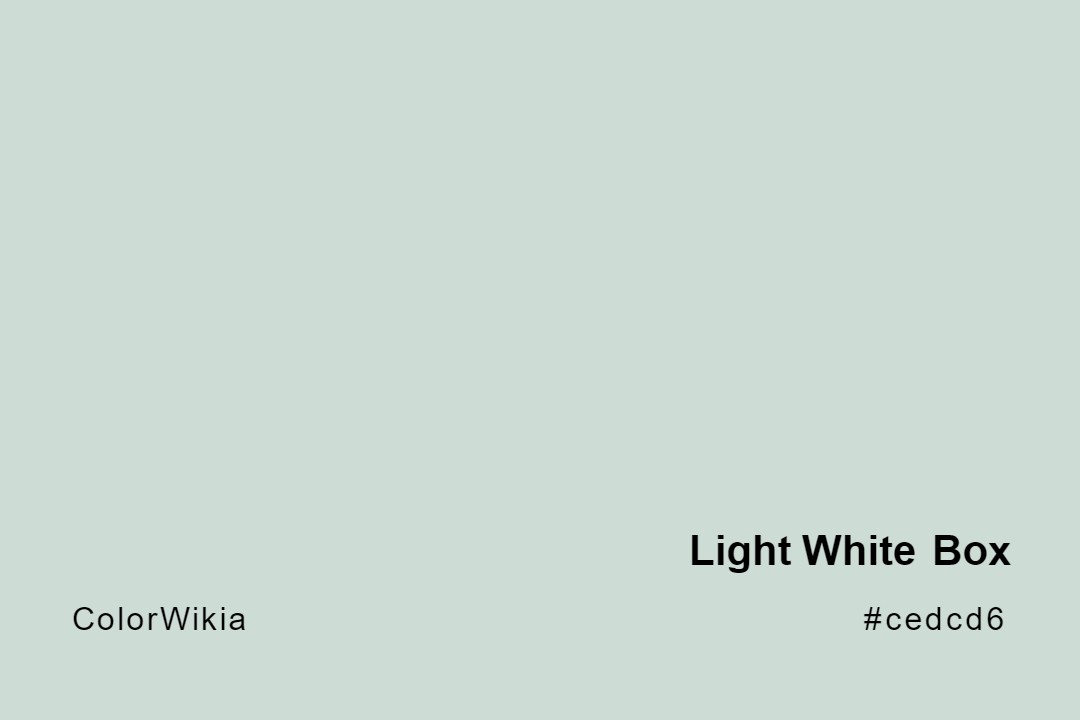
#cedcd6
Light White Box
#cbc4a2
Oyster White
#f0d498
White Corn
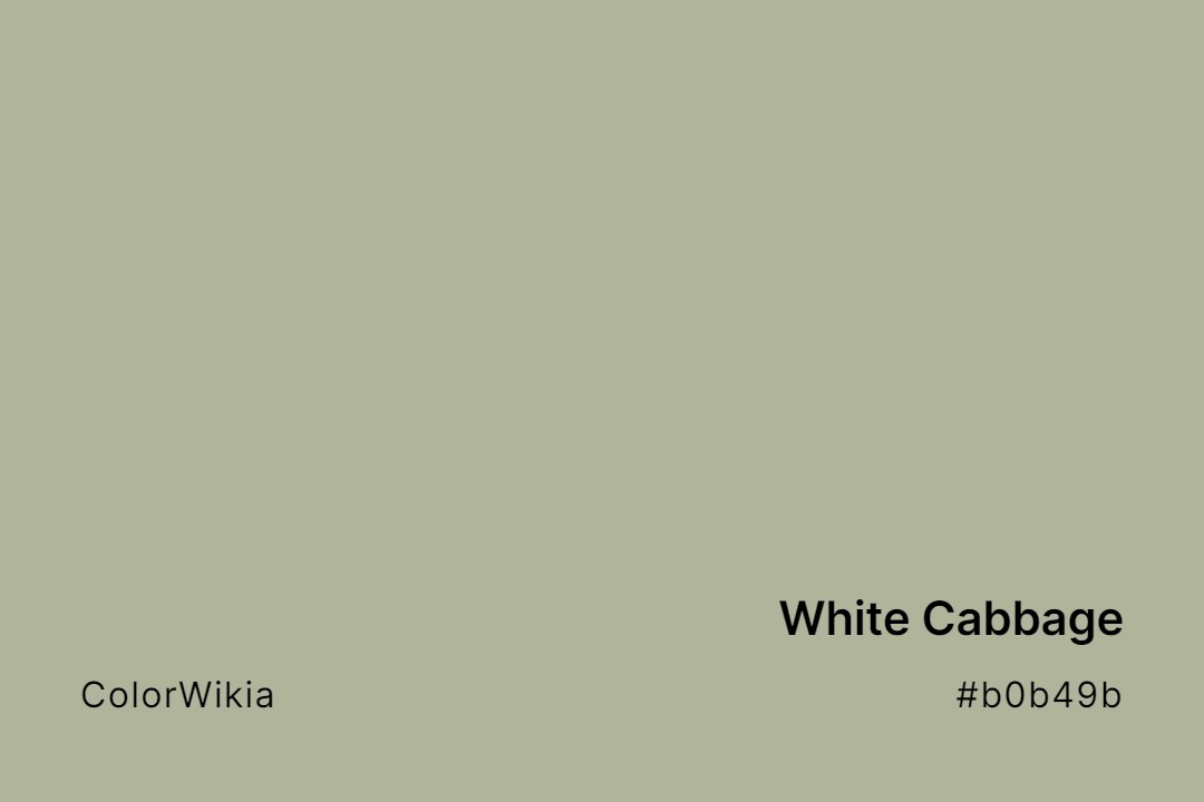
#b0b49b
White Cabbage
#c5b8a8

White Tiger
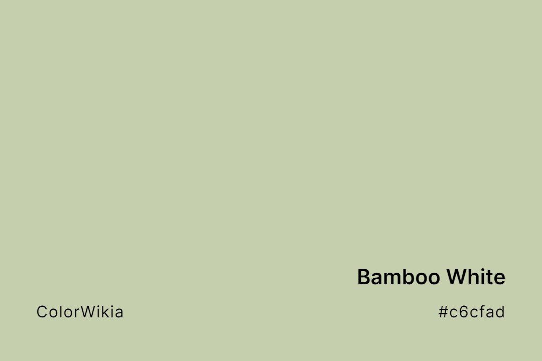
#c6cfad
Bamboo White
#d9d3e5
Powder Viola White
#d0d6a8
White Jade
#b9a193
White Mouse
#c3bdab
White Primer
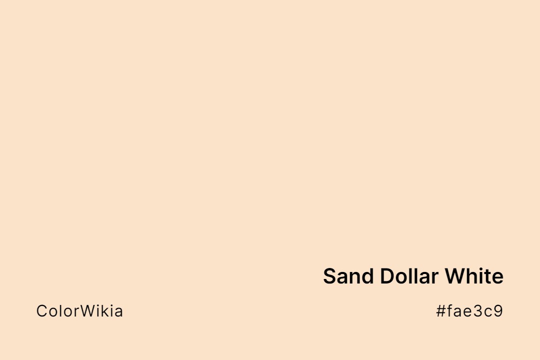
#fae3c9
Sand Dollar White
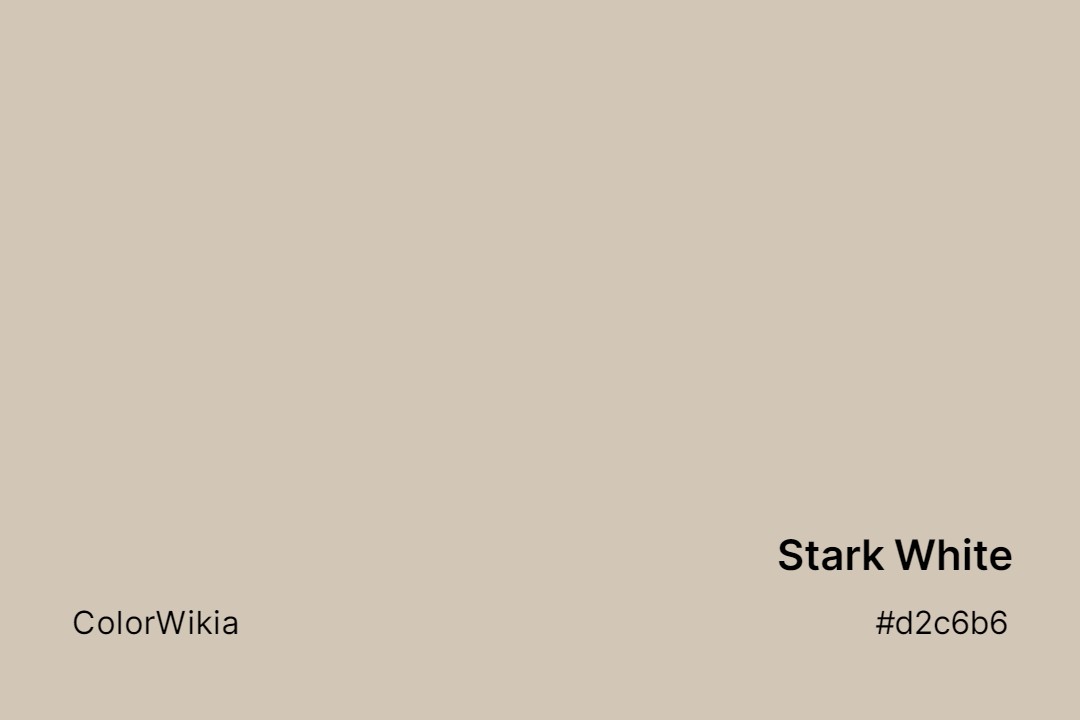
#d2c6b6
Stark White
#c5dcb3
White Vienna
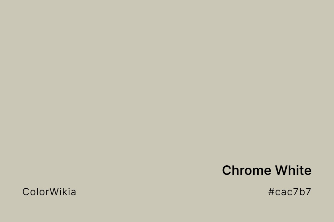
#cac7b7
Chrome White
#e6d0ab
Durian White
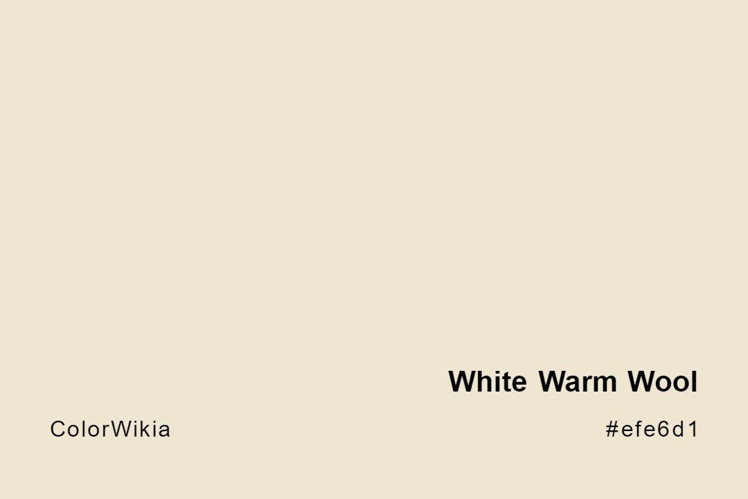
#efe6d1
White Warm Wool
#d4cfb4
White Rock
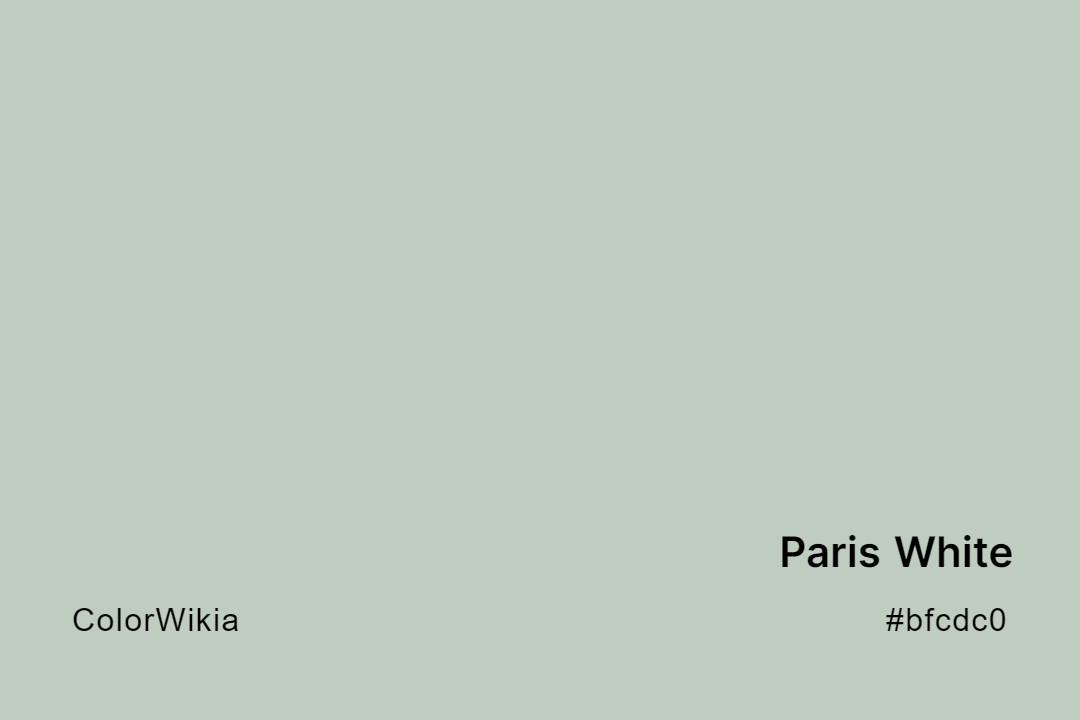
#bfcdc0
Paris White
#d0ebf1
Chalky Blue White
#c9c2bd
White Gauze
#cfc9c0
Limed White
#dcd3b2
Suna White
#c7c1bb
Taupe White
#c8c2c0
White Flag
#bfd0cb
White Box
#bdbdc6
Great White
#ae9e86
White Pepper
#dae7e9
Soft Blue White
#c8d1c4
White Granite
#d8bfc8
Magnolia White
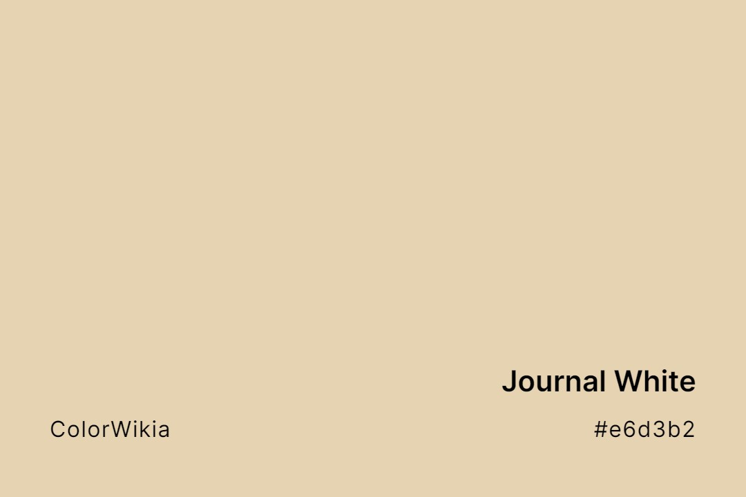
#e6d3b2
Journal White
#ded1b7
Spanish White
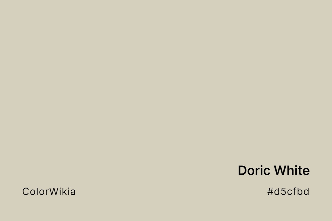
#d5cfbd
Doric White
#c2ced2
Alice White
#d3c2cf
Purple White
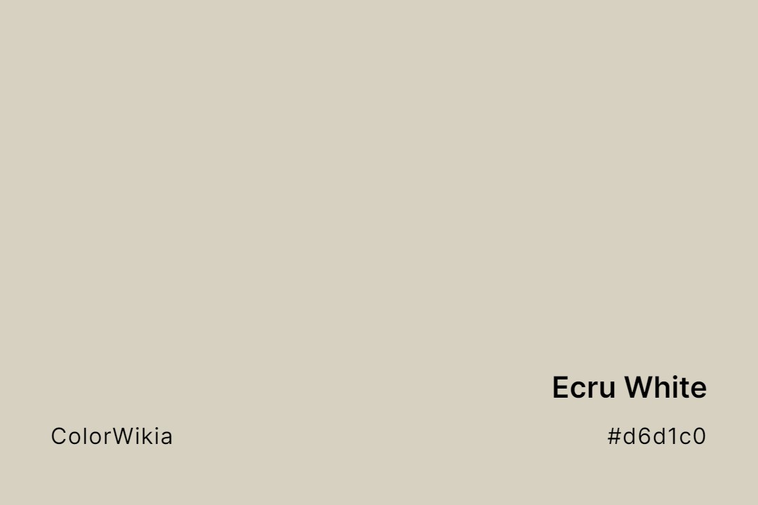
#d6d1c0
Ecru White
#fdf3d5
Satin Cream White
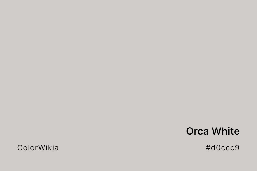
#d0ccc9
Orca White
#e2d3b9
Stucco White
#d2d4c3
White Sage
#8c9fa1
White Scar
#f1e1b0
Bone White
#e9e7e6
Deep Daigi White
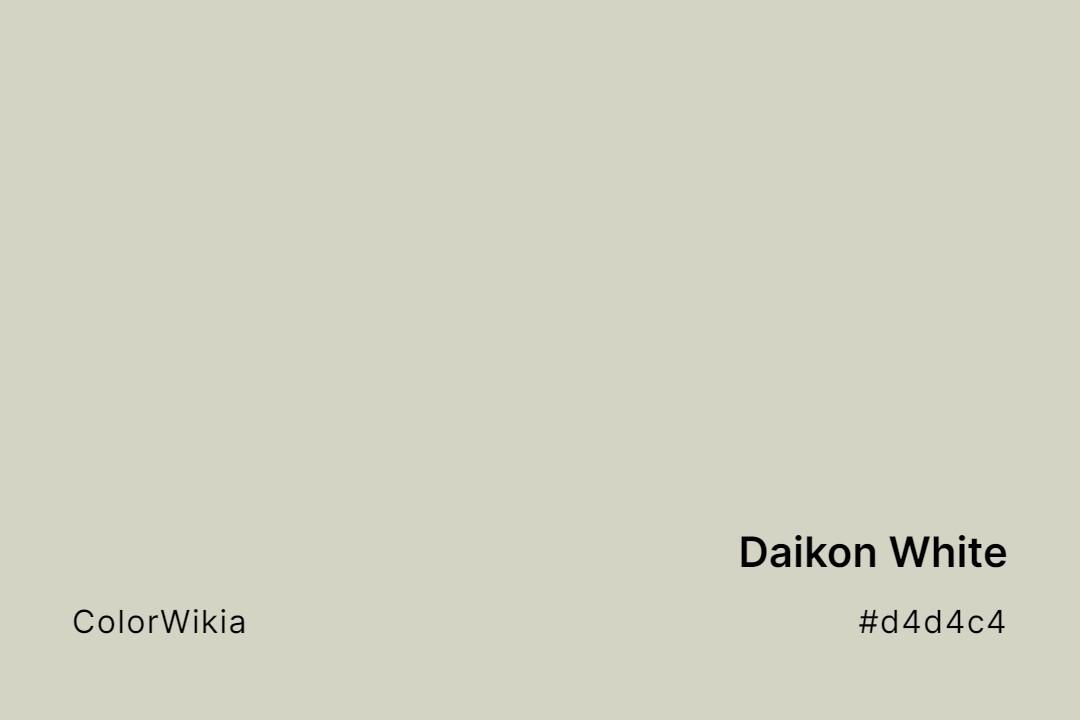
#d4d4c4
Daikon White
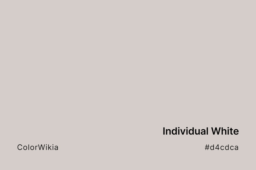
#d4cdca
Individual White
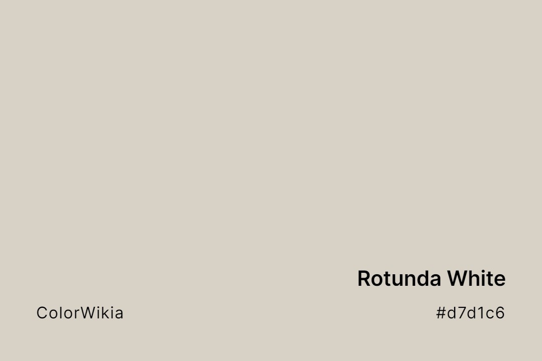
#d7d1c6
Rotunda White
#dfd4bf
Alabaster White
#d1cdd0
Inuit White
#e9ebe7
Ceiling Bright White
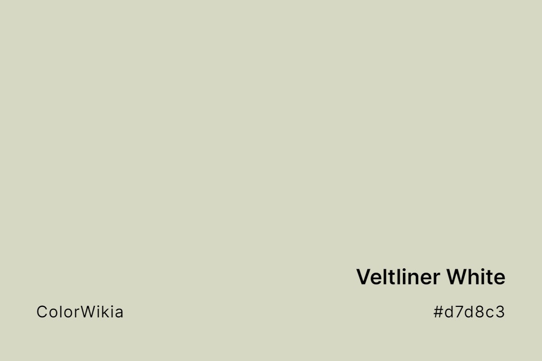
#d7d8c3
Veltliner White
#cbdccb
Transparent White
#d1d1cf
White Metal
#d6d0cc
White City
#cedcca
Leek White
#dacdcd
Shinkansen White
#e2d5c2
Onion White
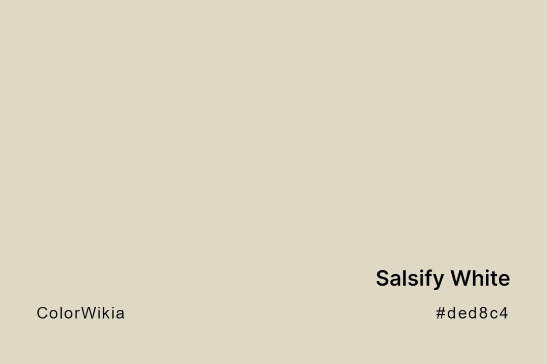
#ded8c4
Salsify White
#e2d8c2
Mission White
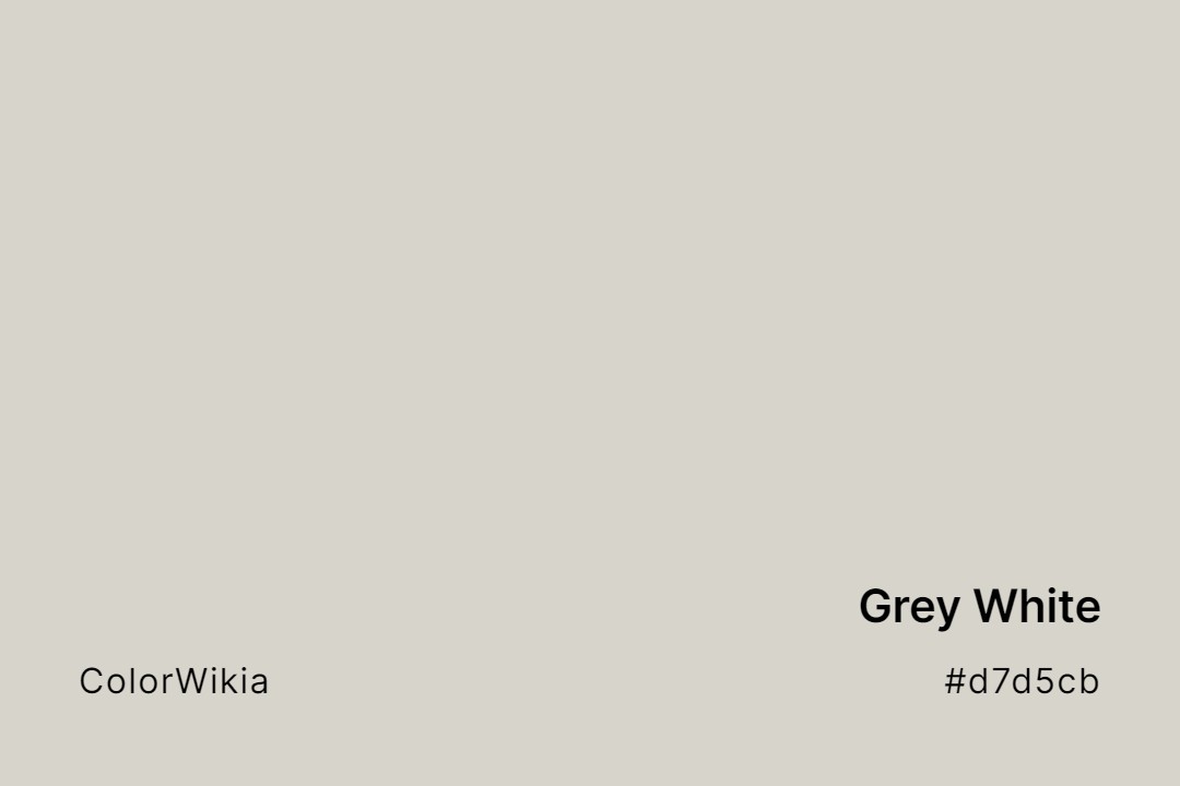
#d7d5cb
Grey White
#f7e5b7
Barley White
#f0dfbb
Dutch White
#e4d7c5
White Swan
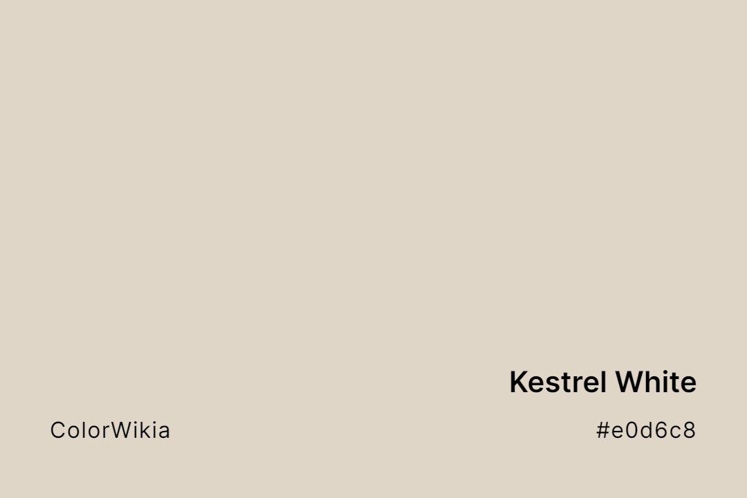
#e0d6c8
Kestrel White
#dad6cc
White Pointer
#e8dac3
Arizona White
#ccccee
Miami White
#cdd6db
White Blue
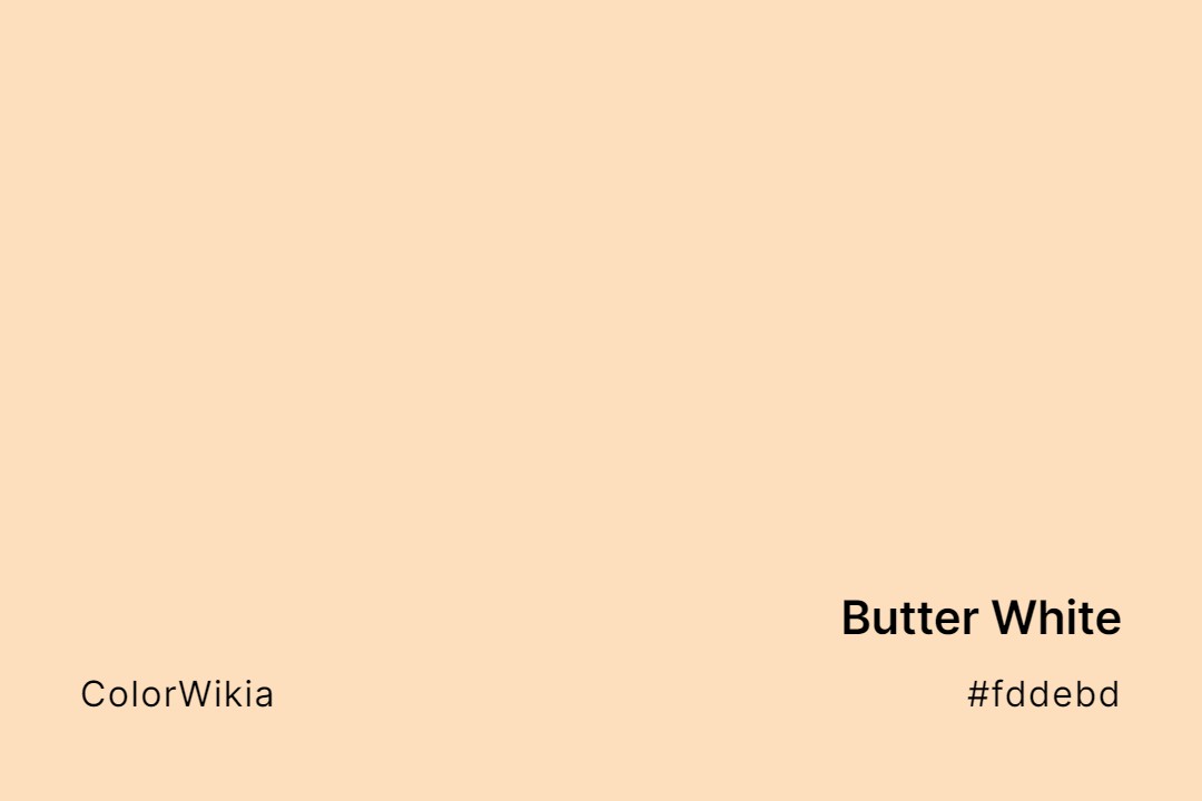
#fddebd
Butter White
#e6dbc4
Adobe White
#cbdadb
Siesta White
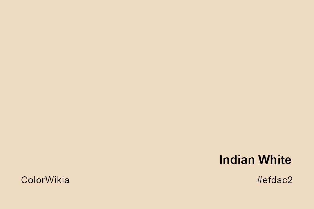
#efdac2
Indian White
#dbd9cd
Celery White
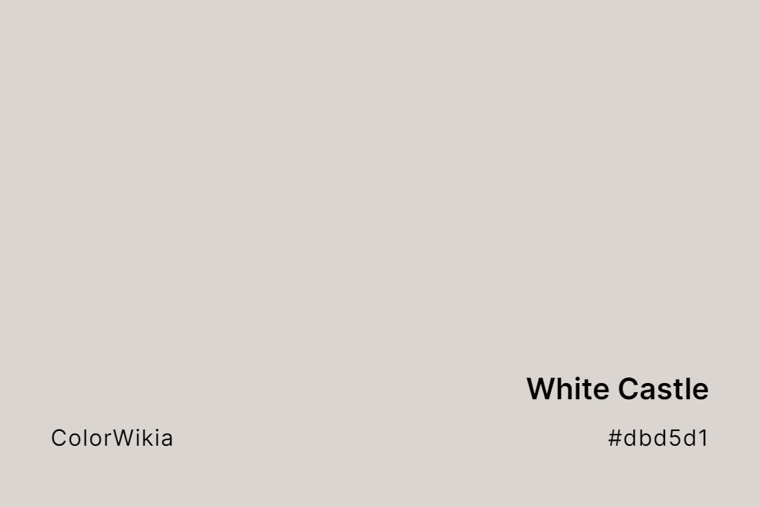
#dbd5d1
White Castle
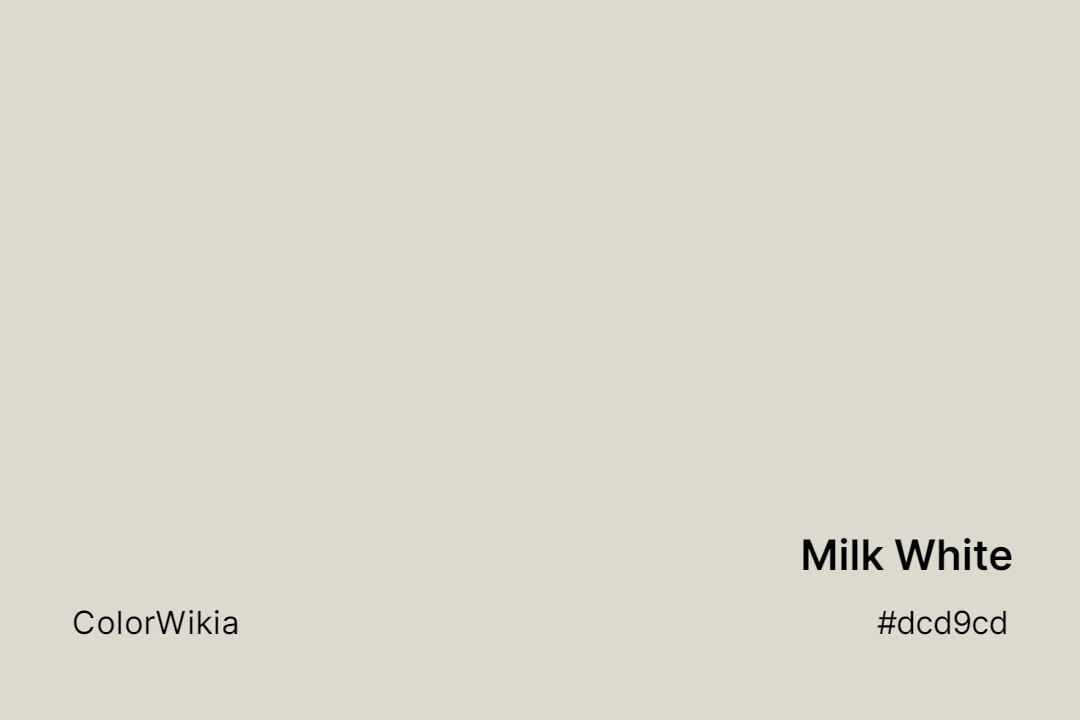
#dcd9cd
Milk White
#fbebbb
Wheaten White
#eceabe
White Asparagus
#d1d3e0
White Shadow
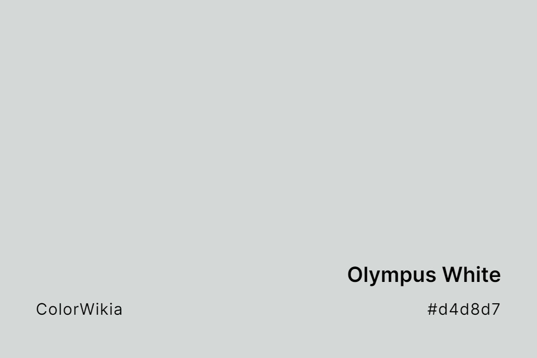
#d4d8d7
Olympus White
#d6e9ca
White Green
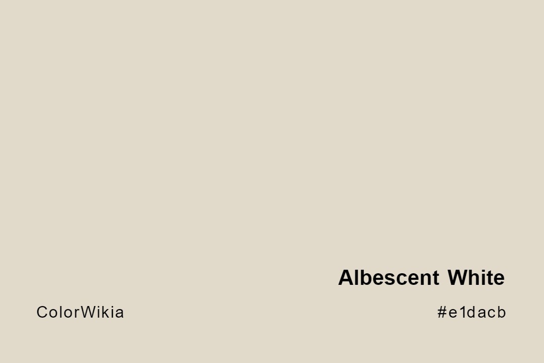
#e1dacb
Albescent White
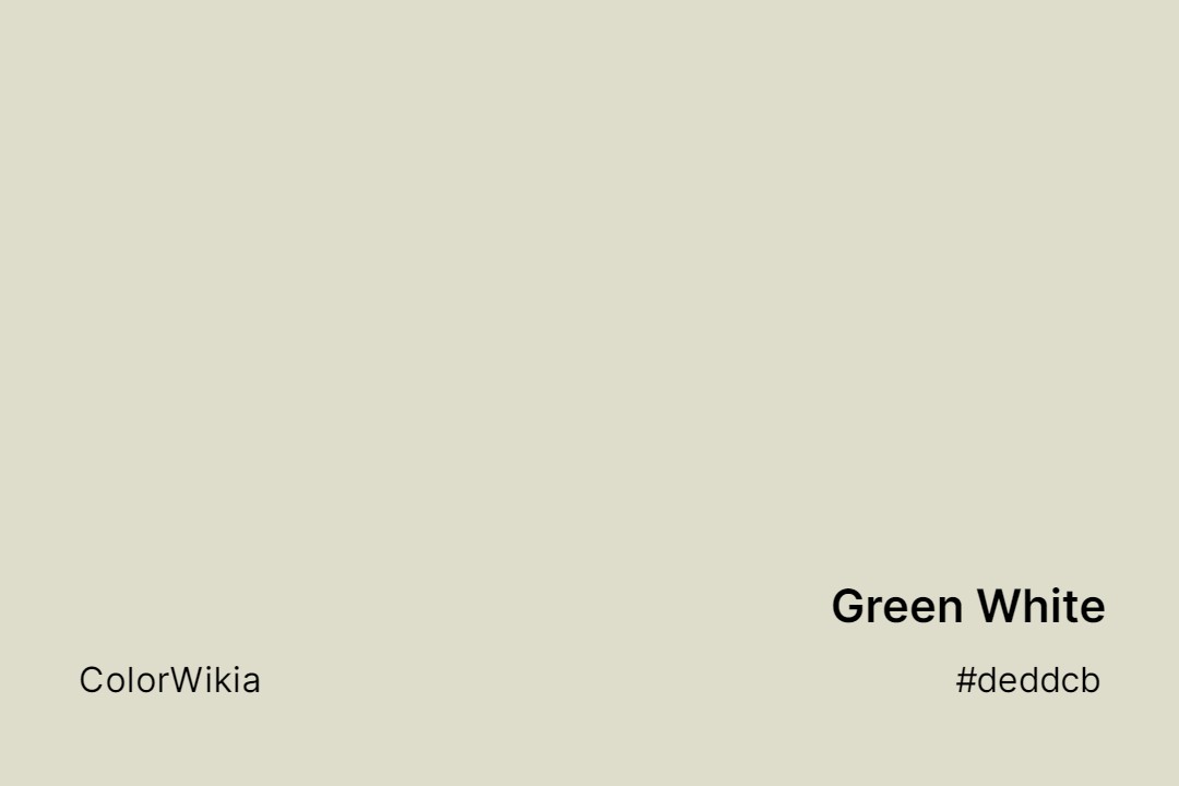
#deddcb
Green White
#ded8cf
Windfresh White
#f5dec2
White Cedar
#dedbce
White Wisp
#dfd9cf
Egret White
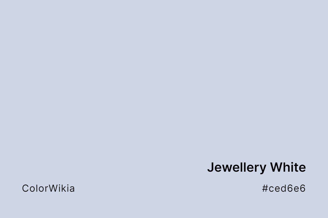
#ced6e6
Jewellery White
#ded8d2
White Woodruff