
234 Shades of Black Color
Every black color says something different. Some blacks are formal, some are cozy, some feel like velvet, others feel like a slap.
#000000

Black Color
Zero light. Black color (#000000) is a digital absolute, which is why it feels flatter on screen than any real-world black pigment. Reserve it for body text, high-contrast interfaces, and the moments that actually need weight. Use it everywhere and the whole page starts to feel airless.
#2b2c42
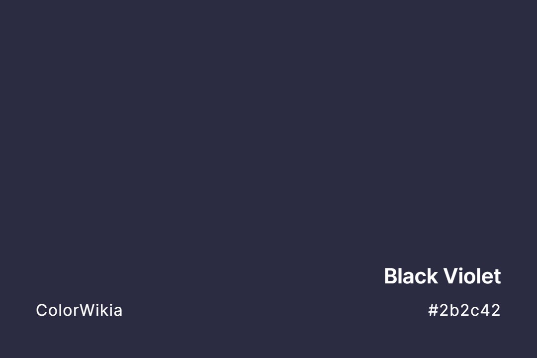
Black Violet Color
Darker than navy, cooler than charcoal, Black Violet holds the indigo of a sky twenty minutes after sunset. The purple only surfaces beside a true black. Dramatic walls and book cloth both use this depth.
#002e51

Indigo Black Color
One step darker than navy and one step warmer than black, Indigo Black is the ocean at night with a moon behind cloud. It substitutes for black in most layouts. Dramatic interiors and formal packaging suit it.
#1e272c
Black Pearl Color
Black Pearl is a deep blue-black with a cool marine sheen, named for the rare Tahitian pearls grown by the black-lipped oyster that shimmer green, blue, and aubergine. At #1e272c it holds that dark, iridescent depth. It is dramatic on cabinetry and doors.
#54626f
Black Coral Color
Crayola released this in 1997 as Black Coral Pearl, part of an ocean-themed set where every name ended in Pearl. Real black coral, order Antipatharia, grows a hard protein skeleton in deep tropical water and gets carved into jewelry. The paint version is a slate blue-grey with real backbone.
#422329
Cherry Black Color
Bite into a bing cherry and the skin is this dark. Cherry Black (#422329) makes a bold cabinet or accent wall, hiding a wine-red glow that strong light pulls forward.
#12221d
Black Emerald Color
The darkest emeralds sink toward a near-black green in shadow, where the trapped inclusions catch no light. Black Emerald color (#12221d) holds that deep jewel-dark tone from a Colombian Muzo mine. A rich moody study grounds itself here.
#263032
Navy Black Color
A deep charcoal with just enough navy shift to feel intentional. Navy black color (#263032) is the shade luxury car interiors and formal tuxedos aim for because it photographs black but feels richer than #000000. Almost impossible to spot the blue until you compare side by side.
#2b303e
Diamond Black Color
A tuxedo lapel under dim restaurant light lands right here. Diamond Black is really a blue-charcoal, which is why it photographs better than jet on interior walls. Use the color code #2b303e where pure black would leave a flat hole.
#2b3042
Black Iris Color
Pantone catalogs Black Iris as 19-3921, a deep blue-purple named for the darkest petals in the iris family. Georgia O’Keeffe painted her own Black Iris in 1926, magnified until the flower filled the canvas. The shade is near-black with real violet under strong light.


#29485a
Black Forest Blue
#694d27
Black Queen
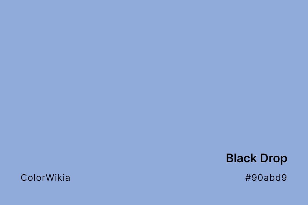
#90abd9
Black Drop
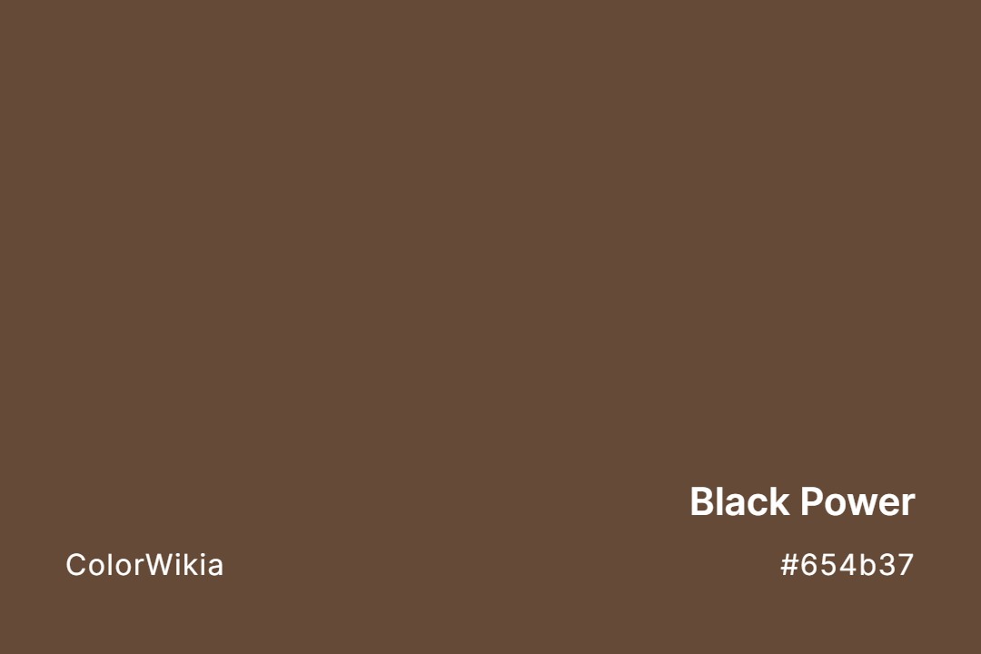
#654b37
Black Power
#322d2d
Deep Daichi Black
#45524f
Black Evergreen
#41435b
Spinel Black
#484c51
Black Ribbon
#4f4554
Black Magic
#4a4354
Serendibite Black
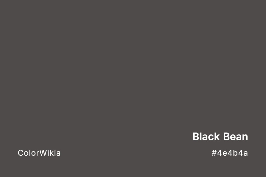
#4e4b4a
Black Bean
#50484a
Black Elegance
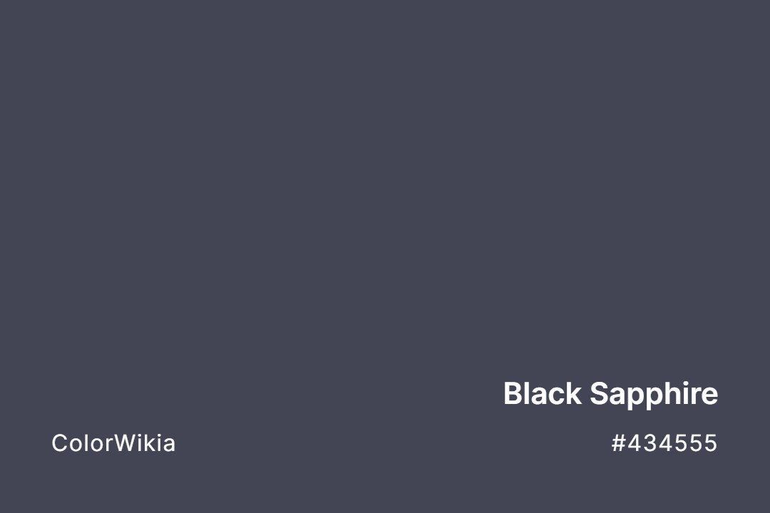
#434555
Black Sapphire
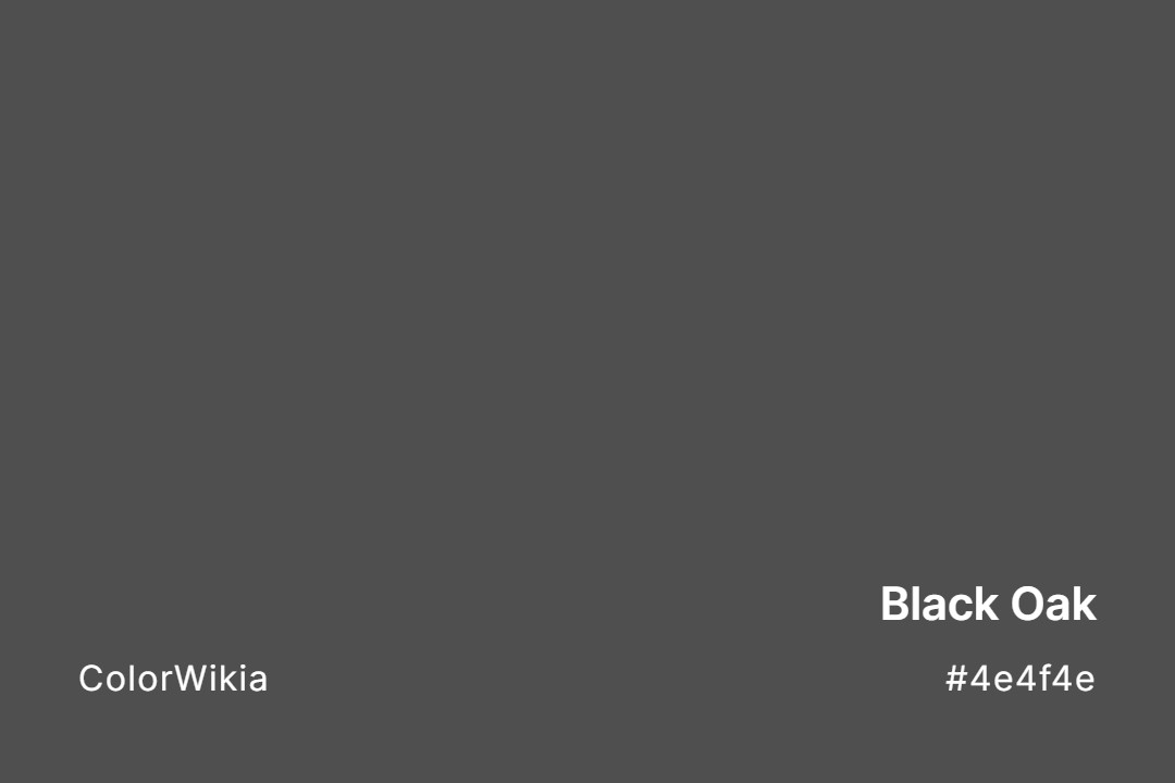
#4e4f4e
Black Oak
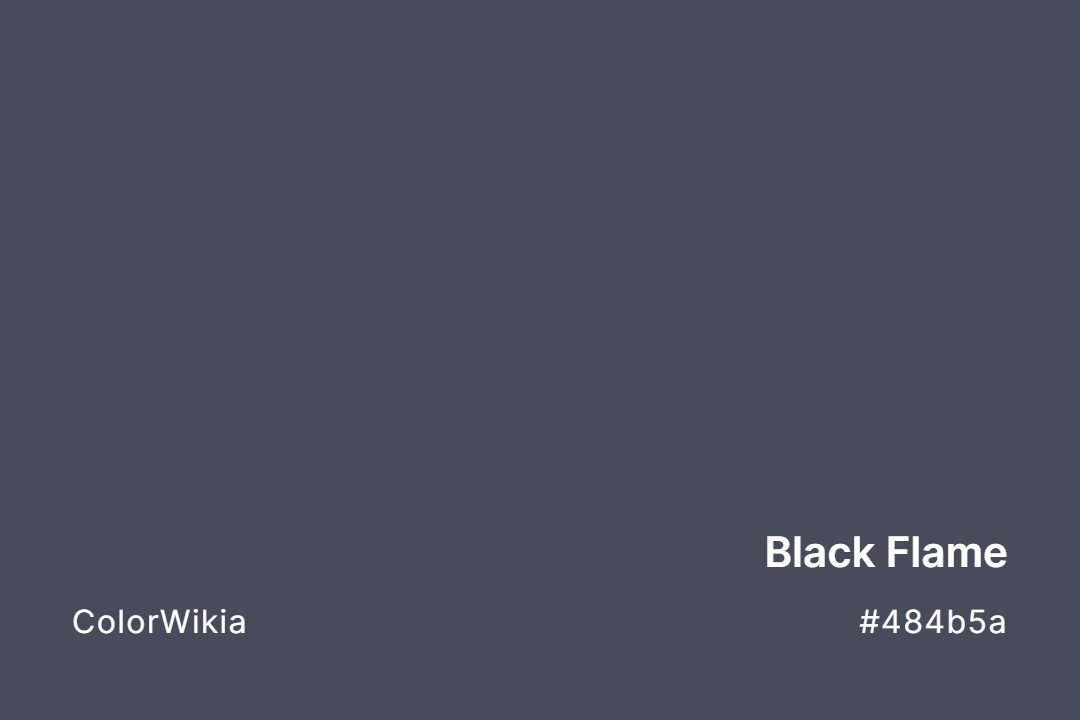
#484b5a
Black Flame
#474c4d
Black Lead
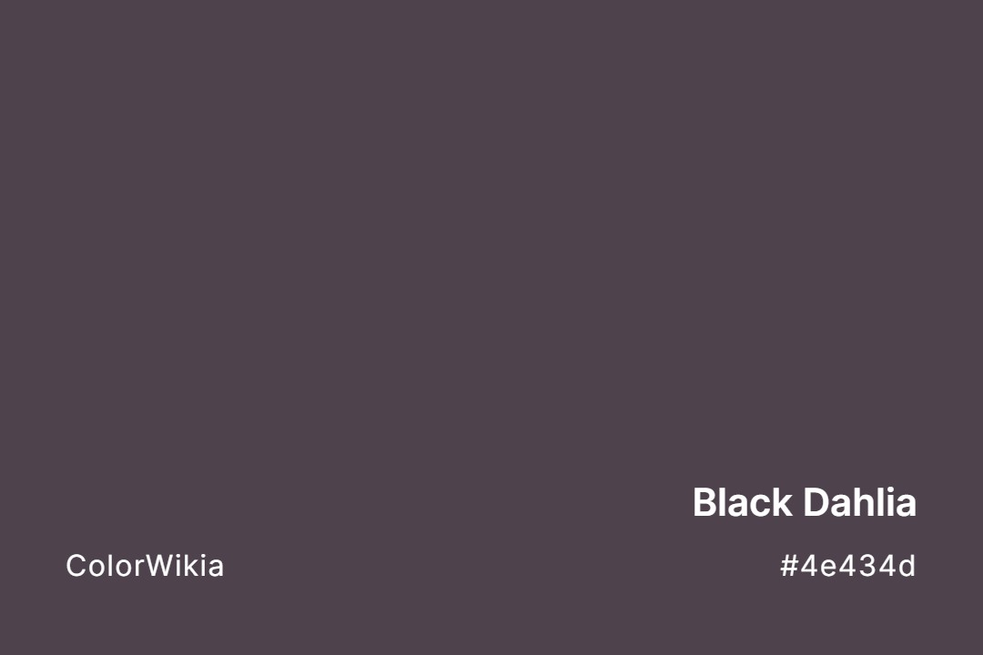
#4e434d
Black Dahlia
#474a4e
Black Bay
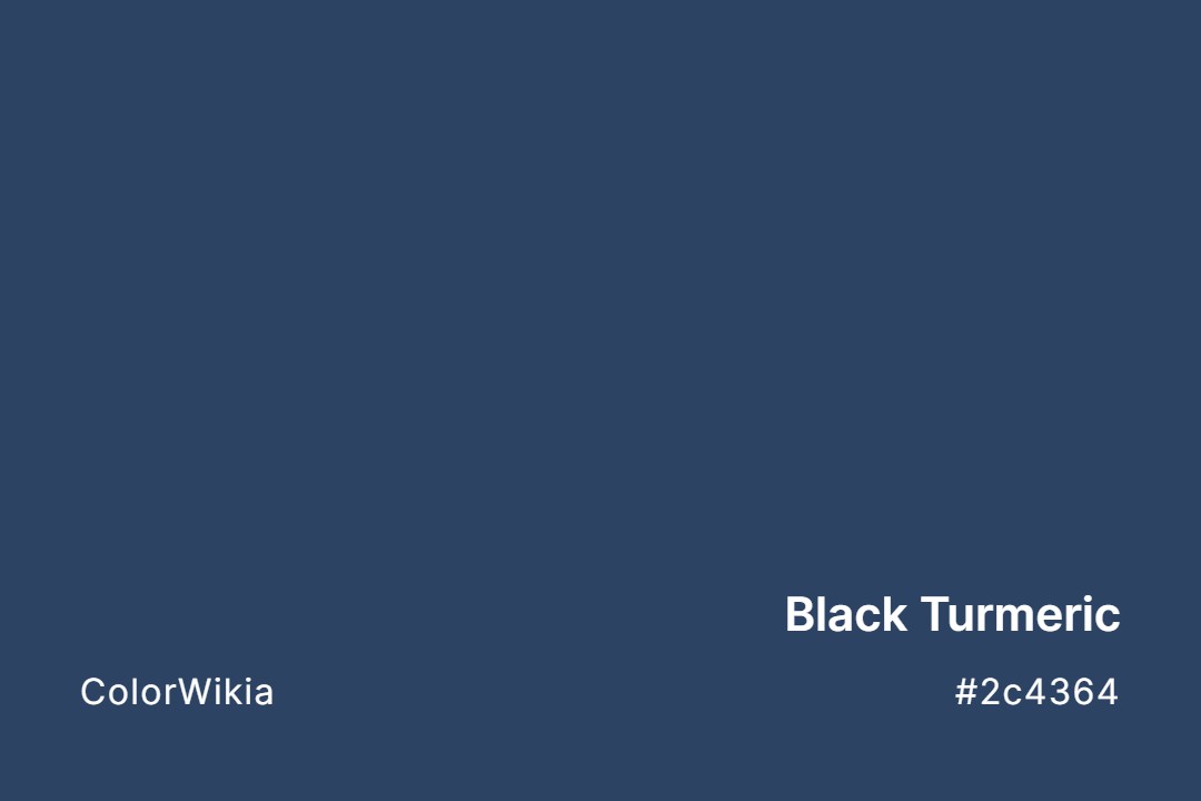
#2c4364
Black Turmeric
#4c4949
Private Black
#554738
Kuri Black
#4d5051
Black Ice
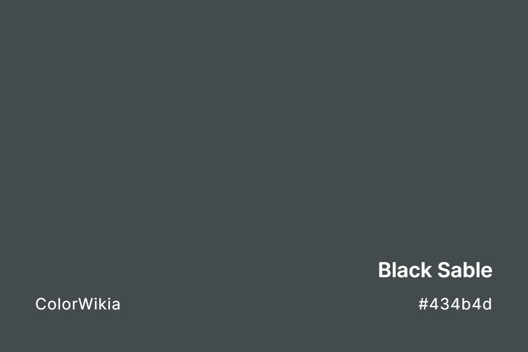
#434b4d
Black Sable
#45494d
Salem Black
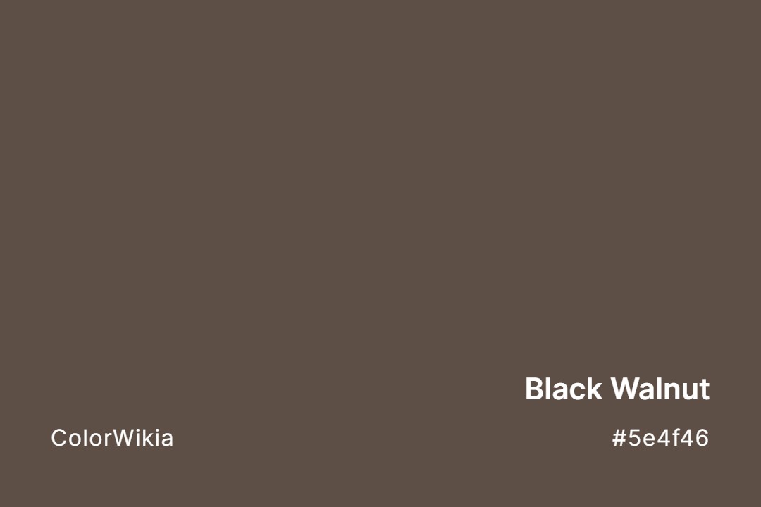
#5e4f46
Black Walnut
#4f4842
Black Fox
#505150
Space Black
#5b4e4b
Black Sand
#4a4747
Dampened Black
#4e4444
Black Garnet
#49434a
Violet Black
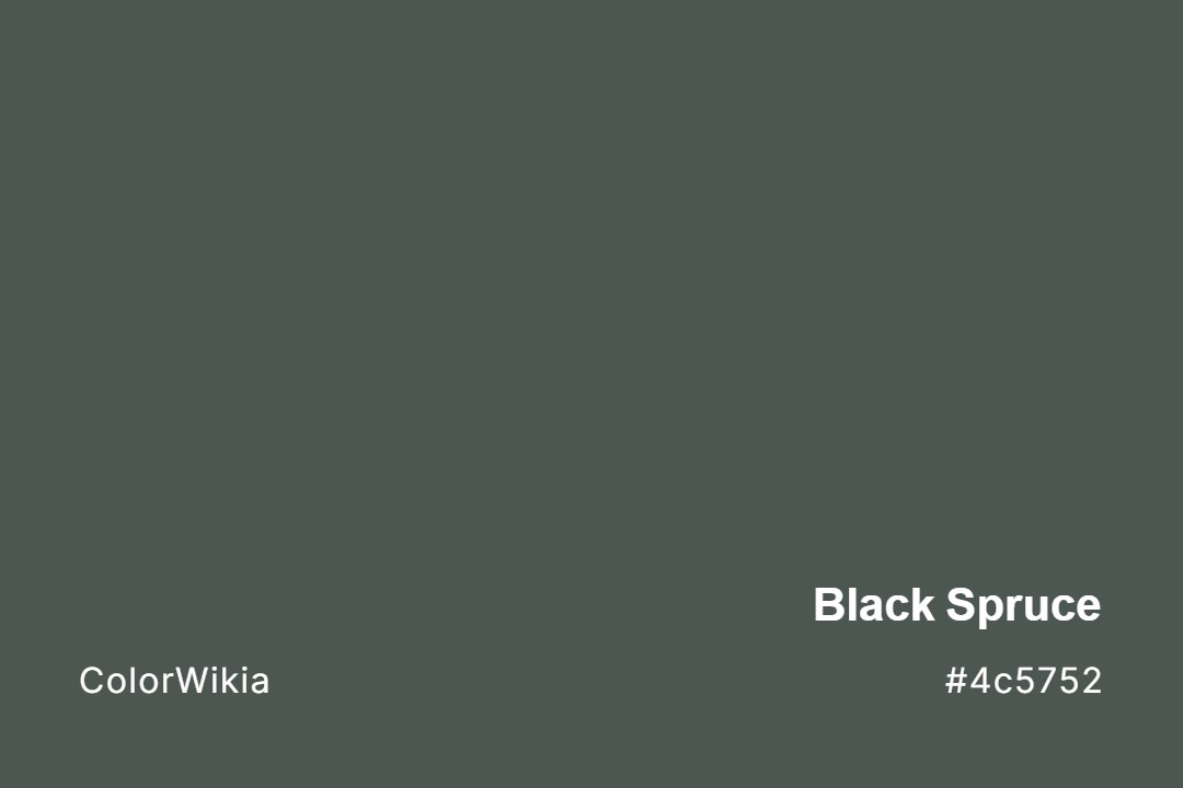
#4c5752
Black Spruce
#384e49
Black Green
#4b4743
Black Mocha
#454749
Black Boudoir
#4f5552
Black Pool
#533e39
Caviar Black
#464647
Black Tie
#555152
Greyish Black
#49555d
Moody Black
#4d423e
Basalt Black
#a44a56
Black Pudding
#545354
Black Space
#454445
Greenish Black
#3c4748
Panda Black
#353e4f
Burka Black
#444443
Medium Black
#49433b
Earth Black
#2e4846
Black Water
#434342
Black Suede
#4e4f6a
Pango Black
#483c41

Pitch Black
#4b3d33
Slate Black
#424242
Black Panther
#424142
Spade Black
#413f44
Bluish Black
#463d3e
Black Truffle
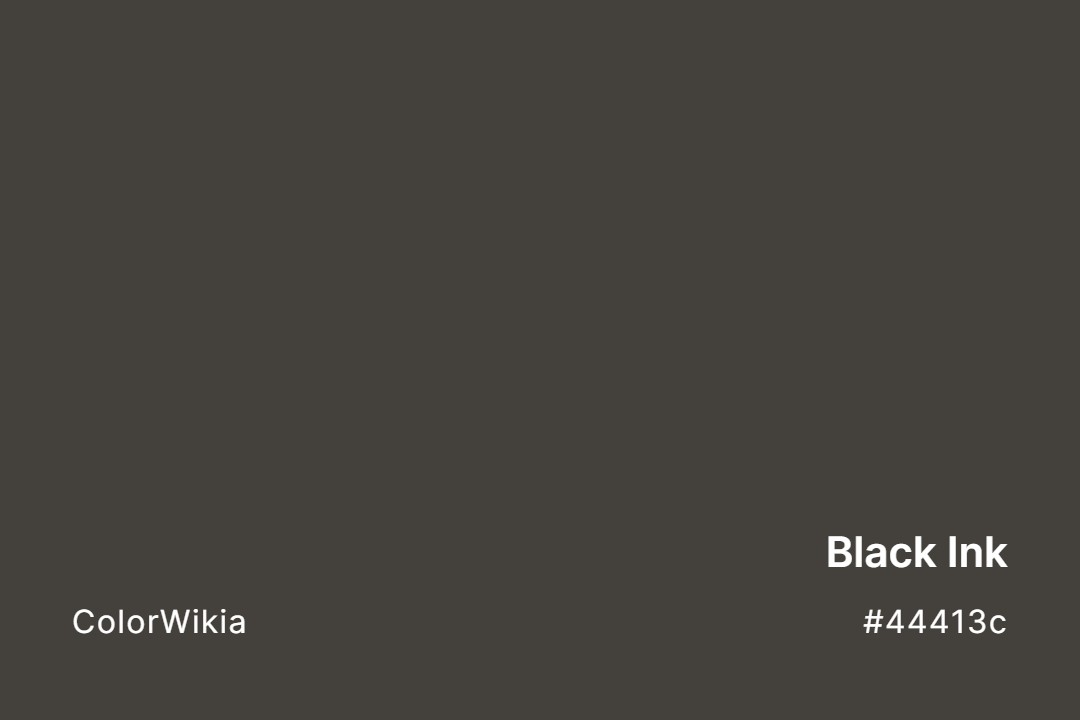
#44413c
Black Ink
#525463
Black Orchid
#3f4041
Totally Black
#532934
Black Rose
#bfafb2
Black Shadows
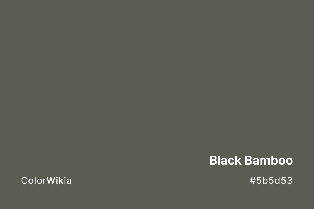
#5b5d53
Black Bamboo
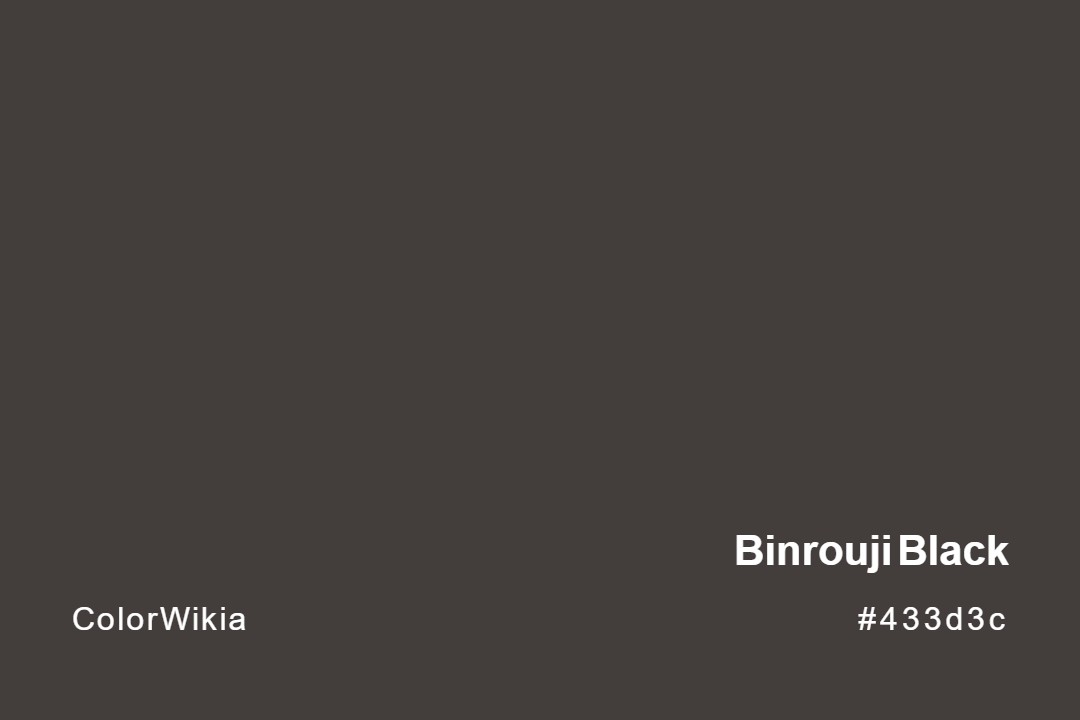
#433d3c
Binrouji Black
#3f3e3e
Black Lacquer
#3e3e3f
Black Smoke
#3d3d3d
Raven Black
#433635
Reddish Black
#413936
Brownish Black
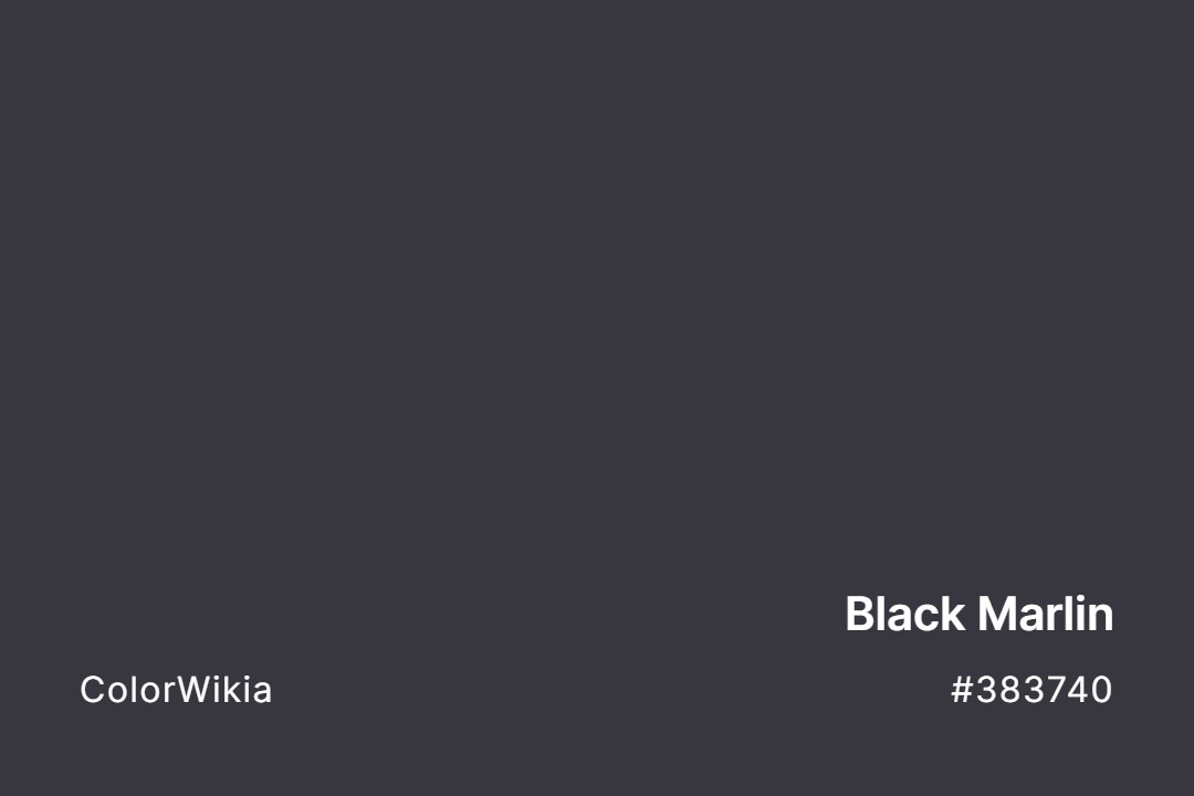
#383740
Black Marlin
#6f5b52
Mocha Black
#3a3b3b
Black Liquorice
#3b373c
Bohemian Black
#3b3c36
Black Olive
#6d6150
Black Heath
#2f2f48
Black Blueberry
#655a5c
Roasted Black
#1c1e21
Satin Deep Black
#5b5b6c
Shearwater Black
#363838
Pirate Black
#54626f
Black Coral
#2e2848
Blackberry Black
#202f4b
Manganese Black
#19443c
Black Soap
#3e3231
Black Coffee
#002e51
Indigo Black
#263145
Crow Black
#2b3042
Black Iris
#353337
Jet Black
#2f2a41
Viola Black
#353235
Black Tortoise
#2b2c42
Black Violet
#313238
Granite Black
#2b303e
Diamond Black
#352f36
Lava Black
#2b3736
Tetsuonando Black
#2c2d3c
Black Rock
#646763
Black Locust
#3e2a2c
Wenge Black
#312f36
Night Black



































Let’s be real, black is not just black.
This stuff matters if you’re a designer. Because the wrong black doesn’t just feel off. It kills the whole mood.
Black Is Not a Single Color
Let me just say it: pure black (#000000) is the most overrated color in design. It’s the loudest whisper, the biggest empty space. And used wrong, it can suck the life out of your layout.
In RGB (screen), black is the absence of light.
In CMYK (print), it’s built up from cyan, magenta, yellow, and black pigment (or “rich black” if you’re layering ink).
But in the real world? Black gets weird.
Put black on glossy paper and it shines.
Put the same black on matte paper and it swallows light like a cave.
Use it on fabric? Now you’ve got undertones: blue, brown, green—depending on the weave and light source.
So yeah, black’s complicated.
The Hidden Emotion in Different Blacks
You might think black is neutral. It’s not. Not even close.
Here’s how I usually break it down with clients:
| Shade Name | Hex Code | What It Feels Like |
|---|---|---|
| Jet Black | #0A0A0A | Polished, bold, sharp. Think: luxury cars. |
| Charcoal | #36454F | Cool, quiet, steady. Used in calm UI design. |
| Onyx | #353839 | Mysterious, bluish, sleek. Looks rich. |
| Licorice | #1A1110 | Warm, vintage, earthy. I’ve used this for coffee brands. |
| Graphite | #1C1C1C | Balanced, neutral. Feels grounded. |
| Raven | #1E1E1E | Flat, matte, modern. Great for minimalist brands. |
| Soot | #555555 | Dusty, approachable. Almost gray, very natural. |
| Midnight | #191970 | Has a strong blue cast. Dramatic and deep. |
Warm vs Cool Blacks: The Real Test
Here’s what I do on the fly:
Drop your black next to a red. Then next to a blue. Watch how it shifts.
If the black feels redder next to blue, you’ve got a warm black.
If it feels bluer next to red, it’s a cool black.
Warm blacks are cozier. More grounded.
Cool blacks feel sleek, techy, modern.
Use the wrong one, and your minimalist homepage starts to look… like a funeral program.
Pure Black Is a Lie (Especially in UI Design)
Dark mode doesn’t mean #000000. Please don’t.
Real talk: true black on pure white is actually bad for your eyes. The contrast is too sharp. It causes visual fatigue and makes reading harder over time.
Instead, try near-black tones like:
- #121212 (Google Material Design’s go-to)
- #1A1A1A
- #202124 (used in Gmail’s dark theme)
Real-World Use: How I Choose a Black
A couple years ago, I worked on a high-end stationery brand. The founder was obsessed with texture. Cotton paper, uncoated stock, hand-pressed type. She asked for “deep black” and handed me a swatch of ink that looked… purple.
Turns out, she didn’t want black. She wanted a romantic, inky, almost bookish black. I ended up using onyx (#353839) with a navy undertone, layered over uncoated paper. In sunlight, it looked bluish. Under warm indoor lighting, it looked like wet stone.
That moment taught me: Black always behaves.