1642 Shades of Blue Color
This comprehensive collection features 1,642 distinct blue color shades, each with its unique hex code and name, giving designers, developers, and creatives a complete reference for finding the perfect blue tone for any project.
#0000ff

Blue Color
Pure RGB blue, with no green or red mixed in. The Blue color hex code #0000ff is one of the three screen primaries, meaning every other blue starts here. Most designers will tell you it’s too intense at full strength for everyday use, and they’re right. Save it for hyperlinks, warning states, and the rare brand bold enough to commit.
#2a52be

Cerulean Blue Color
Pantone crowned Cerulean Blue its very first Color of the Year in 2000, calling it the hue of the future. As a pigment it’s cobalt stannate (PB35), perfected by Andreas Höpfner in 1805 and sold from 1860 by Rowney and Company as coeruleum. The hex code #2a52be delivers a vivid, calming sky blue with real history behind it.
#000080

Navy Blue Color
The default alternative to black. Navy blue color (#000080) is what corporate designers pick when black feels too aggressive, especially for banking, aviation, and government branding. Its edge over black: it plays nicer with warm skin tones and doesn’t dust out over time.
#0067bc

Sapphire Blue Color
Blue sapphire owes its color to traces of iron and titanium inside colorless corundum, with the prized shade called cornflower blue. Sapphire Blue captures that rich, jewel-toned mid blue. The Sapphire Blue color hex code #0067bc holds the clarity of a faceted gemstone.
#020035
Midnight Blue Color
Almost black, but not quite. There’s just enough blue left in midnight blue color (#020035) to catch the light and feel expensive under lamplight. Tuxedo suppliers and Bentley interior specifiers picked this over #000000 decades ago for the same reason: black photographs flat, and this doesn’t.
#6c91c5
Cornflower Blue Color
Named after the wild blue flower that grows in wheat fields across Europe. Cornflower blue color (#6c91c5) is a soft, slightly greyed mid-blue that shows up in everything from bridesmaid dresses to old ceramic dishware. Cream and pale yellow set it off effortlessly.
#9fb9e2
Sky Blue Color
Softer than powder blue, with a hint of violet that pulls it toward dusk instead of noon. Sky blue color (#9fb9e2) shows up in vintage postcards, hospital scrubs, and every Instagram palette tagged coastal. Reliable, useful, and easy to overlook.
#00ffef
Turquoise Blue Color
Crayola’s Turquoise Blue crayon is a softer #77dde7, and the xkcd survey’s turquoise blue is a deeper #06b1c4. This version, #00ffef, sits close to pure cyan, with green maxed at 255 and blue at 239. On screen the Turquoise Blue color buzzes like a neon pool light, and no house paint can match it.
#b0e0e6
Powder Blue Color
Sky reflected in a glass of milk. Powder blue color (#b0e0e6) has been the default nursery shade for at least sixty years because it calms the eye without going saccharine, and it flatters most skin tones. Every spring, sweater brands roll it out again like it’s a new idea.
#add8e6
Light Blue Color
Named exactly what it is. Light blue color (#add8e6) is the crayon-box version of a July sky, cheerful without going childish. Bedding companies use it constantly because it registers as clean and restful to nearly everyone who sees it.


#296767
Dusky Alpine Blue
#94d3d1
Summer Soft Blue
#2a4b5a
Deep Sea Blue
#69b8c0
Maritime Soft Blue
#29485a
Black Forest Blue
#9cadc7
Satin Soft Blue
#96aec5
Nordland Light Blue
#93ccea
Light Cornflower Blue
#6ab9bb
Fresh Soft Blue
#036c91
Pure Light Blue
#0f4d5c
Teal Dark Blue
#8ab3bf
Thistleblossom Soft Blue
#004f57
Deep Atlantic Blue
#a2aebf
Feather Soft Blue
#494f62
Tried & True Blue
#0e4f4f
Malachite Blue Turquoise
#56ffff
CGA Blue
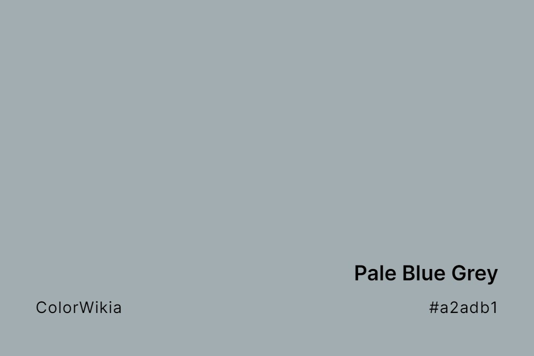
#a2adb1
Pale Blue Grey
#004c6a
Navy Dark Blue
#4411ee
Royal Hunter Blue
#1a5d72
Deep Blue Sea
#9ed6e8
Light Budgie Blue
#475f94
Last Light Blue
#00416a
Dark Imperial Blue
#3311aa
Deep Daijin Blue
#5599b6
Steel Light Blue
#00ffef
Turquoise Blue
#71d9e2
Aquamarine Blue
#a8d3e1
Light Blue Glint
#33ffff
Beaming Blue
#b2cfd3
Clinical Soft Blue
#11ffff
Looney Blue
#65dcd6
Hammam Blue
#73ccd8
Slick Blue
#5e96c3
Blueberry Soft Blue
#acd6db
Light Jellyfish Blue
#7ac7e1
Bliss Blue
#7dd4d6
Aruba Blue
#82c2db
Blue Charm
#888cba
Soft Blue Lavender
#add2e3
Light Bobby Blue
#b6c7e0
Retina Soft Blue
#b9c9d7
Powder Soft Blue
#7fcce2
Blue Limewash
#008a8e
India Blue
#70d4fb
Heisenberg Blue
#76c4d1
Twisted Blue
#008893
Tuscana Blue
#00898c
Industrial Blue
#008793
Blue Slushie
#0b8b87
Greenish Blue
#66ddff
Athena Blue
#b7c9e2
Light Blue Grey
#00888b
Well Blue
#7ed4e6
Middle Blue
#16f8ff
Hey Blue!
#c3c4d6
Tulip Soft Blue
#0d2b52
Dark Tyrian Blue
#84c9e1
Budgie Blue
#acdce7
Light Washed Blue
#008997
Atlantic Blue
#83c5cd
Angel Blue
#8bb9dd
Goluboy Blue
#86d2c1
Blue Frosting
#8ab8fe
Carolina Blue
#80ffcc
Calamine BLue
#7eb6ff
Parakeet Blue
#8ac2d6
Dreaming Blue
#008193
Craftsman Blue
#00869a
Marker Blue
#008389
Precious Blue
#89c3eb
Wasurenagusa Blue
#ace1f0
Atmospheric Soft Blue
#73c2fb
Maya Blue
#15f2fd
Lightsaber Blue
#6cc3e0
Candid Blue
#00849d
Zircon Blue
#510ac9
Violet Blue
#7db5d3
Regale Blue
#00889f
Toy Blue
#78d1b6
Seafoam Blue
#88ace0
Queer Blue
#8cacd6
Boy Blue
#00879f
Eastern Blue
#b4e0de
Frosty Soft Blue
#8bc7c8
Embellished Blue
#137e6d
Blue Green
#8dbbd1
Bonnie Blue
#91b8d9
Blue Beyond
#007c94
Mosaic Blue
#11eeee
Phosphorescent Blue
#77b7d0
Blue Chrysocolla
#7eb4d1
Blue Cuddle
#74bbfb
Broken Blue
#0087a1
Gogo Blue
#88ccee
Airy Blue
#58cfd4
Blue Radiance
#00ebff
Whimsical Blue
#84addb
Buoyant Blue
#88afd3
Blue Bell