
234 Shades of Black Color
Every black color says something different. Some blacks are formal, some are cozy, some feel like velvet, others feel like a slap.
#2b3733

Tetsu Black
#352d32
Liquorice Black
#422329
Cherry Black
#222244
Black Market
#303030
Off Black
#1e323b
Elderberry Black
#a66e7a
Black Elder
#2e2f31
Black Cat
#302833
Black Safflower
#292938
Mangu Black
#232f36
Freinacht Black
#77606f
Black Plum
#312231
Anubis Black
#322b26
Industrial Black
#2a272c
Black Onyx
#292929
Chromaphobic Black
#262a2b
Graphite Black
#24272e
Black Grey
#222233
Black Velvet
#441100
Black Chocolate
#102c33
Black Chasm
#23262b
Black Beauty
#24252b
Black Russian
#351e1c
Black Kite
#1e272c
Black Pearl
#2a2424
Gold Black
#202030
Black Howl
#332211
Black Slug
#0f282f
Black Box
#232324
Verified Black
#332200
Black Swan
#252024

Ink Black
#242124
Raisin Black
#e0ded7
Black Haze
#27221f
Orka Black
#222222
Black Out
#2c1620
Black Cherry
#202124
Noble Black
#241f20
Velvet Black
#231f20
Abaddon Black
#331111
Black Rooster
#330011
Ilvaite Black
#110033
Black Htun
#201b20
Black Halo
#858585
Black Mana
#e5e4db
Black White
#222211
Black Mesa
#112222
Black Feather
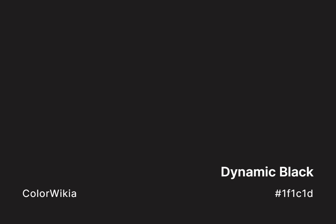
#1f1c1d
Dynamic Black
#e5e6df
Black Squeeze
#12221d
Black Emerald
#220022
Black Sabbath
#1b1b1b
Eerie Black
#251706
Cannon Black
#17181c
Aswad Black
#2b0202
Sepia Black
#17171a
Piano Black
#181818
Thamar Black
#14151d
Kuroi Black
#0e191c
Black Stallion
#171717
Cynical Black
#161616
Pot Black
#221100
Super Black
#151515
Matt Black
#171412
Kokushoku Black
#141314
Kettle Black
#131313
Cursed Black
#16110d
Black Raspberry
#0f0f0f
Chaos Black
#110011
Glossy Black
#111100
Chinese Black
#001111
Black Glaze
#0f0d0d
Black Sheep
#010b13
Black Knight
#0c0c0c
Black Wash
#0f0809
Chyornyi Black
#000011
Benthic Black
#090807
Accursed Black
#060606
Black Metal
#010203
Black Hole
#000200
Registration Black
#424740
Black Forest Green
#2f2f30
Tricorn Black
#1f262a
Washed Black
#004242
Warm Black
#102030
The Count’s Black
#281a14
Tetsu-Guro Black
#131212
Sticky Black Tarmac
#272a3b
Spinel Stone Black
#100c08
Smoky Black
#3b2f2f
Smoked Black Coffee
#4e5152
Satin Black
#004040
Rich Black
#183425
Pumpkin Green Black
#1c3339
Ore Bluish Black
#382b46
Obsidian Lava Black
#322d25
Night Brown Black
#263032
Navy Black
#463f60
Mulberry Mauve Black
#414756
Meteorite Black Blue




Let’s be real, black is not just black.
This stuff matters if you’re a designer. Because the wrong black doesn’t just feel off. It kills the whole mood.
Black Is Not a Single Color
Let me just say it: pure black (#000000) is the most overrated color in design. It’s the loudest whisper, the biggest empty space. And used wrong, it can suck the life out of your layout.
In RGB (screen), black is the absence of light.
In CMYK (print), it’s built up from cyan, magenta, yellow, and black pigment (or “rich black” if you’re layering ink).
But in the real world? Black gets weird.
Put black on glossy paper and it shines.
Put the same black on matte paper and it swallows light like a cave.
Use it on fabric? Now you’ve got undertones: blue, brown, green—depending on the weave and light source.
So yeah, black’s complicated.
The Hidden Emotion in Different Blacks
You might think black is neutral. It’s not. Not even close.
Here’s how I usually break it down with clients:
| Shade Name | Hex Code | What It Feels Like |
|---|---|---|
| Jet Black | #0A0A0A | Polished, bold, sharp. Think: luxury cars. |
| Charcoal | #36454F | Cool, quiet, steady. Used in calm UI design. |
| Onyx | #353839 | Mysterious, bluish, sleek. Looks rich. |
| Licorice | #1A1110 | Warm, vintage, earthy. I’ve used this for coffee brands. |
| Graphite | #1C1C1C | Balanced, neutral. Feels grounded. |
| Raven | #1E1E1E | Flat, matte, modern. Great for minimalist brands. |
| Soot | #555555 | Dusty, approachable. Almost gray, very natural. |
| Midnight | #191970 | Has a strong blue cast. Dramatic and deep. |
Warm vs Cool Blacks: The Real Test
Here’s what I do on the fly:
Drop your black next to a red. Then next to a blue. Watch how it shifts.
If the black feels redder next to blue, you’ve got a warm black.
If it feels bluer next to red, it’s a cool black.
Warm blacks are cozier. More grounded.
Cool blacks feel sleek, techy, modern.
Use the wrong one, and your minimalist homepage starts to look… like a funeral program.
Pure Black Is a Lie (Especially in UI Design)
Dark mode doesn’t mean #000000. Please don’t.
Real talk: true black on pure white is actually bad for your eyes. The contrast is too sharp. It causes visual fatigue and makes reading harder over time.
Instead, try near-black tones like:
- #121212 (Google Material Design’s go-to)
- #1A1A1A
- #202124 (used in Gmail’s dark theme)
Real-World Use: How I Choose a Black
A couple years ago, I worked on a high-end stationery brand. The founder was obsessed with texture. Cotton paper, uncoated stock, hand-pressed type. She asked for “deep black” and handed me a swatch of ink that looked… purple.
Turns out, she didn’t want black. She wanted a romantic, inky, almost bookish black. I ended up using onyx (#353839) with a navy undertone, layered over uncoated paper. In sunlight, it looked bluish. Under warm indoor lighting, it looked like wet stone.
That moment taught me: Black always behaves.