
234 Shades of Black Color
Every black color says something different. Some blacks are formal, some are cozy, some feel like velvet, others feel like a slap.
#282e27

Melanite Black Green
#43484b
Little Black Dress
#551f2f
Largest Black Slug
#001122
Kuretake Black Manga
#3a514d
Heavy Black Green
#32494b
Graphite Black Green
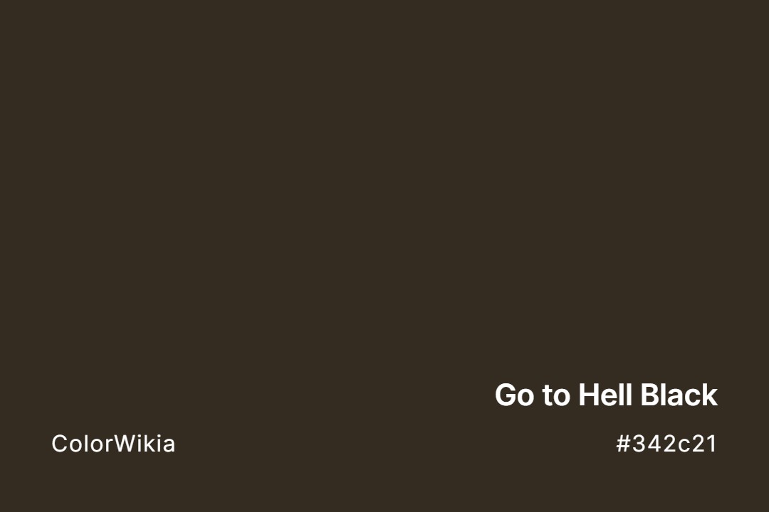
#342c21
Go to Hell Black
#354a41
Garnet Black Green
#676965
Fade to Black
#54585e
Edge of Black
#112f4b
Crow Black Blue
#002e63
Cool Black
#4b1c35
Chilli Black Red
#52593b
Blue Black Crayfish
#000000
Black
#34342c
Black Powder
#5e6354
Black Forest
#33654a
Black Pine Green
#9c856c
Black Headed Gull
#253529
Black Leather Jacket
#323639
Black of Night
#252321
Black Chestnut Oak
#74563d

Black Jasmine Rice
#8a779a
Black Diamond Apple
#0f1519
Black is Back
#552222
Black Is Beautiful
#545562
Black Dragon’s Cauldron
#343e54
Black River Falls
#c89180
Black Hills Gold
#2b322d
Beryl Black Green
#0a0908
Badab Black Wash
#16141c
Back In Black
#4b4247
Apple Herb Black




Let’s be real, black is not just black.
This stuff matters if you’re a designer. Because the wrong black doesn’t just feel off. It kills the whole mood.
Black Is Not a Single Color
Let me just say it: pure black (#000000) is the most overrated color in design. It’s the loudest whisper, the biggest empty space. And used wrong, it can suck the life out of your layout.
In RGB (screen), black is the absence of light.
In CMYK (print), it’s built up from cyan, magenta, yellow, and black pigment (or “rich black” if you’re layering ink).
But in the real world? Black gets weird.
Put black on glossy paper and it shines.
Put the same black on matte paper and it swallows light like a cave.
Use it on fabric? Now you’ve got undertones: blue, brown, green—depending on the weave and light source.
So yeah, black’s complicated.
The Hidden Emotion in Different Blacks
You might think black is neutral. It’s not. Not even close.
Here’s how I usually break it down with clients:
| Shade Name | Hex Code | What It Feels Like |
|---|---|---|
| Jet Black | #0A0A0A | Polished, bold, sharp. Think: luxury cars. |
| Charcoal | #36454F | Cool, quiet, steady. Used in calm UI design. |
| Onyx | #353839 | Mysterious, bluish, sleek. Looks rich. |
| Licorice | #1A1110 | Warm, vintage, earthy. I’ve used this for coffee brands. |
| Graphite | #1C1C1C | Balanced, neutral. Feels grounded. |
| Raven | #1E1E1E | Flat, matte, modern. Great for minimalist brands. |
| Soot | #555555 | Dusty, approachable. Almost gray, very natural. |
| Midnight | #191970 | Has a strong blue cast. Dramatic and deep. |
Warm vs Cool Blacks: The Real Test
Here’s what I do on the fly:
Drop your black next to a red. Then next to a blue. Watch how it shifts.
If the black feels redder next to blue, you’ve got a warm black.
If it feels bluer next to red, it’s a cool black.
Warm blacks are cozier. More grounded.
Cool blacks feel sleek, techy, modern.
Use the wrong one, and your minimalist homepage starts to look… like a funeral program.
Pure Black Is a Lie (Especially in UI Design)
Dark mode doesn’t mean #000000. Please don’t.
Real talk: true black on pure white is actually bad for your eyes. The contrast is too sharp. It causes visual fatigue and makes reading harder over time.
Instead, try near-black tones like:
- #121212 (Google Material Design’s go-to)
- #1A1A1A
- #202124 (used in Gmail’s dark theme)
Real-World Use: How I Choose a Black
A couple years ago, I worked on a high-end stationery brand. The founder was obsessed with texture. Cotton paper, uncoated stock, hand-pressed type. She asked for “deep black” and handed me a swatch of ink that looked… purple.
Turns out, she didn’t want black. She wanted a romantic, inky, almost bookish black. I ended up using onyx (#353839) with a navy undertone, layered over uncoated paper. In sunlight, it looked bluish. Under warm indoor lighting, it looked like wet stone.
That moment taught me: Black always behaves.