
30,000+ Shades of Color with Names and HEX Code
Explore unique color shades for your website, brand or any project.
#660088

Peaceful Purple
#579797
Peaceful Pond
#ffddcd
Peaceful Peach
#94d8ac
Peaceful Pastures
#d6e7e3
Peaceful Night
#878e83
Peaceful Glade
#ddccac
Peaceable Kingdom
#a2b2bd
Peace
#eecf9e
Peace Yellow
#a8bfcc
Peace River
#e0dac8
Peace & Quiet
#c1875f
Peace of Mind
#3f7074
Peabody
#a4bf20
Pea
#929901
Pea Soup
#8eab12

Pea Green
#709d3d
Pea Case
#94a617
Pea Soup Green
#7c9865
Pea Aubergine Green
#536878
Payne’s Grey
#c8c6da
Pax
#473430
Pawn Broker
#827a6d
Paw Print
#fbd49c
Paw Paw
#baab87
Pavlova
#cbccc4
Paving Stones
#a8a498
Paving Stone
#ede4d4
Pavillion
#bebf84
Pavilion
#df9c45
Pavilion Peach
#c5b6a4
Pavilion Beige
#c9c4ba
Pavestone
#554f53
Pavement
#828782
Paved Path
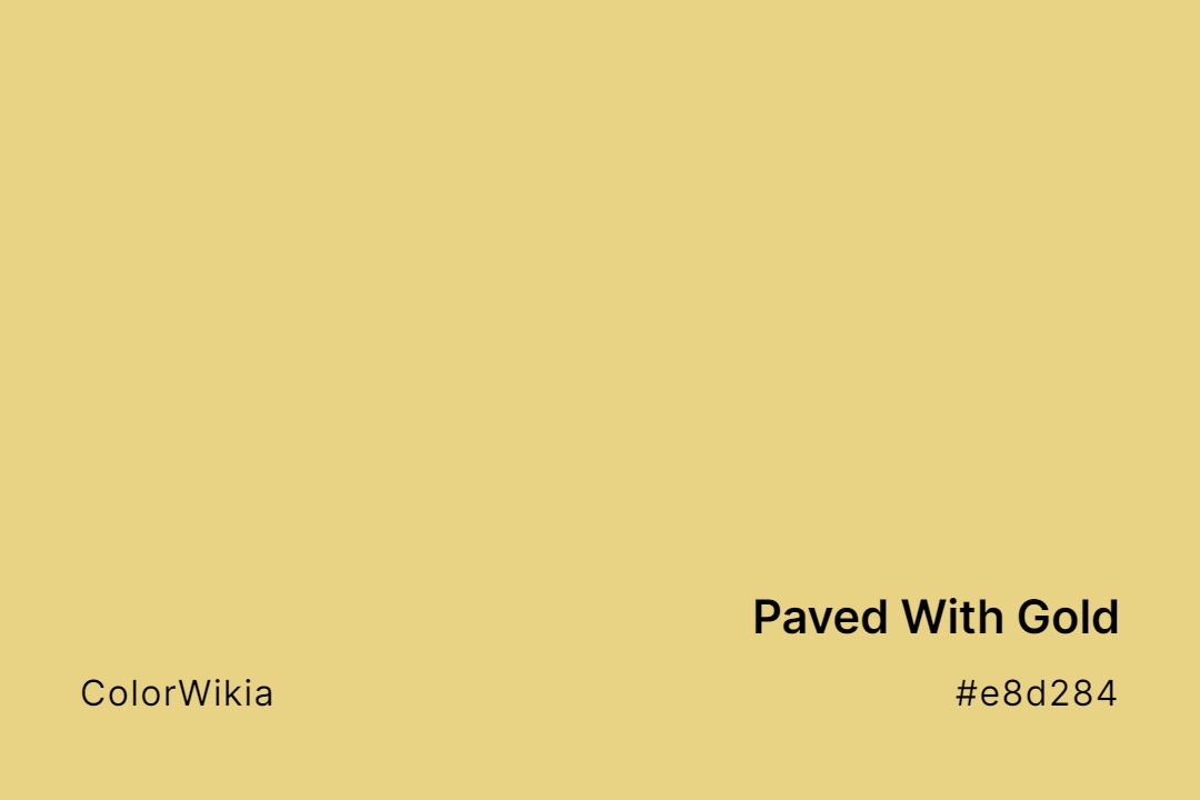
#e8d284
Paved With Gold
#343445
Pauper
#629191
Pauley
#edb80f
Pattypan
#bcc6b1
Pattipan
#f2f2b0
Patrinia Scabiosaefolia
#d9b611
Patrinia Flowers
#72527f
Patrician Purple
#8cd9a1
Patrice
#800070
Patriarch
#eddbc8
Patisserie
#6b655b
Patio Stone
#639283
Patina
#695a67
Patina Violet
#b6c4bd
Patina Creek
#ffaba5
Patient Pink
#e6ddd6
Patience
#dbd6d2
Pathway
#c4eee8
Path to the Sky
#c7c7c6
Paternoster
#7e696a
Patchwork Plum
#c4a89e
Patchwork Pink
#8a7d6b
Patches
#225511
Patch of Land
#f8deb8
Pastry
#b77d58
Pastry Shell
#faedd5
Pastry Dough
#e87175
Pastrami
#edfad9
Pastoral
#cb99c9
Pastel Violet
#99c5c4
Pastel Turquoise
#ef4f4c
Pastel Strawberry
#deece1
Pastel Smirk
#d5c6b4
Pastel Sand
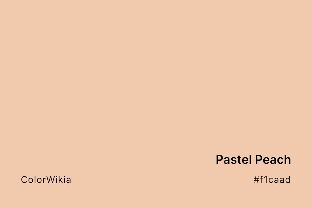
#f1caad
Pastel Peach
#bee7a5
Pastel Pea
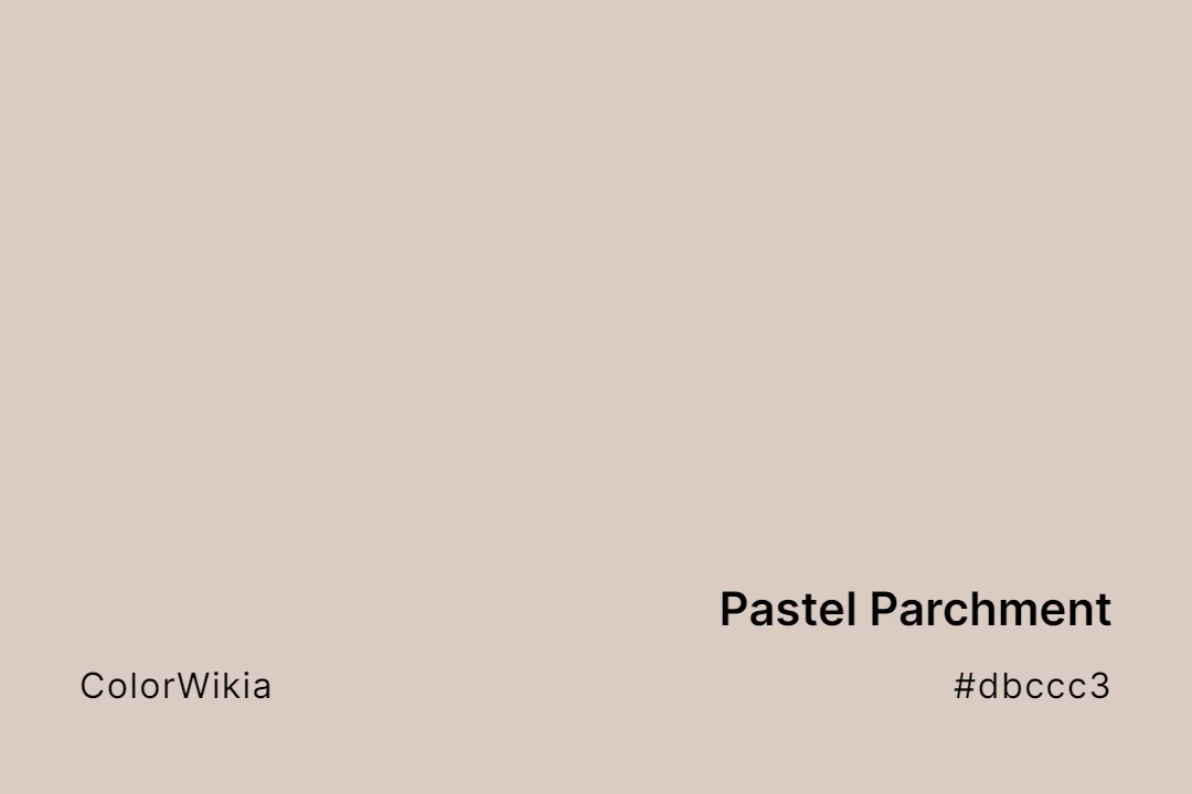
#dbccc3
Pastel Parchment
#cef0cc
Pastel Mint
#a9c9af
Pastel Meadow
#b9d786
Pastel Lime
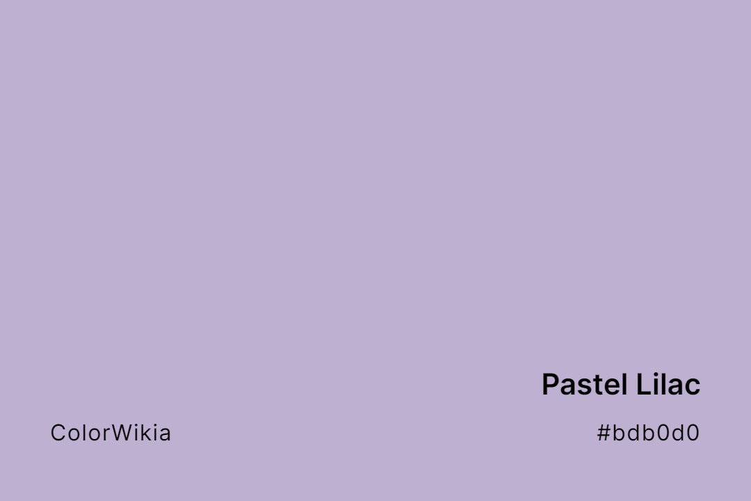
#bdb0d0
Pastel Lilac
#d2f0e0
Pastel Jade
#cfcfc4
Pastel Grey
#dfd8e1
Pastel Day
#f0e4e0
Pastel China
#a2bffe
Pastel Blue
#e4c5b0
Pastel Rose Tan
#f2c975
Pastel de Nata
#fff5d9
Pastel Moon Creme
#f7dfaf
Pasta
#eec474
Pasta Rasta
#fae17f
Pasta Luego
#cbccc9
Passive
#795365
Passive Royal
#dba29e
Passive Pink
#513e49
Passionfruit Mauve
#882299
Passionate Purple
#753a58
Passionate Plum
#dd00cc
Passionate Pink
#edefcb
Passionate Pause
#334159
Passionate Blueberry
#59355e
Passion Razz
#e398af
Passion Potion
#9c5f77
Passion Plum
#907895
Passion Fruit
#6f5698
Passion Flower











The language of color can become confusing because everyday speech and color theory do not always use the word shade in exactly the same way. A page about color shades may describe a whole group of related colors, while the technical definition of a shade refers specifically to a hue made darker with black.
That difference matters when you compare taupe color shades, rust shades, or any other color family. The names people use are practical labels, while color systems provide more precise ways to describe the underlying values.
Understanding the difference between shade, tint, tone, and hue makes it easier to talk about color accurately. It also explains why one named color can have several related variations.
What Is a Color Shade?
In strict color theory, a shade is a hue with black added. Adding black lowers the lightness and produces a darker version of the starting color. A red can move toward burgundy, for example, while a blue can move toward navy.
In everyday language, people use shade more broadly. A search for “different shades of blue” may include lighter, darker, muted, and named variations that are not technically shades under the narrow definition.
That broader usage is common in design, retail, fashion, and online color references. It is also why color shade pages usually cover a family of related colors rather than only mixtures created by adding black.
The distinction is useful because it separates technical color terminology from the way people normally describe color families.
Shade, Tint, Tone, and Hue
These four terms describe different relationships between colors.
- Hue refers to the pure color position itself, such as red, blue, green, or yellow.
- Tint is a hue with white added, producing a lighter version such as pink from red.
- Shade is a hue with black added, producing a darker version such as burgundy from red.
- Tone is a hue with gray added, reducing saturation and muting the color.
The distinctions become useful when you need to describe why two colors look different. A pale blue may be a tint, while a dusty blue may be a tone and a navy blue may be a shade.
These terms can also be used together when discussing a larger color family. A named color may be lighter than the base color, darker than it, or more muted without fitting neatly into one everyday category.
How Digital Color Systems Describe Shades
Digital color systems make these relationships easier to quantify. RGB describes a color by the amount of red, green, and blue light used to create it, while HSL separates the color into hue, saturation, and lightness.
Hex codes provide a compact representation of RGB values. A six-character code such as #DC143C can identify crimson in a digital interface, but the number does not tell you where the color name originally came from or whether a physical pigment uses the same formulation.
In HSL, reducing lightness while holding hue and saturation constant moves a color toward a darker digital version. Raising lightness moves it toward a lighter version, while reducing saturation creates a more muted result.
This distinction is important when working with digital color. A color name can provide a useful visual reference, but a hex code gives you a specific digital value.
How Color Shade Names Develop
Color names often come from things people recognize. Taupe refers to the mole, while rust takes its name from corroded iron. Other names come from materials or places, including copper, terracotta, mahogany, sienna, and umber.
Language can preserve those histories even after a color becomes a digital swatch. Khaki color shades provide another example because the word traces back to a Hindustani term connected with dust and earth.
Commercial color naming adds another layer. Paint makers, textile companies, standards groups, and digital platforms may assign different names to closely related colors, so one shade does not always have one universal label.
This is one reason color names can feel inconsistent. A name can describe a recognizable visual family without pointing to one universal digital value.
Color Standards and Shade Codes
Professional color systems exist because names alone are too vague for precise reproduction. The Pantone Matching System assigns numbered references to color formulations, while systems such as Munsell describe colors using hue, value, and chroma.
The Natural Color System uses a different framework based on color perception. These systems serve different purposes, but they share the same practical goal. A numeric reference can communicate more precisely than a word such as “blue” or “green.”
That is also why a page listing color codes should distinguish between a named color, a standardized reference, and an ordinary digital hex value.
A hex code is useful for digital work, but it should not automatically be treated as a universal definition of a named color. The context behind the color reference matters.
Major Color Families and Their Shades
Every broad color family branches into many named variations. The examples below show how familiar shade names sit within larger groups.
| Color Family | Popular Shade | Hex Code |
| Red | Crimson | #DC143C |
| Blue | Navy | #000080 |
| Green | Forest Green | #228B22 |
| Yellow | Gold | #FFD700 |
| Purple | Indigo | #4B0082 |
| Orange | Coral | #FF7F50 |
| Brown | Tan | #D2B48C |
Warm families such as orange and brown include earthy variations such as rust, terracotta, and chocolate. Blue and green branch into names such as navy, teal, forest, and olive.
Neutral families work differently because their boundaries are less obvious. Beige, gray, taupe, and related colors can overlap substantially depending on saturation, lightness, and undertone.
Why named colors can overlap
A useful color family is not always a strict technical category. Two colors can look very similar while carrying different names because the names come from different materials, places, industries, or traditions.
For practical design work, it is often more useful to compare the actual color values than to rely on the name alone.
Frequently Asked Questions
What is the difference between a shade and a tint?
A shade is a darker version created by adding black, while a tint is a lighter version created by adding white.
Is a tone the same as a shade?
No. A tone adds gray and reduces saturation, while a shade adds black and darkens the original hue.
Why does one color have so many shade names?
Different industries, standards groups, companies, and cultures develop names independently. Closely related colors can therefore receive several labels.
How many shades of a color are there?
There is no fixed limit. Digital systems can generate very large numbers of distinct values, while named shades depend on the terms that become widely recognized or useful.