28 Shades of Porcelain Color
Matching porcelain is one of those tasks that sounds easy until you actually try it. What seems like simple off-white in your head might carry warm ivory undertones, faint pink hints, or a cool gray cast once you put swatches side by side. This collection of porcelain color shades sorts through those subtle differences, with hex codes and RGB values for every variation.
#f8fbf8

White Porcelain Color
The smooth calm of a glazed Meissen teacup catching afternoon light. White porcelain color (#f8fbf8) carries the faintest green-cool edge. Premium and minimal design pull it as a refined background.
#118c7e
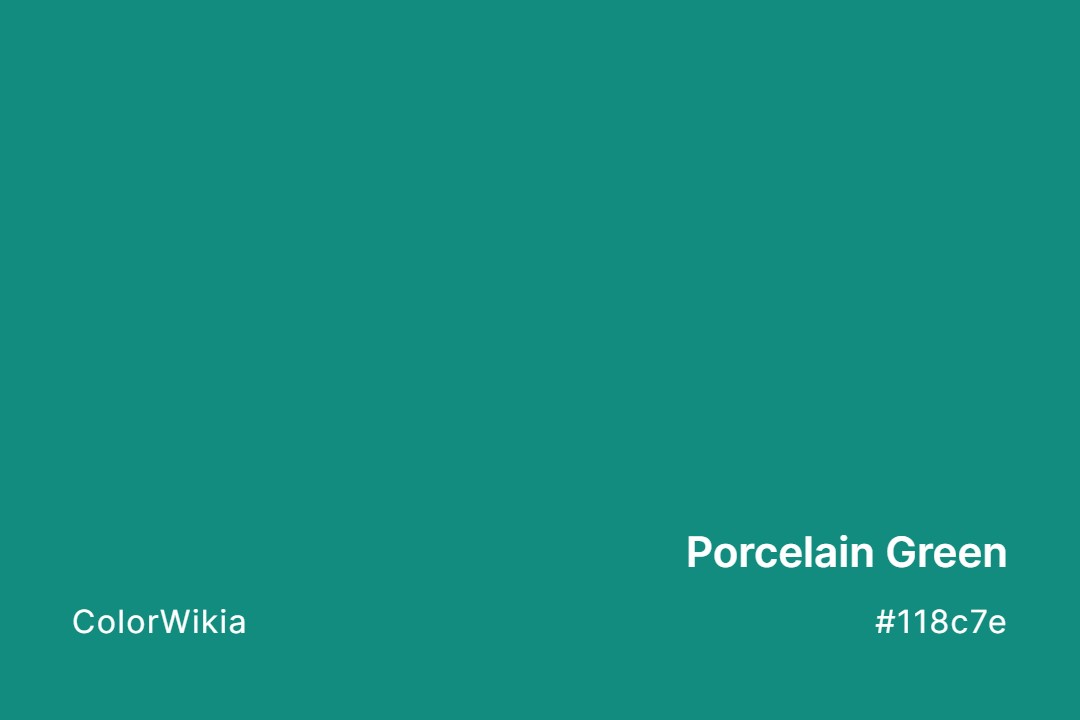
Porcelain Green Color
Porcelain Green color code #118c7e is a saturated jade-teal, nothing like the pale grey-green of celadon porcelain. If you want the glaze, go much lighter. If you want bold bathroom tile with a little vintage swagger, this is the one.
#95c0cb

Porcelain Blue Color
Porcelain Blue color (#95c0cb) is a pale gray aqua, much lighter and greener than the cobalt on Chinese blue-and-white porcelain. It sits closer to a sun-faded duck egg. Daylight cools it further, and warm light tips it green.
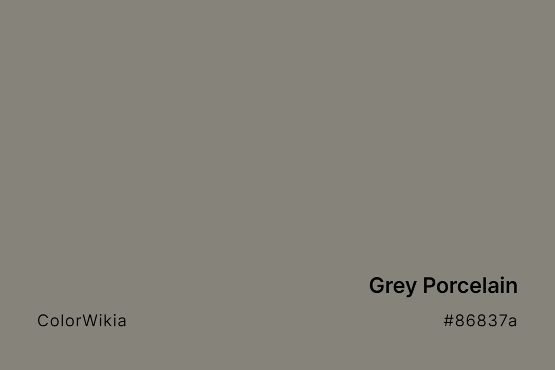
#86837a
Grey Porcelain Color
Unglazed stoneware clay dries to a warm matte grey-tan before it hits the kiln. Grey Porcelain color at #86837a takes that raw ceramic tone from a Jingdezhen studio. A potter’s-studio interior grounds itself here.
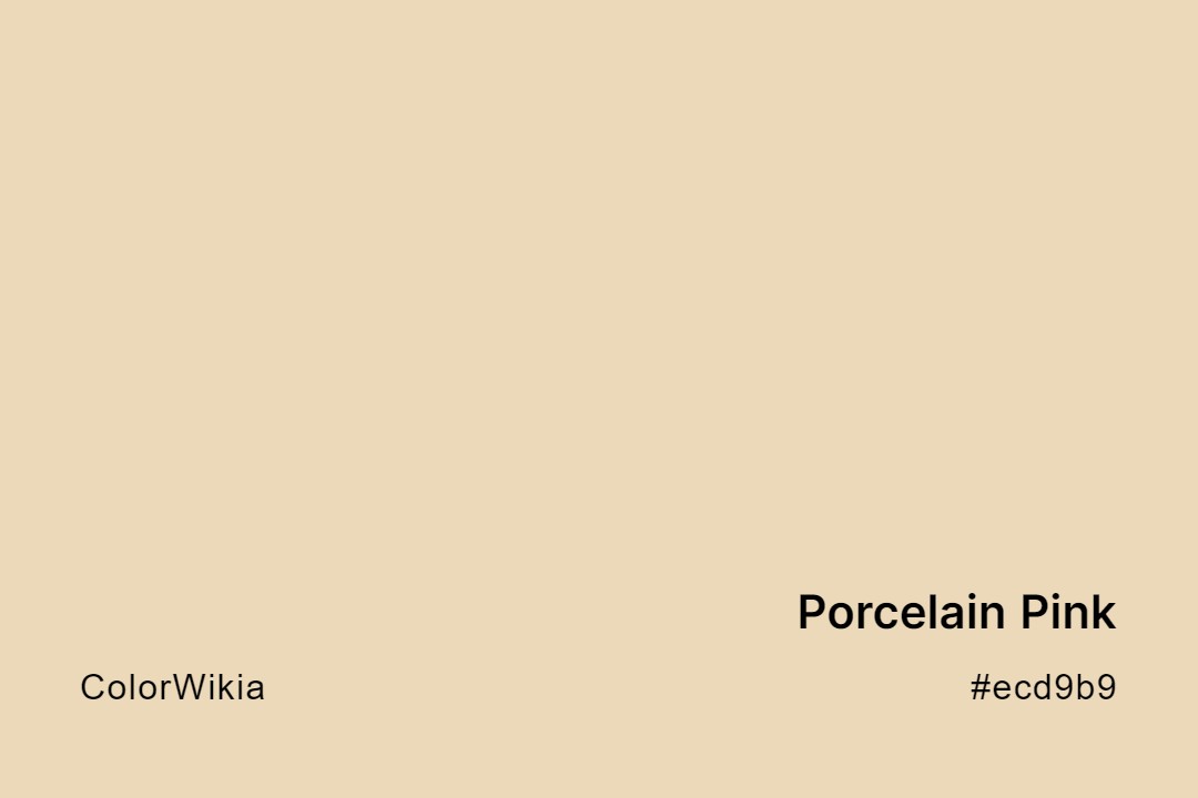
#ecd9b9
Porcelain Pink Color
Porcelain Pink is barely pink, since #ecd9b9 is a warm ivory-beige like the unglazed bisque under a china doll’s paint. The Porcelain Pink color carries more yellow than red, so it behaves like a creamy neutral. Order it expecting a cream wall and you’ll be happy.

#118c7e
Porcelain Green
#ecd9b9
Porcelain Pink
#95c0cb
Porcelain Blue
#86837a
Grey Porcelain
#f8fbf8
White Porcelain
#f2edec
Vintage Porcelain
#eee2e0
Shattered Porcelain
#eeffbb
Porcelain Earth
#a9998c
Porcelain Figurines
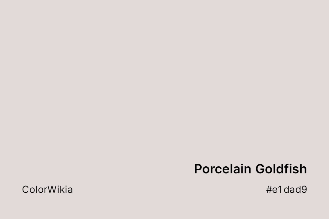
#e1dad9
Porcelain Goldfish
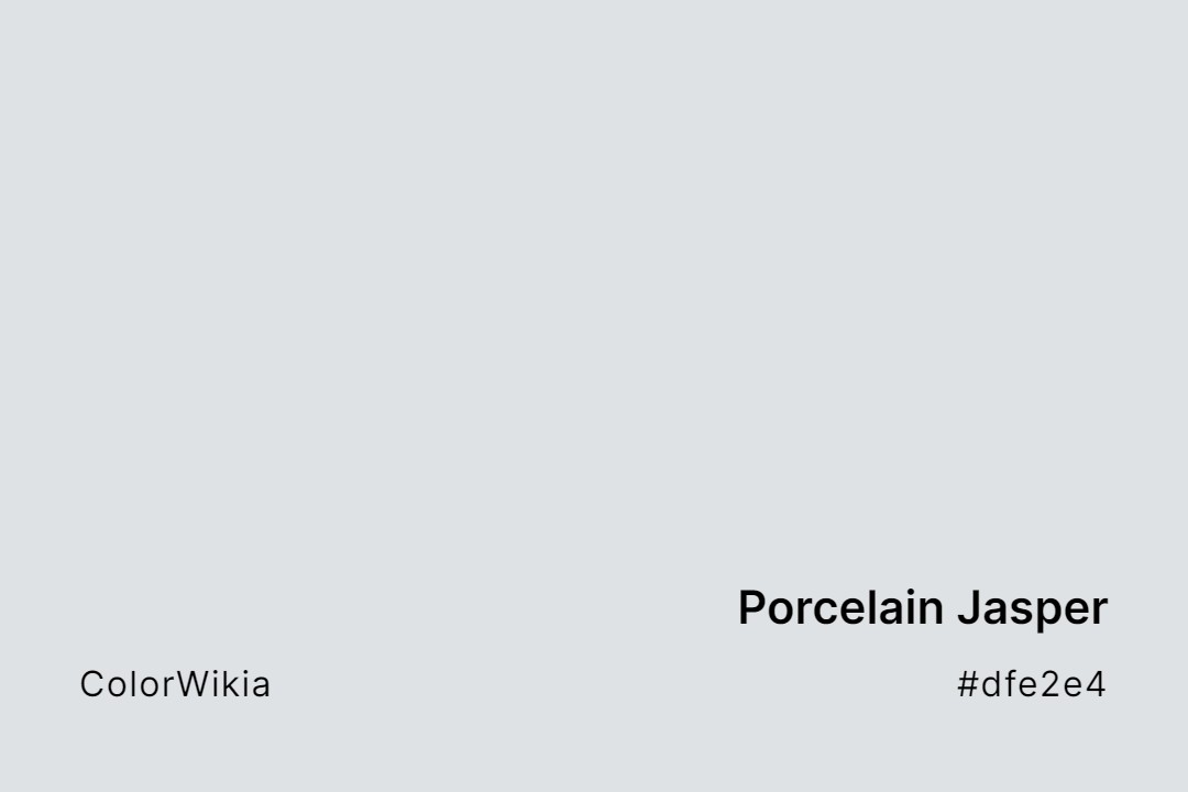
#dfe2e4
Porcelain Jasper
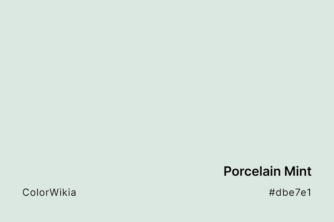
#dbe7e1
Porcelain Mint
#ebe8e2
Porcelain Mold
#f5d8ba
Porcelain Peach
#ea6b6a

Porcelain Rose
#ffe7eb
Porcelain Skin
#f7d8c4
Porcelain Tan
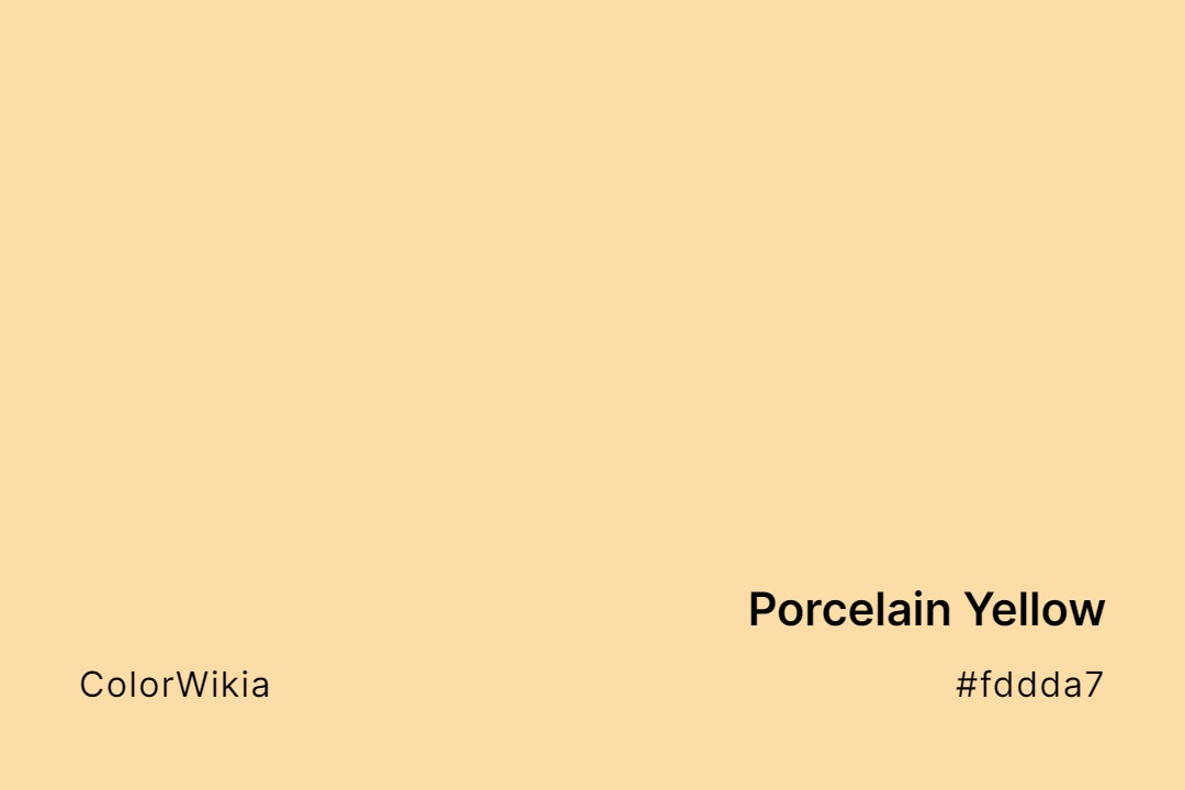
#fddda7
Porcelain Yellow
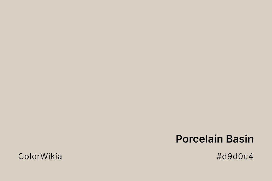
#d9d0c4
Porcelain Basin
#dddcdb
Porcelain
#e9b7a8
Porcelain Crab
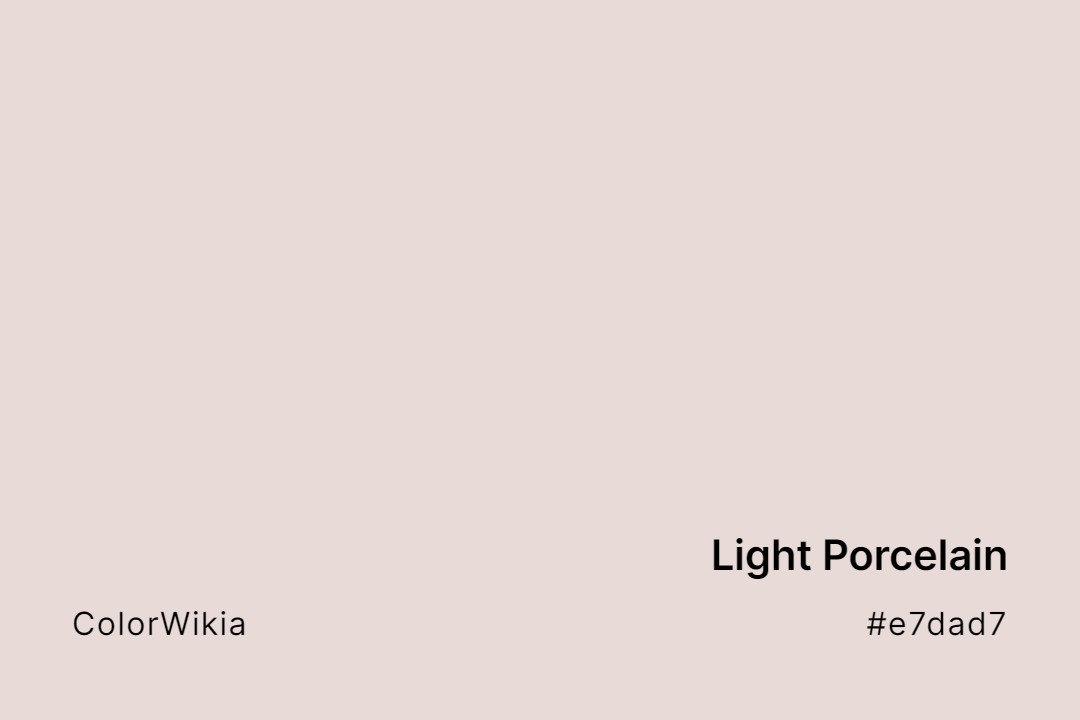
#e7dad7
Light Porcelain
#faf1d7
French Porcelain Clay
#f6f4f6
French Porcelain
#faf0e1
Fine Porcelain
#e0dbd3
Empire Porcelain
#3a5f7d
Chinese Porcelain
#7ebea5
Celadon Porcelain