Evergreen isn’t just a plant, or a seasonal metaphor, it’s a deeply rooted color that speaks in hushed tones; yet leaves a lasting impact. Hex #125b49 is a cool, forest-rich green that whispers stability and breathes timelessness. It’s the kind of green that doesn’t beg for attention but earns it with quiet confidence.
I remember first encountering this color while restoring a vintage Japanese poster from the early ’60s. The paper had faded, but that green was still intact, still regal. There’s something about #125b49 that feels ancient but not old, earthy but not muddy.
What Kind of Color Is Evergreen?
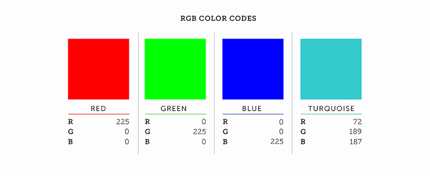
Evergreen (#125b49) is a deep green with cool undertones and a medium-dark luminance. Technically, it holds an RGB value of (18, 91, 73) and a HSL composition of 161°, 68%, 21%. This means it skews toward teal with a low lightness, making it feel mature, grounded, and a little mysterious.
Think alpine trees soaked in rain. Think ink-dyed linen. Think the smell of crushed pine needles on a morning hike. It doesn’t shout. It doesn’t sparkle. But it stays with you.
Color Psychology: What Evergreen Makes Us Feel
Evergreen doesn’t scream. It steadies. It’s the shade of deep-rooted things: trees, traditions, hard-earned trust. Dark greens like Evergreen often signal resilience, safety, and natural strength.
There’s also an undercurrent of sophistication. You’ll often see #125b49 used in branding when a company wants to appear serious, mature, and sustainable. Think heritage whiskey, artisan soap, or a minimalist wellness brand.
In digital contexts, this color:
- Reduces eye fatigue (good for UI backgrounds)
- Feels calming, especially on dark-mode screens
- Helps highlight earthy themes without falling into cliché “eco green” territory
Cultural Symbolism of Dark Green
Let’s not forget, color meaning changes with context.
- In Western cultures, dark green often signals wealth, growth, and tradition. Think hunting jackets, old universities, classic cars.
- In East Asia, deeper greens are used less frequently, but they’re respected for their association with nature and balance.
- In Middle Eastern art, deep green holds religious significance, especially in Islamic symbolism.
- In Indigenous cultures, green shades represent life cycles, regeneration, and sacred landscapes.
Evergreen walks a fine line. It carries weight without arrogance. It belongs, quietly, almost everywhere.
Where to Use Evergreen (#125b49)
Honestly? Just about anywhere you need stability, elegance, or natural strength. But here are a few spots where Evergreen really shines:
1. Brand Identity
Evergreen works for brands that want to feel durable, trustworthy, or eco-conscious without being obvious about it. This is the green that says, “We’ve been here a while, and we’re not going anywhere.”
Pair it with creams, golds, or off-blacks. Evergreen and ivory? Timeless. Evergreen and copper? Bold but mature.
Great for:
- Luxury outdoor brands
- Boutique wellness products
- Craft alcohol or coffee packaging
- Financial institutions leaning toward green investing
2. Web and UI Design
Dark green backgrounds feel restful and grounded, especially in dark mode interfaces. Evergreen pairs well with white text for contrast, or muted earth tones for a warmer palette.
Try it in:
- Sidebar navs or footers
- Alert success messages (instead of bright green)
- Backgrounds for digital portfolios
Avoid overusing it in buttons. It’s too serious to feel click-friendly.
3. Interior Spaces
Think painted cabinetry, accent walls, velvet couches, ceramic tiles. Designers in 2024 are using tones like Evergreen in moody bathrooms, kitchens, or small reading corners.
Tip: Put Evergreen on a matte surface, then add warm brass hardware or leather nearby. The green won’t feel cold, it’ll feel curated.
4. Print and Editorial
In books or magazines, Evergreen makes headers feel grounded and sophisticated. It adds seriousness without being black. On matte paper, it absorbs just enough light to feel soft, not severe.
When to Skip It:
- Fast fashion or tech startups: It might feel too slow or somber.
- Small text on dark backgrounds: Contrast can suffer.
- Holiday designs: Unless carefully toned, it can feel too Christmassy.