134 Shades of Pale Color
Pale describes intensity, not a color. This collection holds every hue on the wheel dialed down to a murmur. Pinks, blues, greens, all softened and muted.Browse the full range of pale tones with their exact hex codes. These are your go-to shades when you want color in a room or a design without it demanding the whole conversation.
#d0fefe

Pale Blue Color
A tinted white with the barest blue-green shimmer. Pale blue color (#d0fefe) reads as fresh and airy, which is why it appears in bathroom tile, hospital signage, and cleaning product packaging. Almost impossible to overdo.
#69b076
Pale Green Color
Halfway between mint and moss, with enough saturation to still feel alive. Pale green color (#69b076) works well on kitchen tile, natural product packaging, and health-app dashboards. Fights any red it touches, so keep the surrounding palette cool.
#fdfdfe
Pale Grey Color
So light it’s almost white. Pale grey color (#fdfdfe) is the shade you use when you want a background barely different from white, useful for separating cards from a body background without adding visible weight. Blink and you’d miss it.
#efcddb
Pale Pink Color
The pink you’d paint a nursery if you didn’t want to commit to pink. Pale pink color (#efcddb) lives between dusty rose and warm white, useful when skincare packaging needs to feel gentle without going into cosmetic-industry cliché. Sweet without going sugary.
#a5fbd5
Pale Turquoise Color
Mint’s brighter cousin. Pale turquoise color (#a5fbd5) has enough green to feel fresh and enough blue to stay calm, which is why spa brands and toothpaste boxes keep circling back to it. Deceptively hard to pair; it needs neutrals to work.
#82cbb2

Pale Teal Color
Pale teal is a soft, milky green-blue, the color of oxidized silver or a foggy morning over the sea. Calm and slightly nostalgic, the pale teal color makes a soothing wall shade for a bedroom or spa.
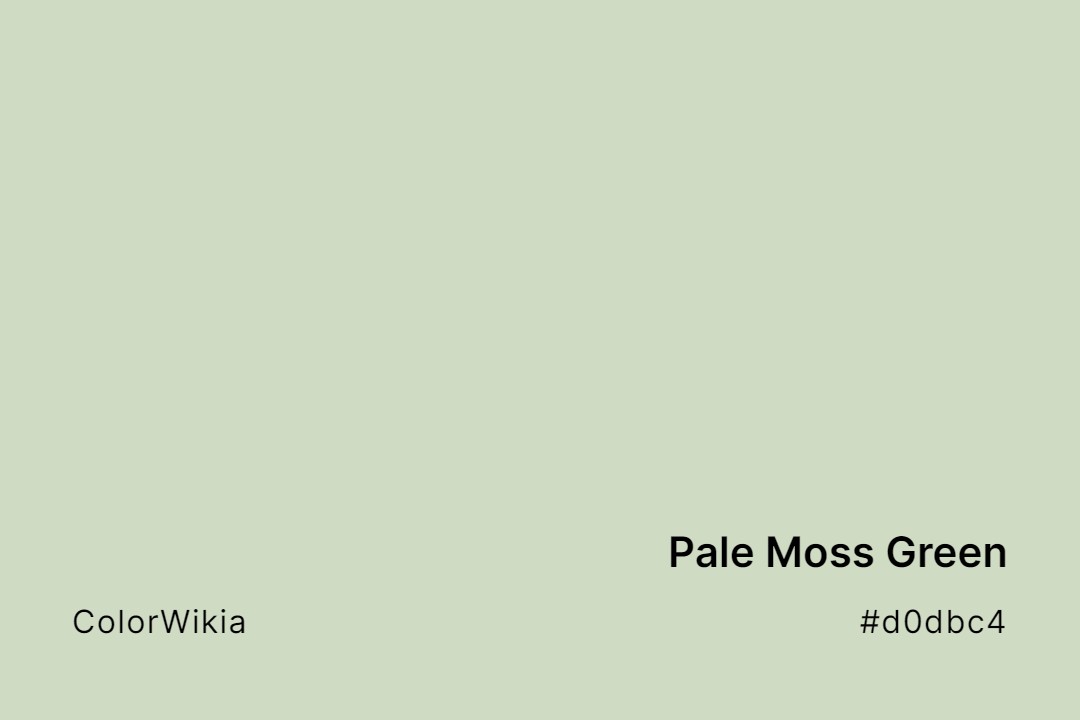
#d0dbc4
Pale Moss Green Color
Pale moss green is a soft, dusty sage with a grey cast, like moss dried in the sun. Calm and natural, the pale moss green color makes a gentle, organic background for a nature-inspired design.
#b790d4
Pale Purple Color
Think wisteria vines dripping off a summer porch, then dial down the saturation. Pale purple color (#b790d4) holds enough gray to stay grown-up, which is why bridal stationers keep circling back. Set white type on top and this shade turns almost silver.
#b1916e
Pale Brown Color
Gingerbread cookies pulled straight from the oven, or suede that has been scuffed just enough. What color is pale brown? A milky tan that feels warm and quiet, easy on the eye across large fields. It pairs well with forest green and cream, less so with pastels.
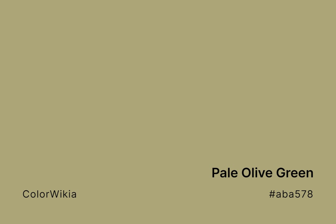
#aba578
Pale Olive Green Color
Dried sage on the stem, or old canvas that has been through too many summers. Pale olive green color (#aba578) grounds an earthy palette without turning it dull. Choose the shade when full olive feels too dark and khaki looks too flat.




#ccd5ff
Pale Phthalo Blue
#d4e2eb
Pale Grey Blue
#96ded1
Pale Robin Egg Blue
#e7d8ea
Pale Grey Magenta
#b1ff65
Pale Lime Green
#b1fc99
Pale Light Green
#fdde6c
Pale Gold
#d3c7a1
Pale Olive
#aba578
Pale Olive Green
#b1916e
Pale Brown
#b790d4
Pale Purple
#d0dbc4
Pale Moss Green
#82cbb2
Pale Teal
#e3c6d6
Pretty Pale
#fff9d0
Pale
#ccd2ca
Pale Loden
#ffe5ad
Pale Peach
#acbda1
Pale Sage
#6f9892
Pale Verdigris
#69b076
Pale Green
#c4acb2
Pale Lychee
#f4da6e
Pale Pear
#d3d1b9
Pale Sagebrush
#f4f2e2
Pale View
#fdfdfe
Pale Grey
#ffbb44
Pale Marigold
#fff2de
Pale Pearl
#e5d5ba
Pale Sand
#c6c3d6
Pale Violet
#f5d6aa
Pale Honey
#c6a4a4
Pale Mauve
#f7e0de
Pale Perfection
#c3e7e8
Pale Seafoam
#d8dece
Pale Vista
#bdd4d1
Pale Icelandish
#aac2a1
Pale Mint
#c8d2e2
Pale Periwinkle
#cacfdc
Pale Shale
#b6d3df
Pale Whale
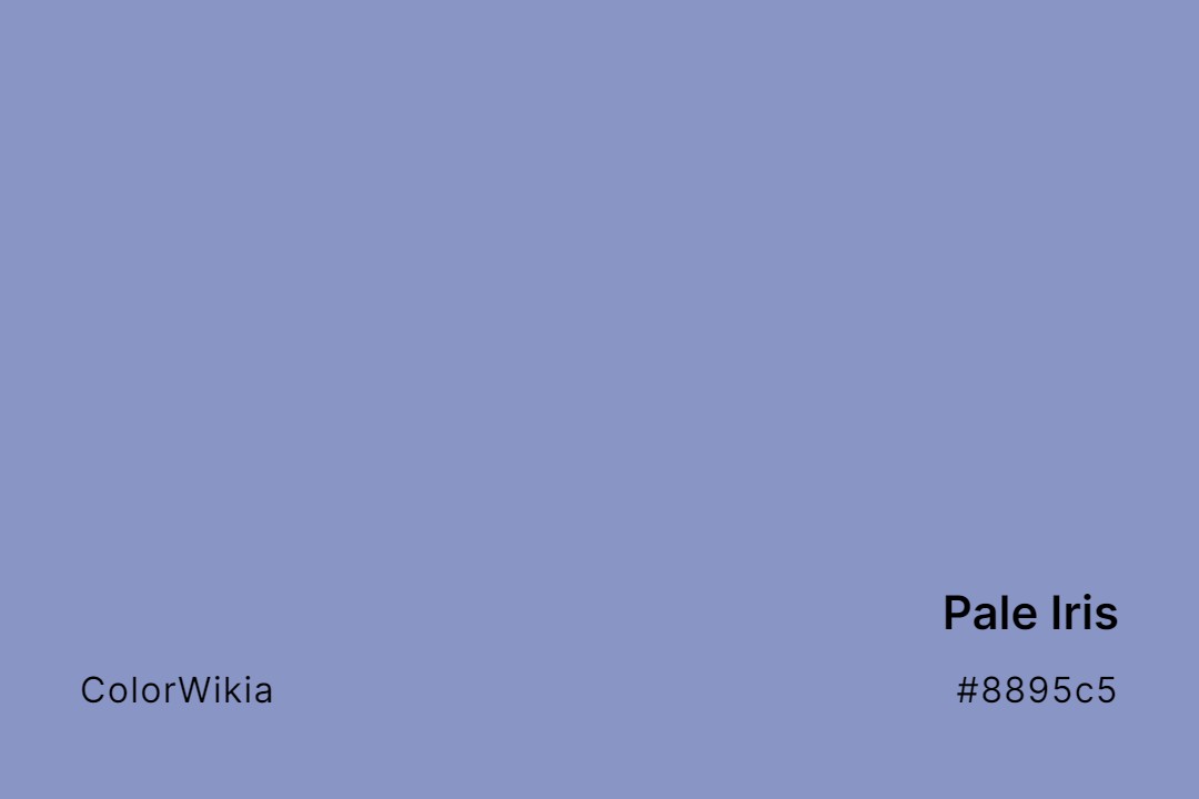
#8895c5
Pale Iris
#dcc797
Pale Moss
#d4acad
Pale Persimmon
#f8dbd6
Pale Shrimp
#d9c29f
Pale Wheat
#d4cfb2
Pale Ivy
#e4dde7
Pale Muse
#d9bfce
Pale Petals
#dfc7bc
Pale Sienna
#89ab98
Pale Willow
#77c3b4
Pale Jade
#faf5e2
Pale Narcissus
#ba9ba5
Pale Petticoat
#bdf6fe
Pale Sky
#bbc8e6
Pale Wisteria
#fed6cc
Pale Jasper
#f8c0c7
Pale Petunia
#9fabad
Pale Slate
#ead2a2
Pale Wood
#998877
Pale Khaki
#dedbe5
Pale Orchid
#efcddb
Pale Pink
#e4ded8
Pale Starlet
#dcd0ff
Pale Lavender
#fdebbc
Pale Organza
#e3e7d1
Pale Pistachio
#f2c880
Pale Sunshine
#bdcaa8
Pale Leaf
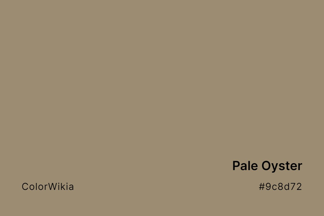
#9c8d72
Pale Oyster
#bca8ad
Pale Poppy
#bc987e
Pale Taupe
#d8d4bf
Pale Lichen
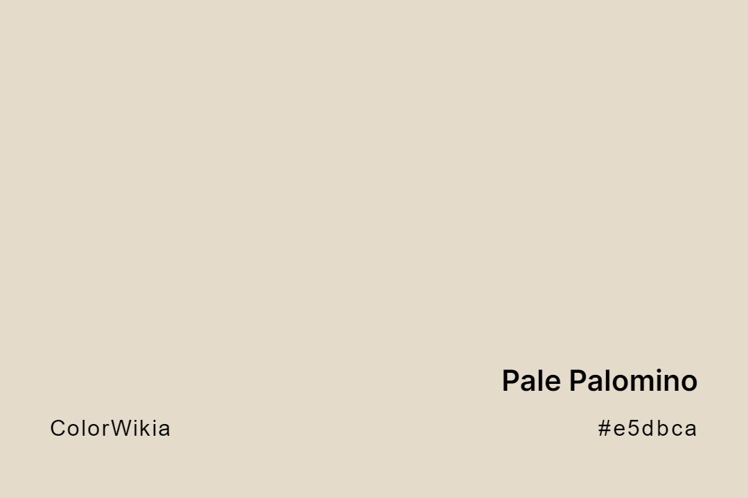
#e5dbca
Pale Palomino
#eec8d3
Pale Primrose
#d8b5bf
Pale Lilac
#d1c3ad
Pale Parchment
#cecdbb
Pale Tendril
#f3ece7
Pale Lily
#e3d8bf
Pale Parsnip
#efeada
Pale Quartz
#eaaa96
Pale Terra
#ebe5d6
Pale Linen
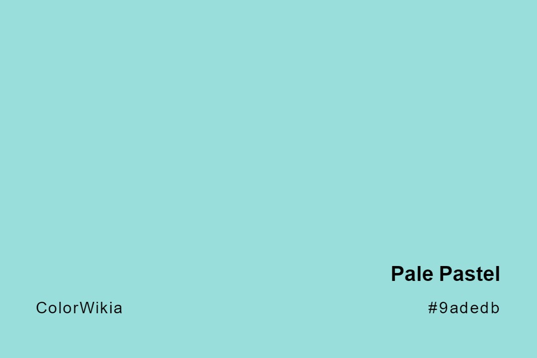
#9adedb
Pale Pastel
#efd6da
Pale Rose
#a5fbd5
Pale Turquoise
#abf5ed
Pale King’s Blue
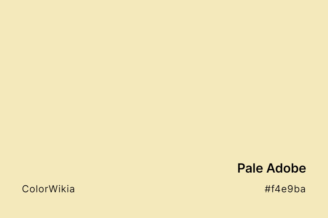
#f4e9ba
Pale Adobe
#c9cbbe
Pale Celadon
#c0a2c7
Pale Grape
#fef068
Pale Ale
#e9e9c7
Pale Celery
#ecebbd
Pale Spring Bud
#bcd4e1
Pale Aqua
#9bc4e2
Pale Cerulean
#c9bfa8
Pale Bamboo
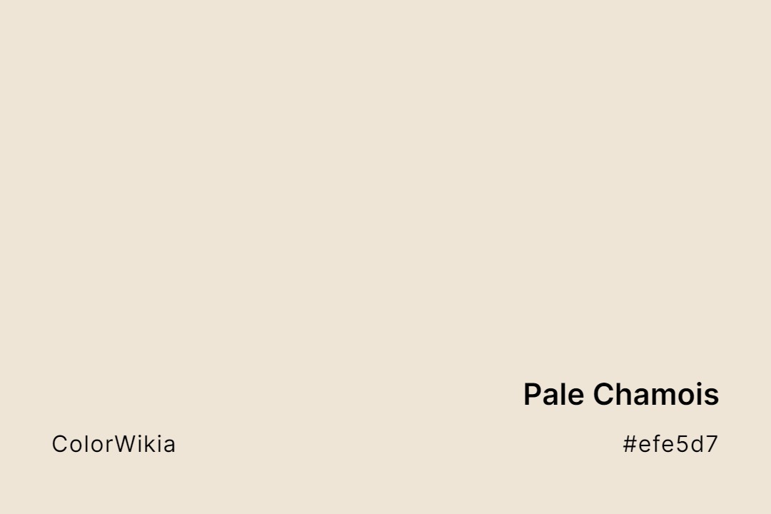
#efe5d7
Pale Chamois
#f5e28d
Pale Banana
#ddadaf
Pale Chestnut
#ccc7b1
Pale Beige
#dadee9
Pale Cloud
#e2ccc7
Pale Berries