What Exactly Is #0000FF?
In digital color systems like RGB, #0000FF is blue at full intensity. It’s one of the three primary colors in light-based design, alongside red and green. This shade is clean, saturated, and often used when designers want a bold, unmistakable blue.
A Brief History of Blue
For much of human history, blue was rare and prized. The ancient Egyptians created a pigment called Egyptian blue — one of the first synthetic colors ever made. Later, the precious stone lapis lazuli was ground into ultramarine, a pigment so expensive it was reserved for the robes of the Virgin Mary in Renaissance art.
The word “blue” didn’t even exist in many early languages. It came to English from Old French, where “bleu” described the color of the sky.
What Blue Feels Like
Blue affects us in ways we often don’t notice. It’s cool and stable — the opposite of fiery red. Psychologists and color theorists often link blue to:
- Calmness – Think open skies and still water.
- Trust – Used by banks, tech firms, and healthcare providers.
- Sadness – In many cultures, “feeling blue” means feeling down.
These emotional connections make it a popular choice in branding and interior design.
Where You See It
#0000FF may be the most recognizable blue on the internet. It’s often used for default hyperlinks, buttons, and digital accents. But it also works in print, signage, fashion, and packaging — anywhere clarity and strength are needed.
Real-world examples:
- Facebook and LinkedIn use blue to signal trust.
- Ford and HP use it to imply reliability.
- Hospitals often choose blue in uniforms and logos to suggest cleanliness and calm.
Similar and Related Colors
Blue doesn’t live alone — it sits in a rich ecosystem of related hues.
Popular shades of blue:
Complementary color:
- Yellow – #FFFF00 (This combo creates high contrast and energy.)
Analogous colors:
- Cyan (#0ff0fe) and Violet (#9a0eea) — harmonious for gradients and layered visuals.
Triadic pairing:
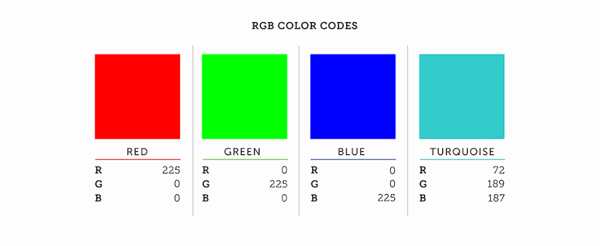
- Red (#FF0000) and Green (#00FF00) — bold, balanced, and dynamic.
Using Blue in Design
Designers use blue to guide mood and hierarchy. Here are a few best practices:
- Use white or yellow text on a blue background for strong readability.
- Avoid overusing blue in food packaging — it’s known to reduce appetite.
- Combine with warm tones (like coral or orange) for visual contrast.
- For a clean, tech-friendly look, pair blue with gray or silver.
Cultural Significance
- In Christian art, blue symbolizes purity and heaven.
- In politics, it can signal either liberal or conservative values, depending on the country.
- In language, phrases like “blue blood” (nobility) or “blue Monday” (melancholy) show how deeply the color runs in our metaphors.