
30,000+ Shades of Color with Names and HEX Code
Explore unique color shades for your website, brand or any project.
#e99a10

Pumpkin Yellow
#ffa74f
Pumpkin Vapour
#de9456
Pumpkin Toast
#b2691a
Pumpkin Spice
#e17701
Pumpkin Soup
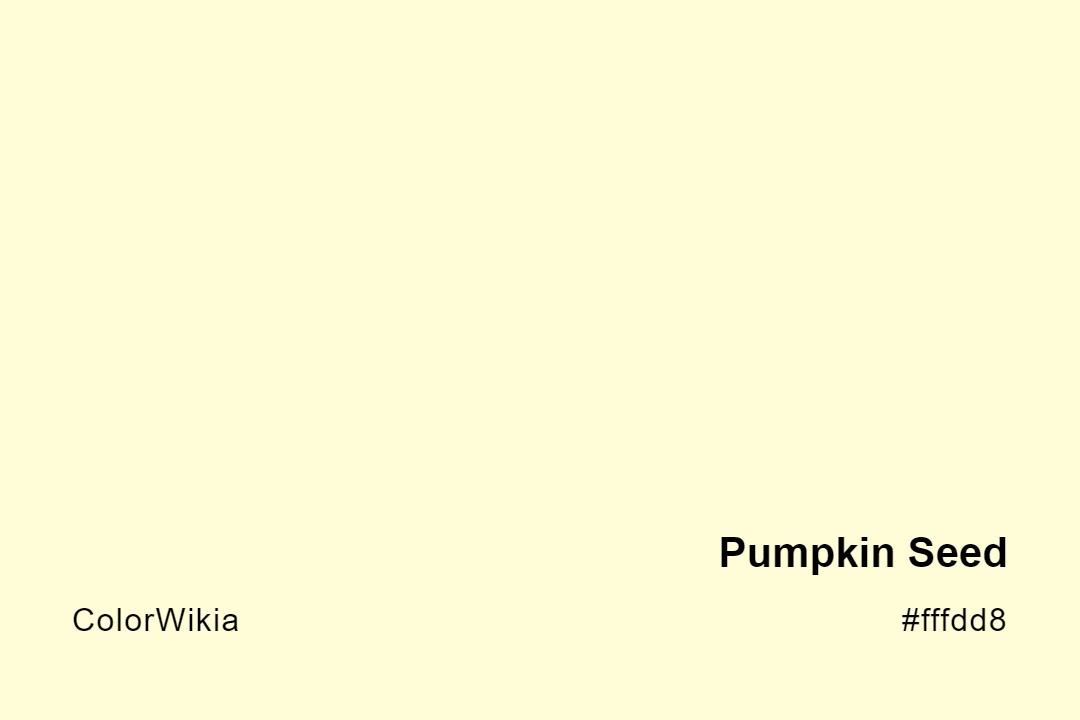
#fffdd8
Pumpkin Seed
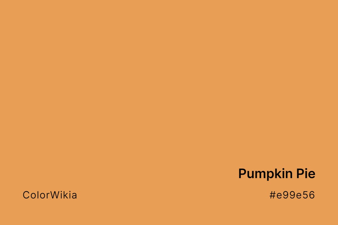
#e99e56
Pumpkin Pie
#d59466
Pumpkin Patch
#fb7d07
Pumpkin Orange
#f2c3a7
Pumpkin Mousse
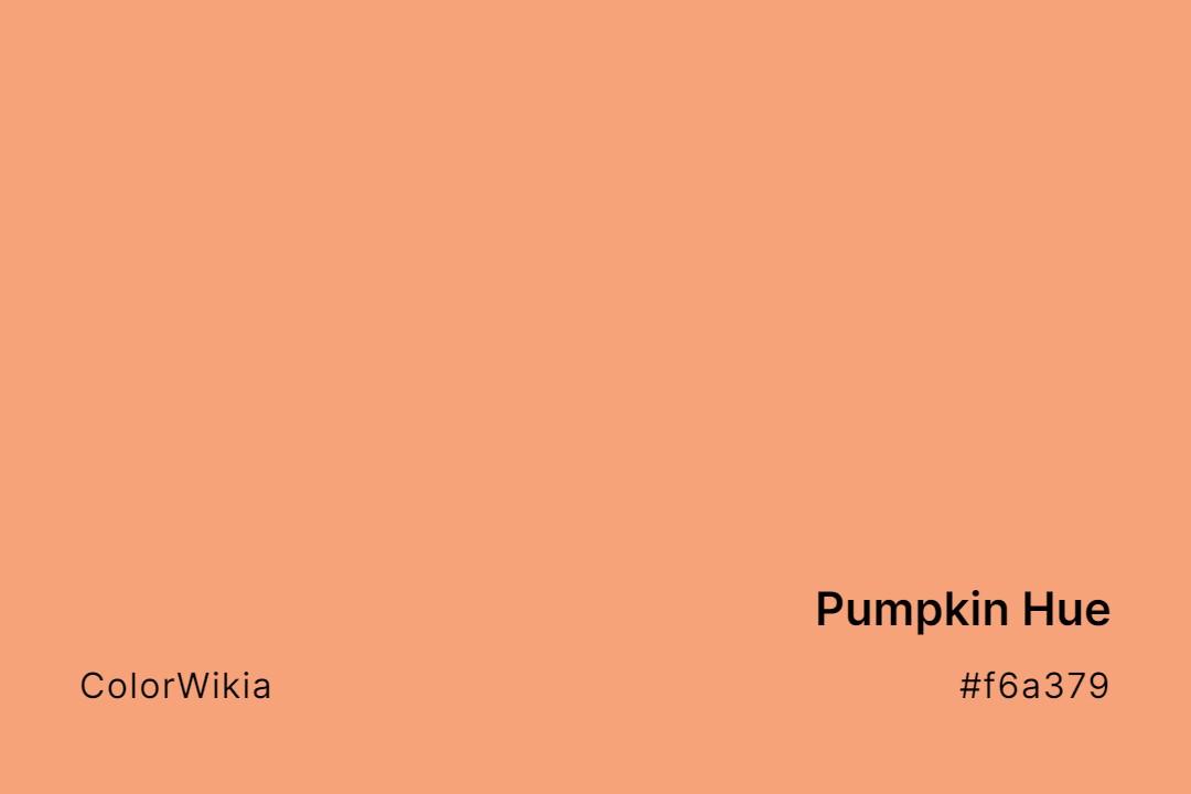
#f6a379
Pumpkin Hue
#f7dac0
Pumpkin Essence
#b96846
Pumpkin Drizzle
#e6c8a9
Pumpkin Cream
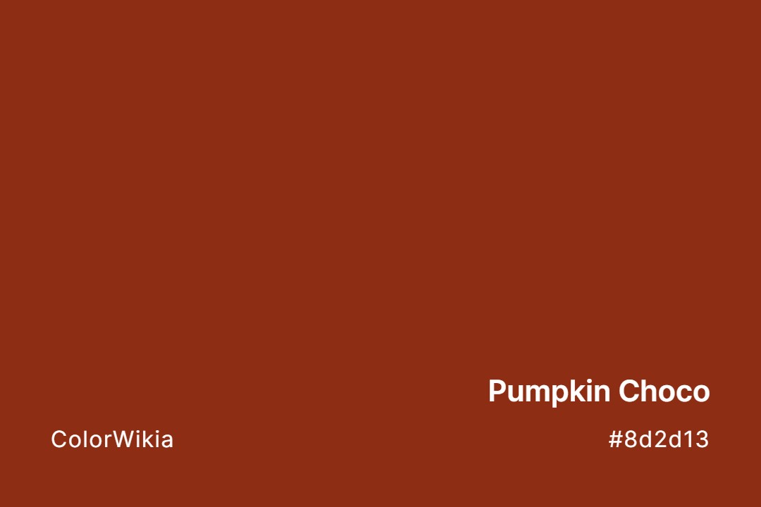
#8d2d13
Pumpkin Choco
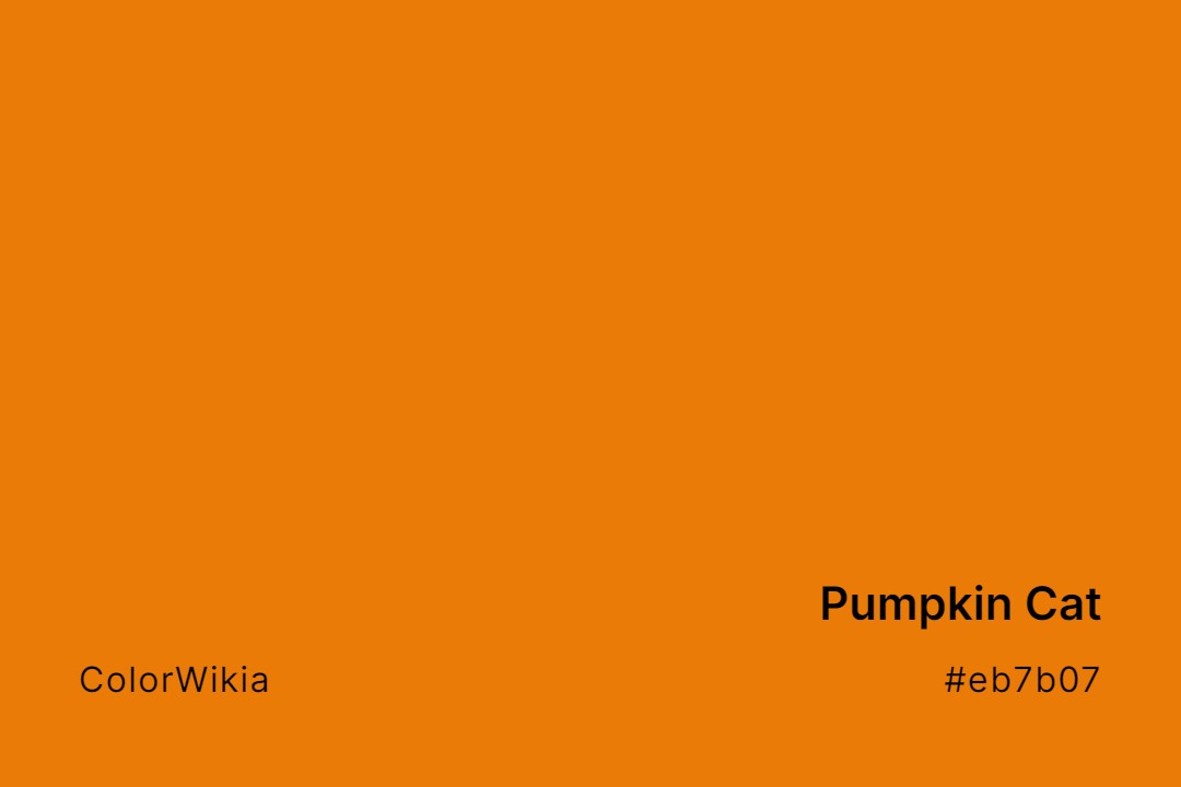
#eb7b07
Pumpkin Cat
#cba077
Pumpkin Butter
#d27d46
Pumpkin Bread
#183425
Pumpkin Green Black
#f7504a
Pumping Spice
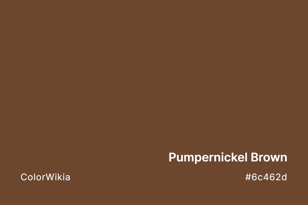
#6c462d
Pumpernickel Brown
#bac0b4
Pumice
#cac2b9
Pumice Stone
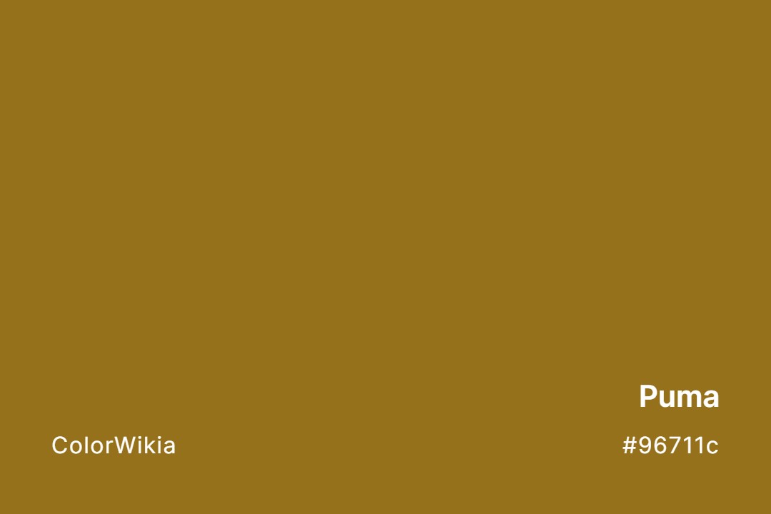
#96711c
Puma
#e18289
Pulp
#f1d6bc
Pulled Taffy
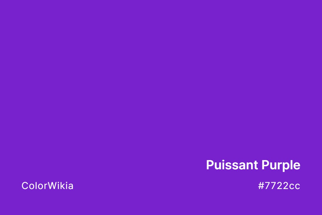
#7722cc
Puissant Purple
#e8e5de
Puffy Pillow
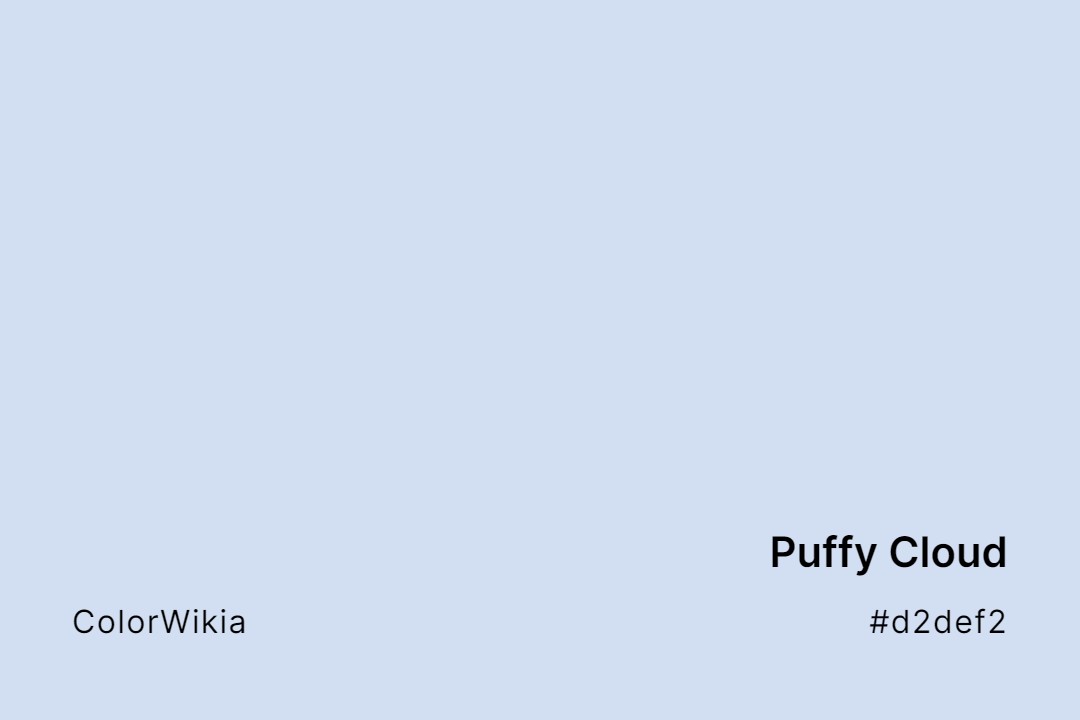
#d2def2
Puffy Cloud
#d7edea
Puffy Little Cloud
#e95c20
Puffins Bill
#ccbfc9
Puffball
#e2dadf
Puffball Vapour
#635940
Puff Dragon
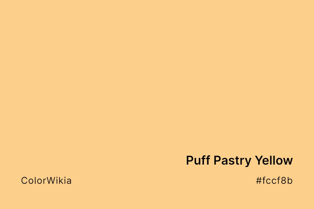
#fccf8b
Puff Pastry Yellow
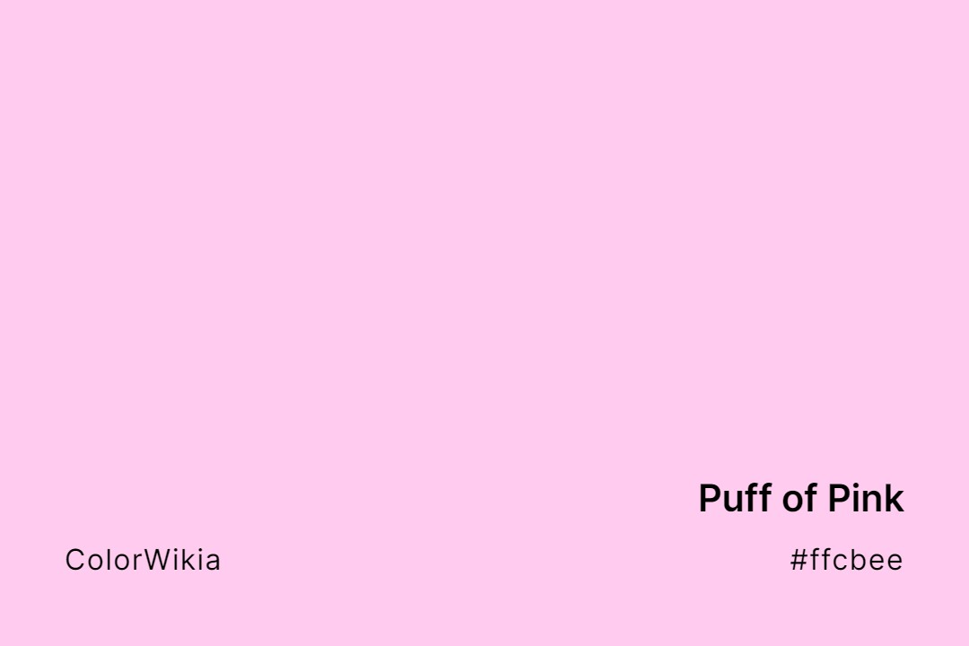
#ffcbee
Puff of Pink
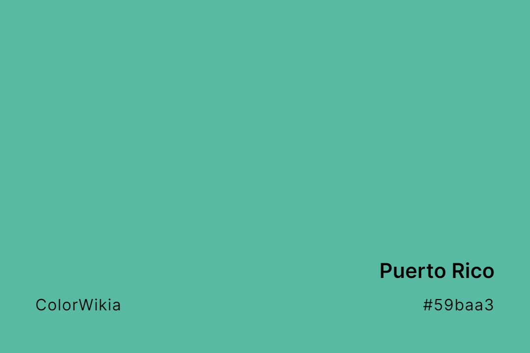
#59baa3
Puerto Rico
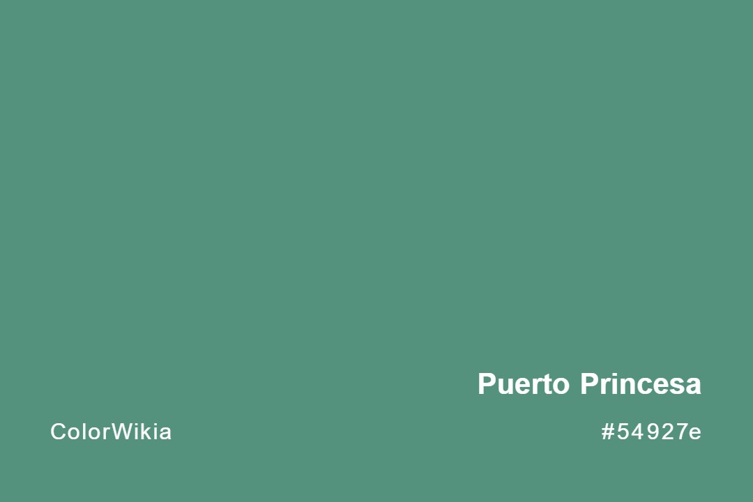
#54927e
Puerto Princesa
#6e3326
Pueblo
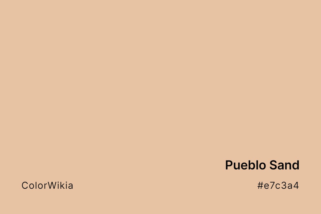
#e7c3a4
Pueblo Sand
#e9786e
Pueblo Rose
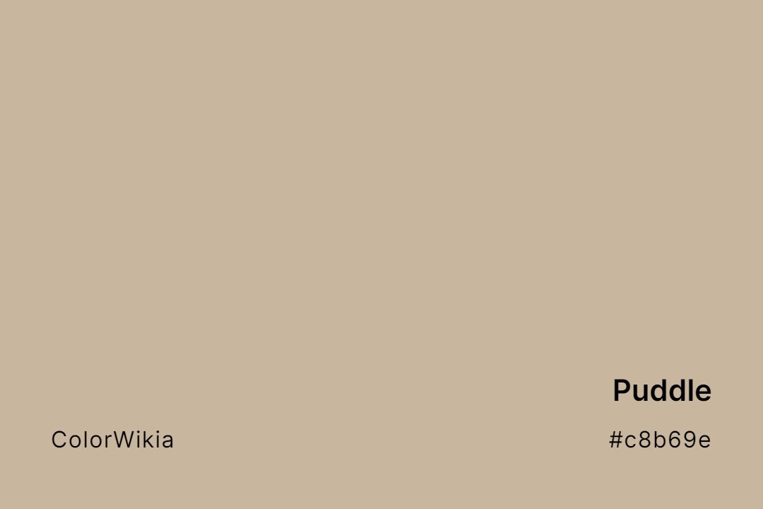
#c8b69e
Puddle
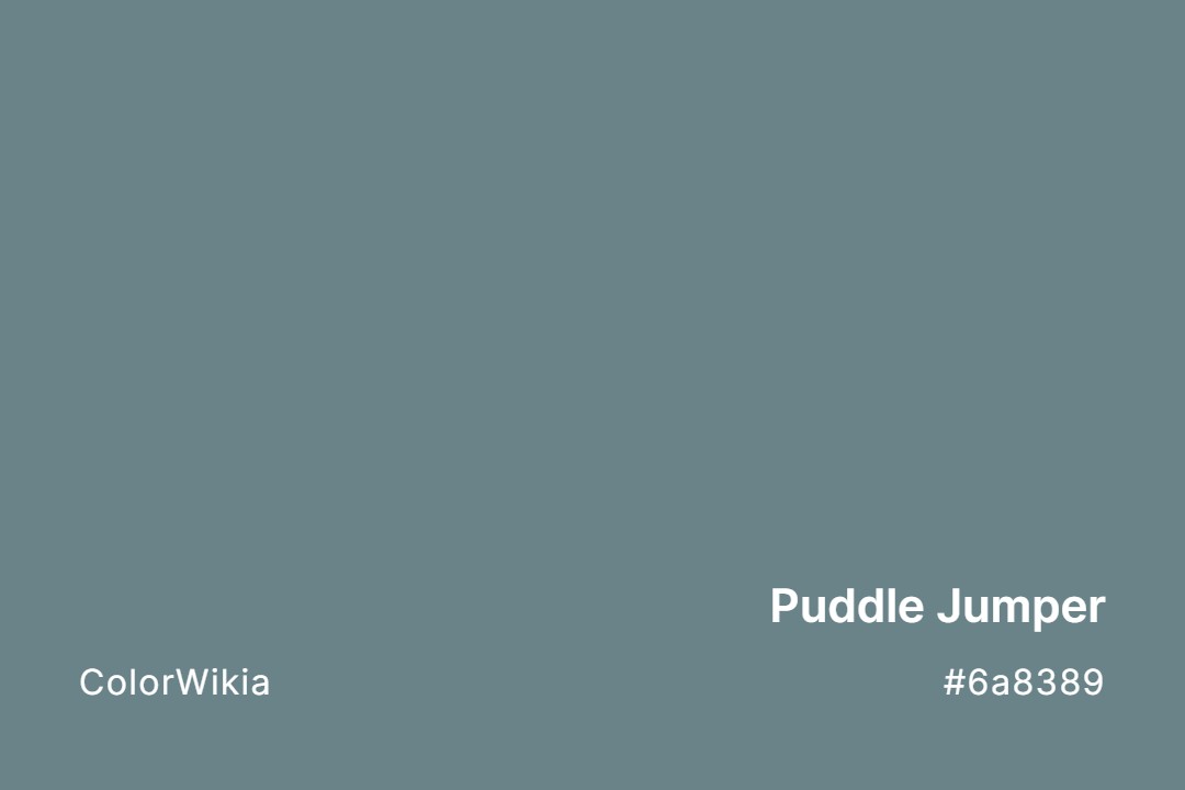
#6a8389
Puddle Jumper
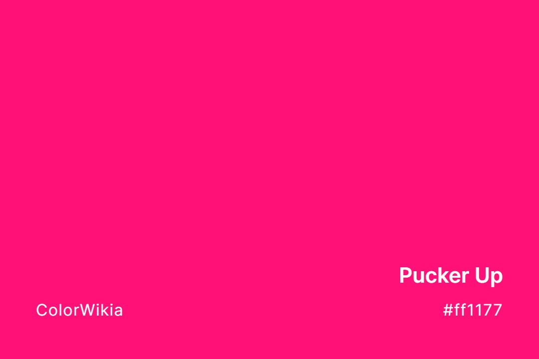
#ff1177
Pucker Up
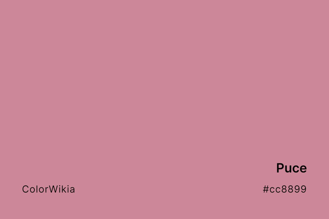
#cc8899
Puce
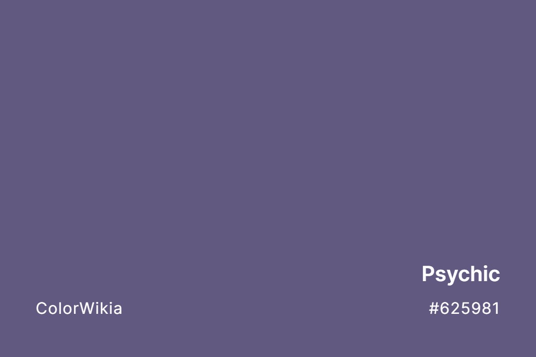
#625981
Psychic
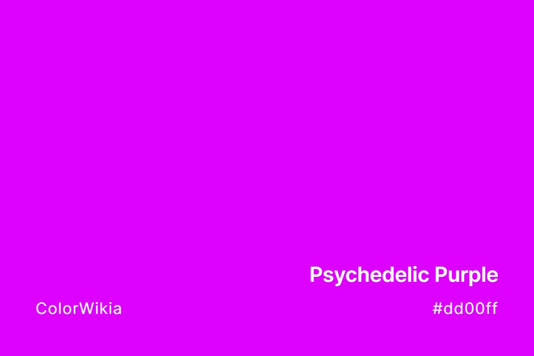
#dd00ff
Psychedelic Purple
#3f585f
Prussian
#6f4b5c
Prussian Plum
#0b085f
Prussian Nights
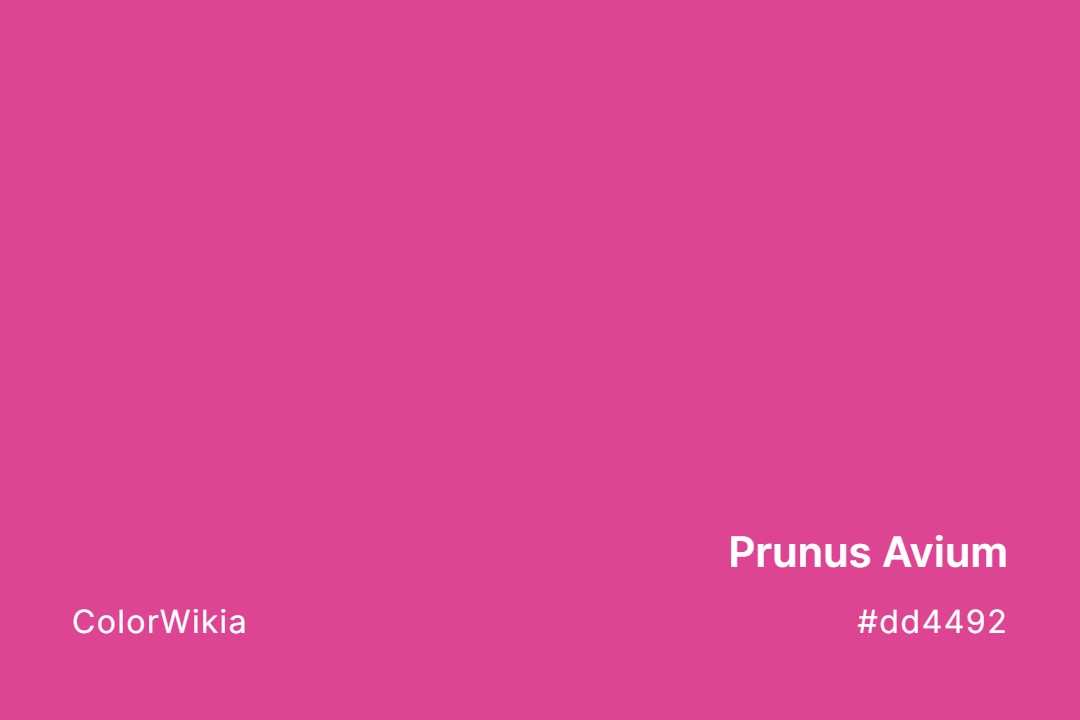
#dd4492
Prunus Avium
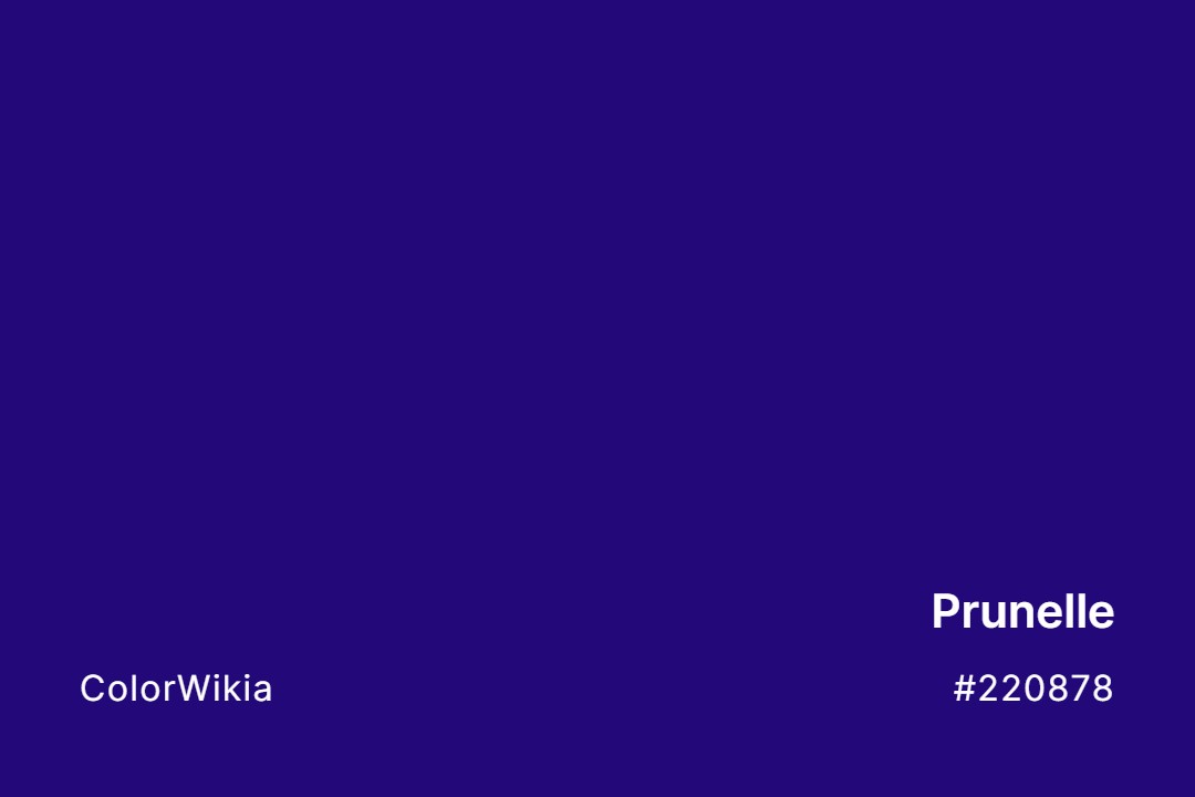
#220878
Prunelle
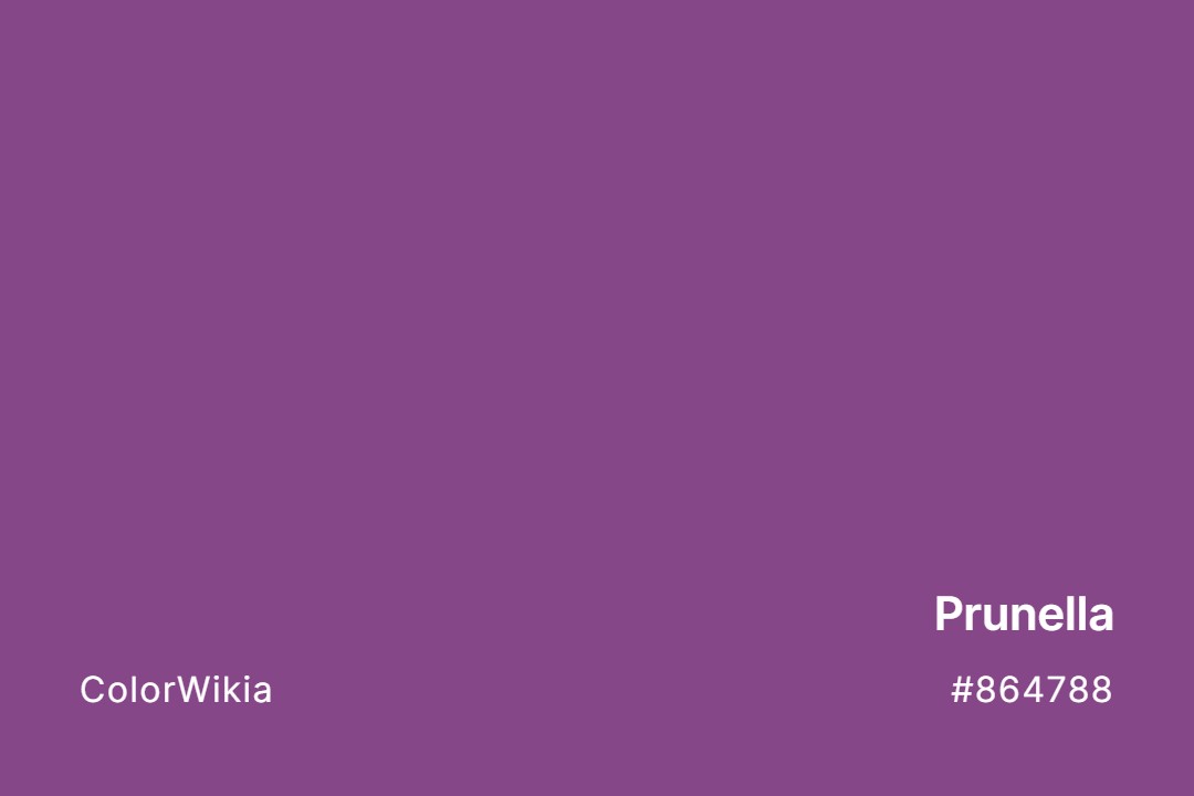
#864788
Prunella
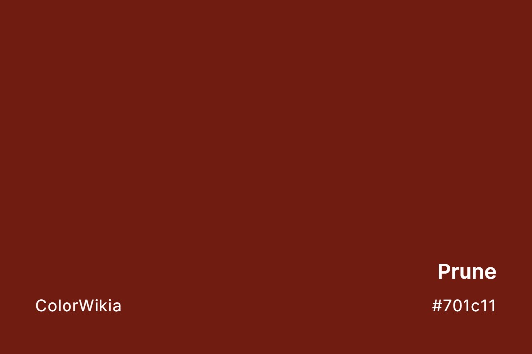
#701c11
Prune
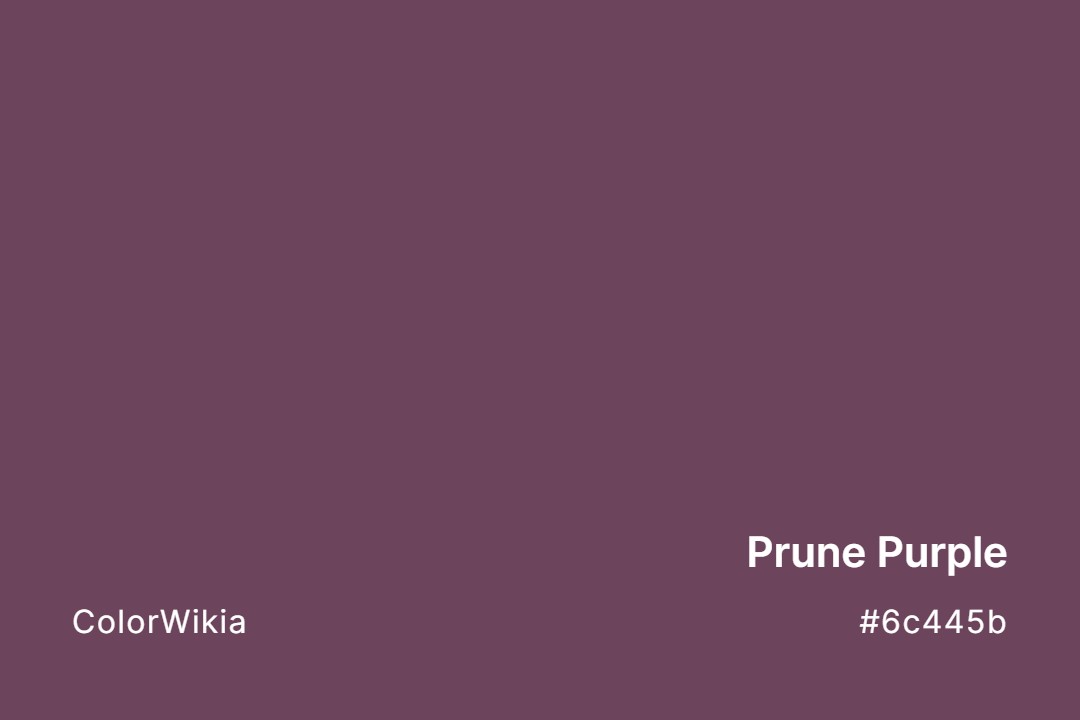
#6c445b
Prune Purple
#211640
Prune Plum
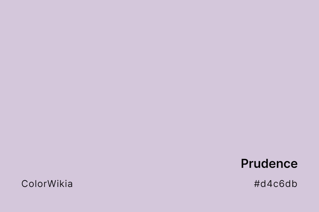
#d4c6db
Prudence
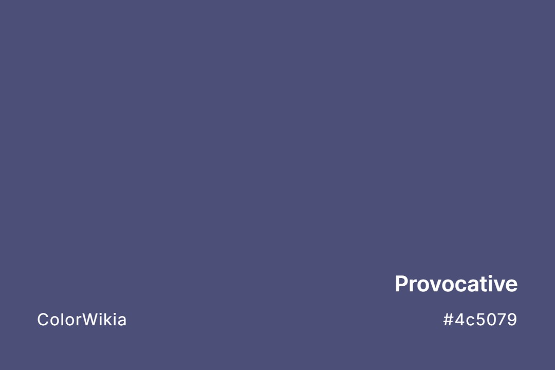
#4c5079
Provocative
#a8aca2
Provincial
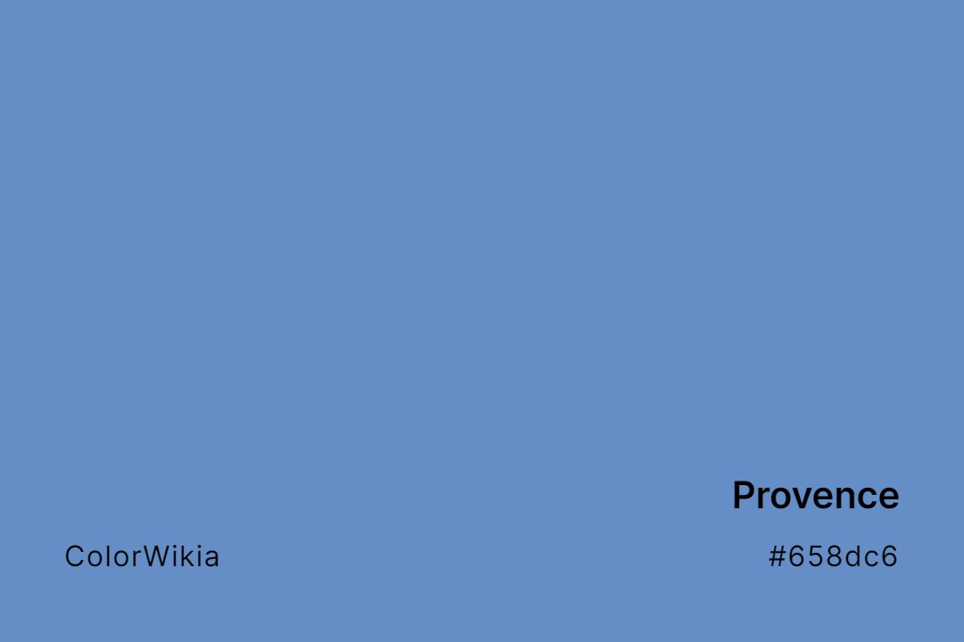
#658dc6
Provence
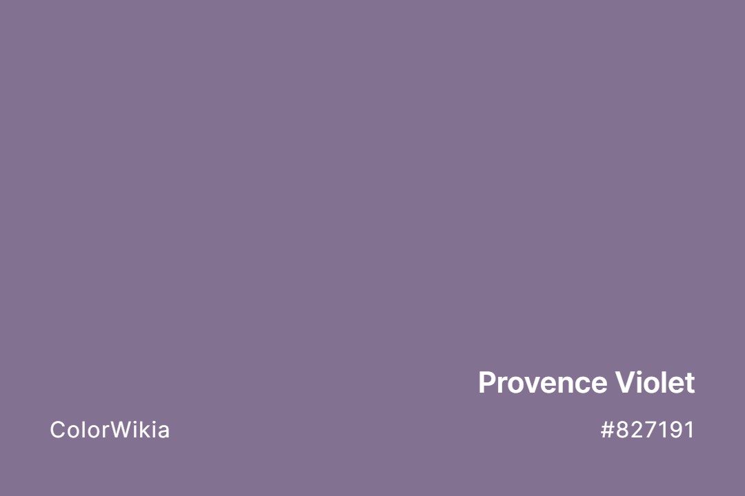
#827191
Provence Violet
#ffedcb
Provence Creme
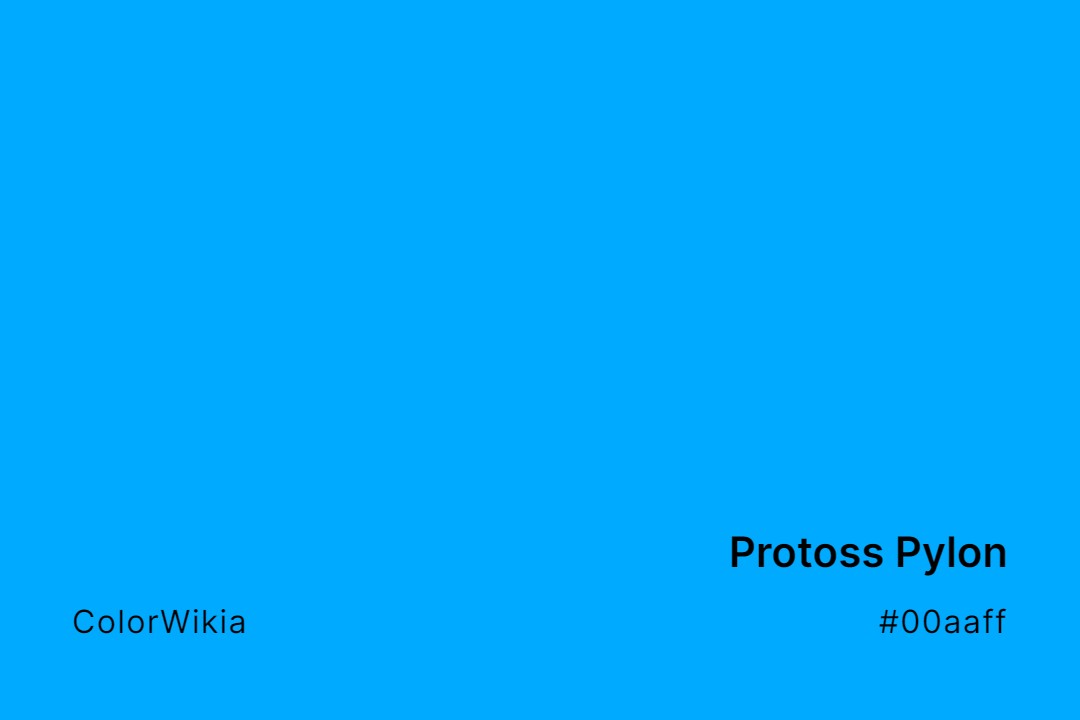
#00aaff
Protoss Pylon
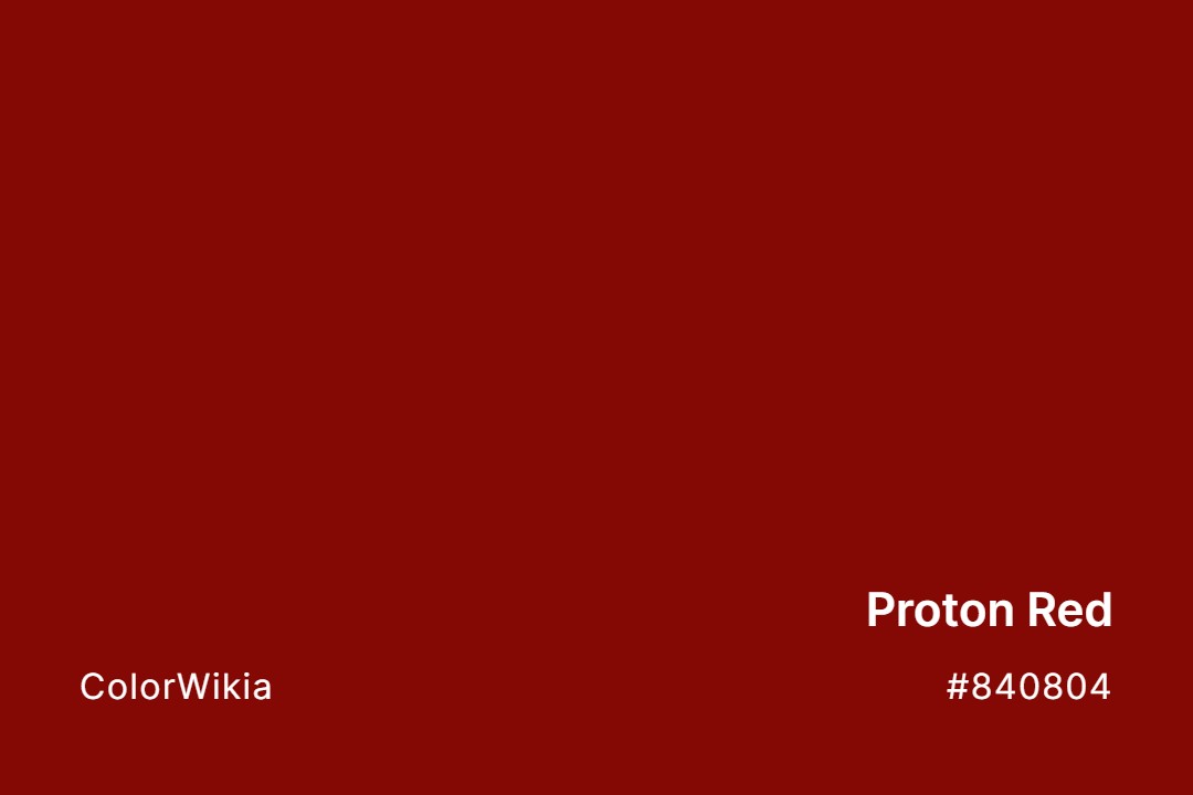
#840804
Proton Red
#ff8866
Protein High
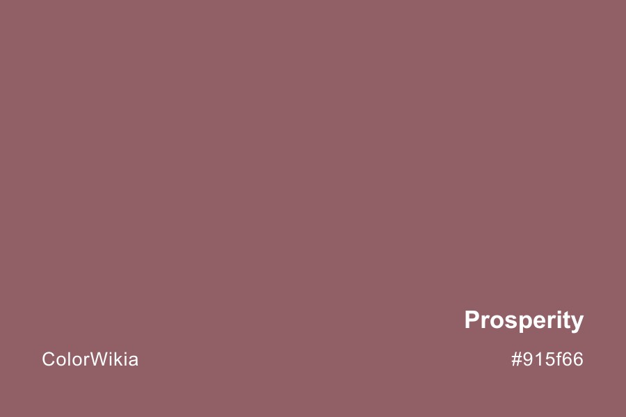
#915f66

Prosperity
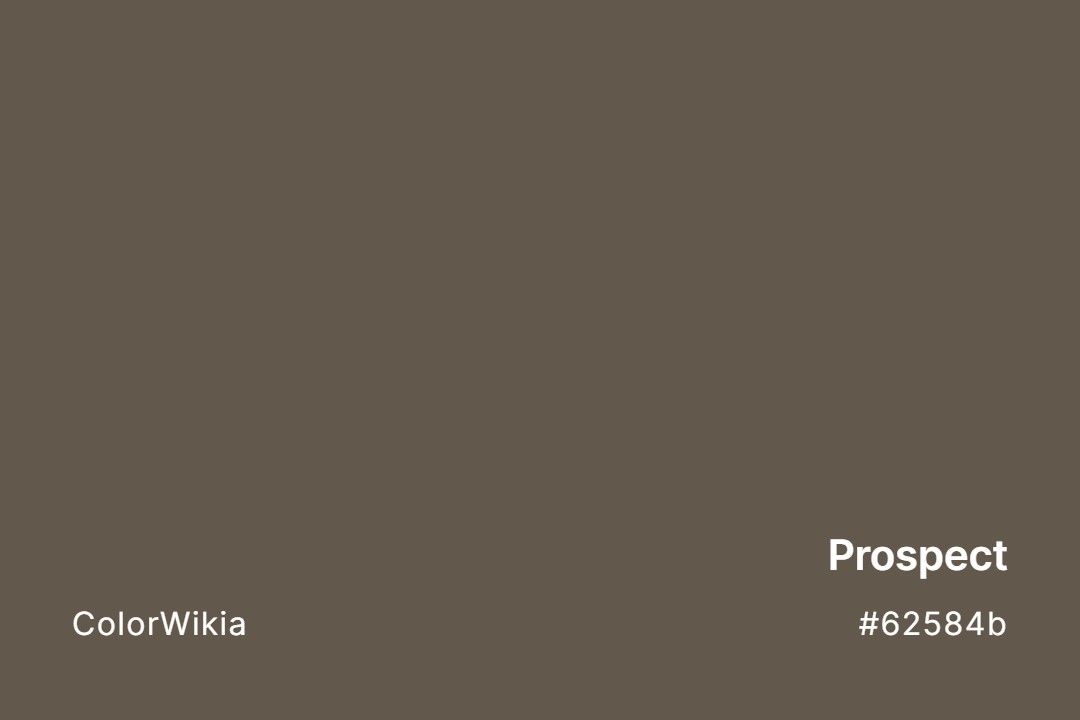
#62584b
Prospect
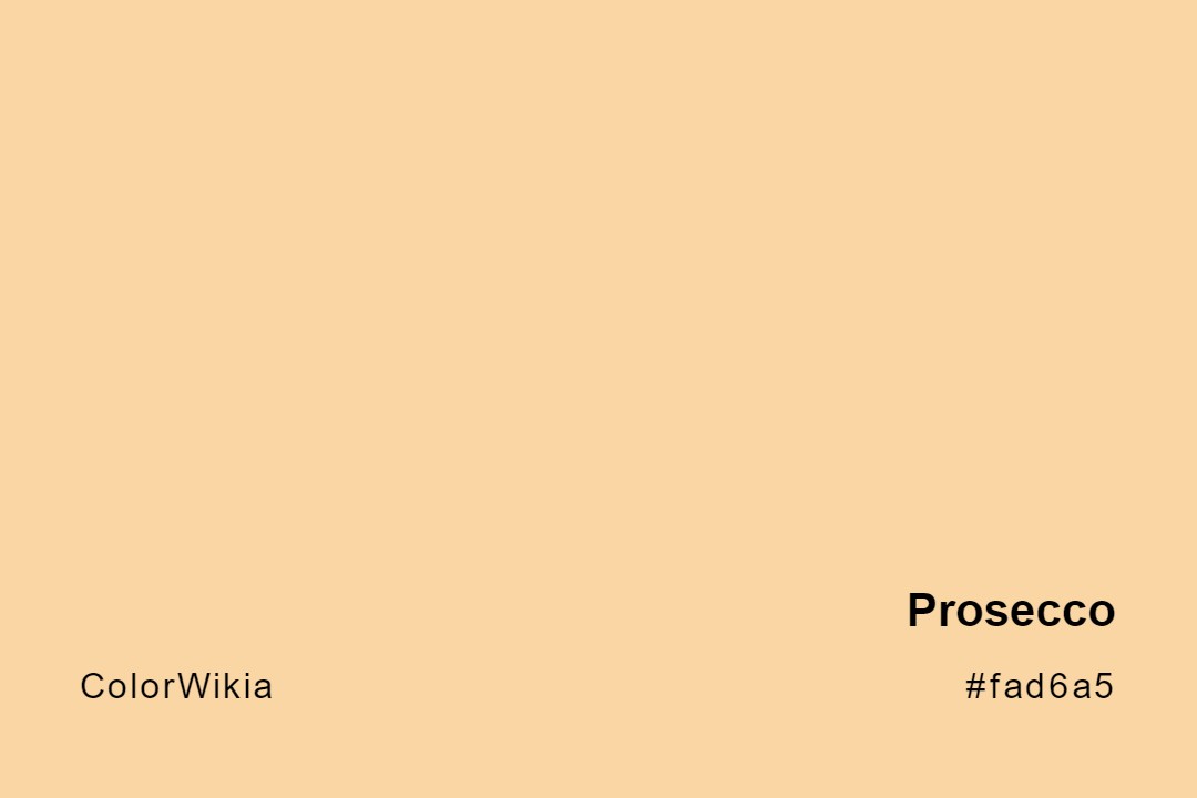
#fad6a5
Prosecco
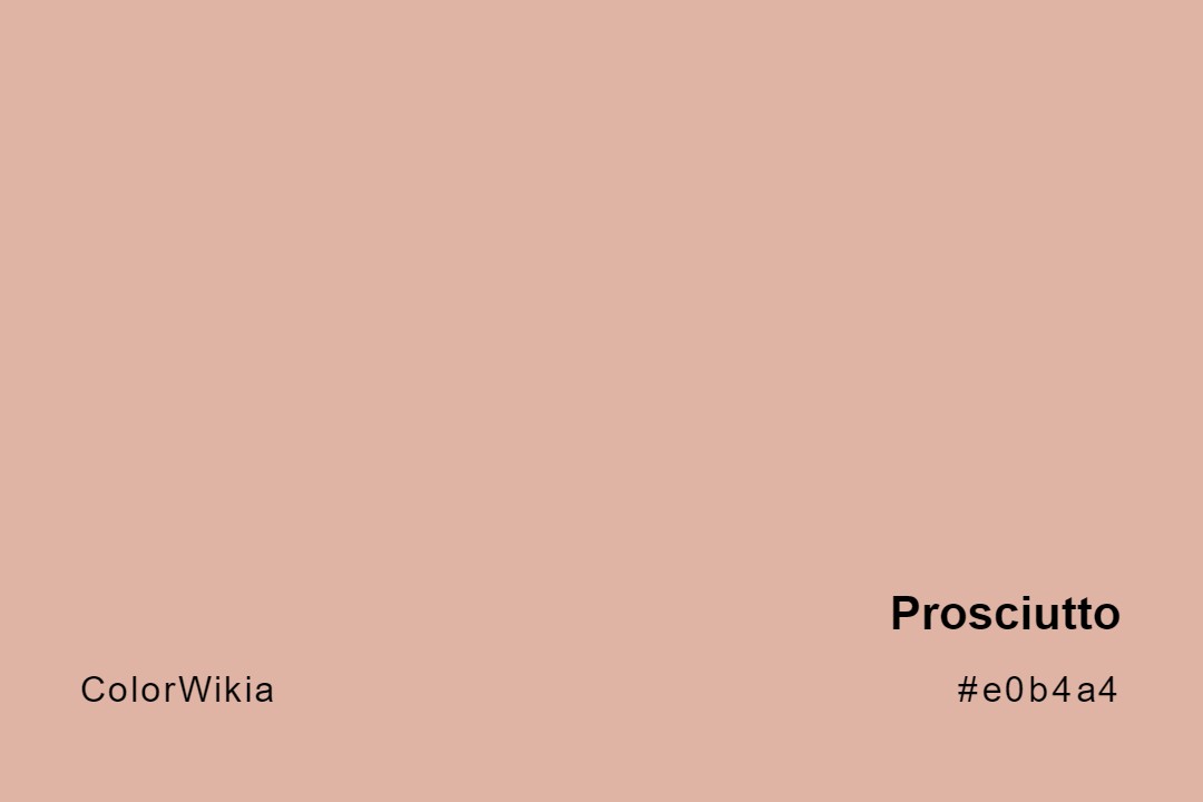
#e0b4a4
Prosciutto
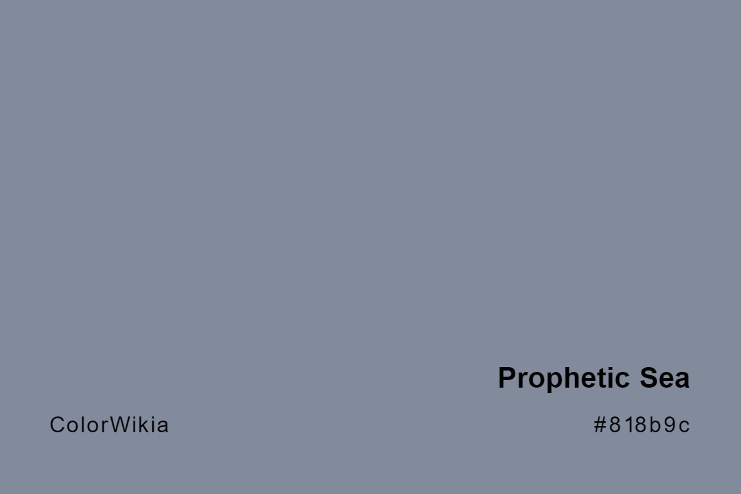
#818b9c
Prophetic Sea
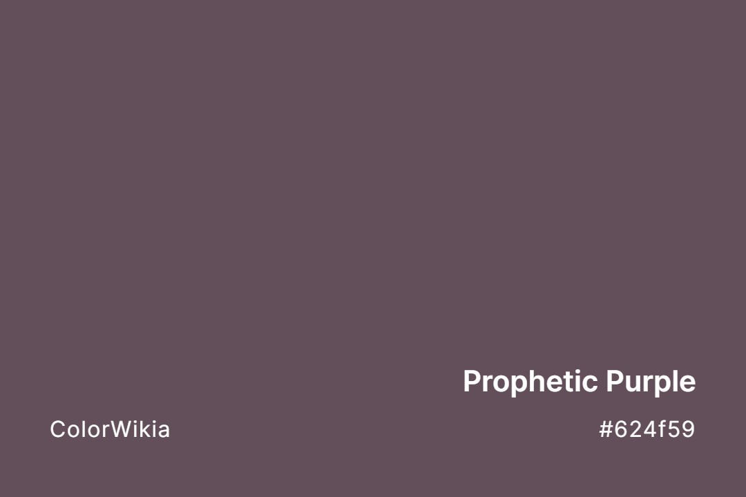
#624f59
Prophetic Purple
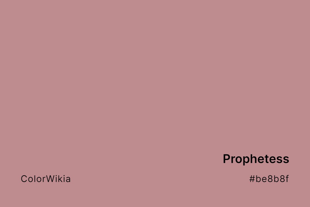
#be8b8f
Prophetess
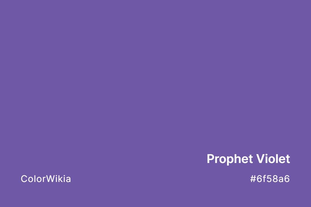
#6f58a6
Prophet Violet
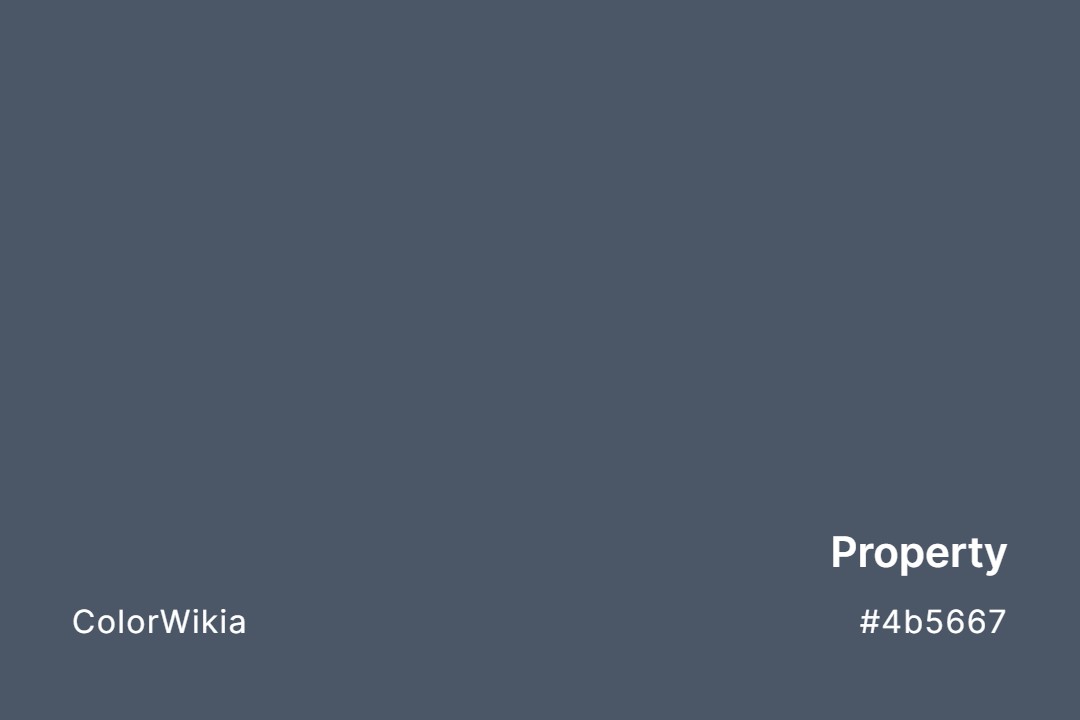
#4b5667
Property
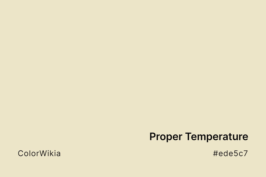
#ede5c7
Proper Temperature
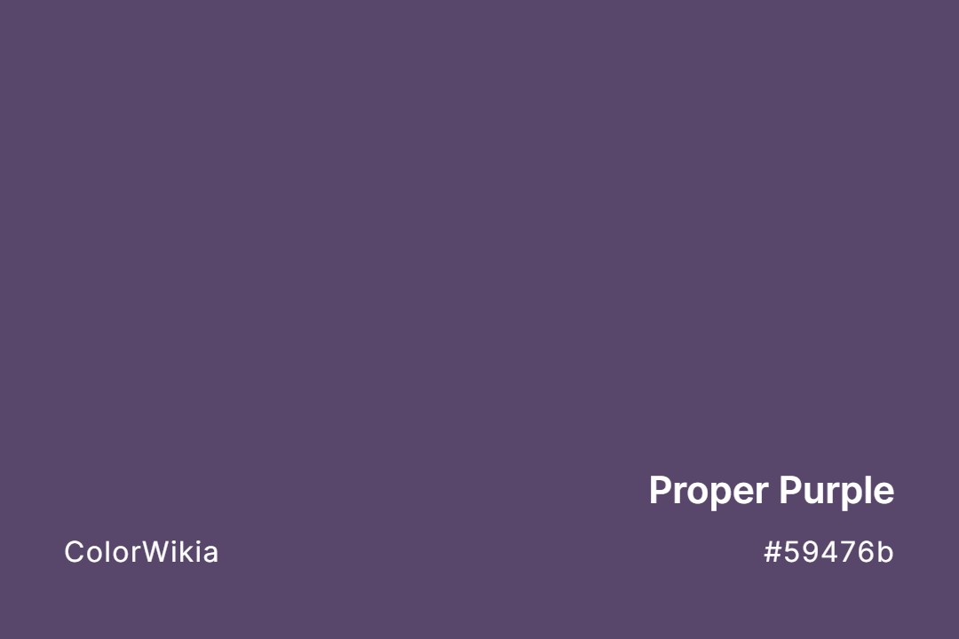
#59476b
Proper Purple
#5e7fb5
Prompt
#686278
Promised Amethyst
#afc7e8
Promise Keeping
#bb11ee
Promiscuous Pink
#da9ec5
Prominent Pink
#f4581e
Prometheus Orange
#f8f6df
Promenade
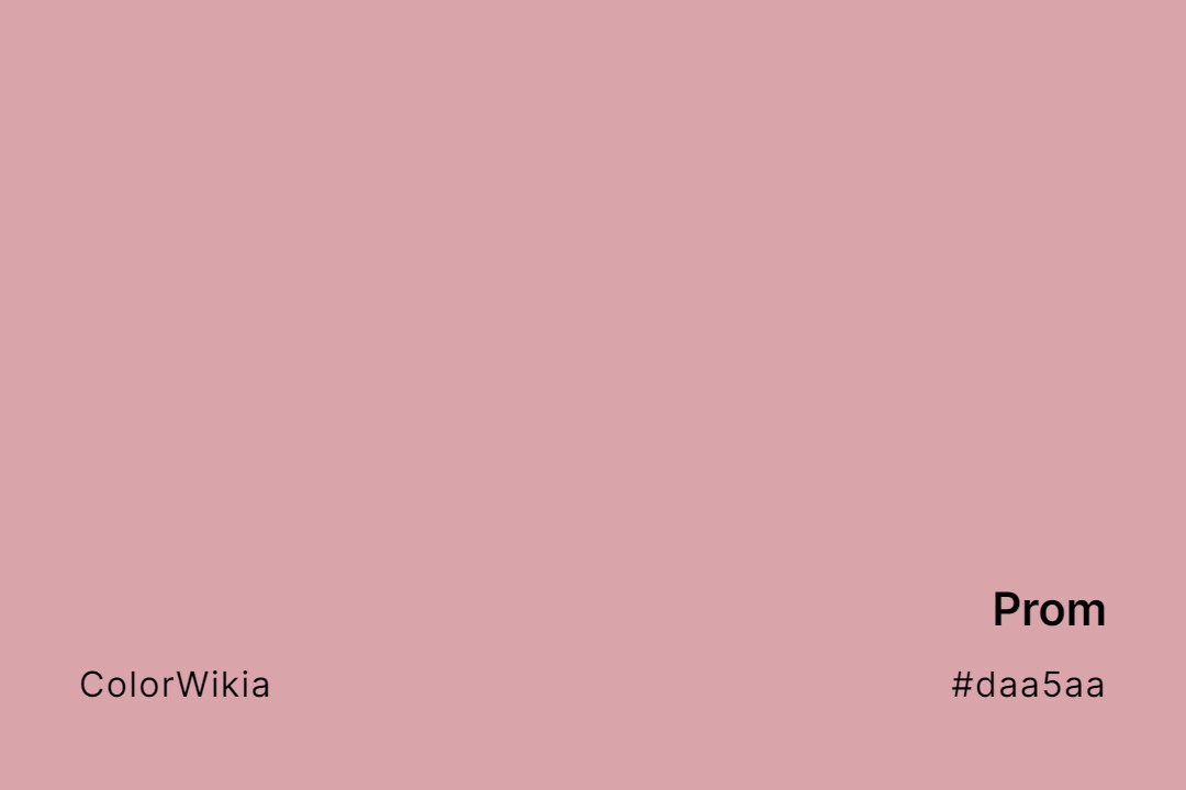
#daa5aa
Prom
#9b1dcd
Prom Queen
#e7c3e7
Prom Corsage
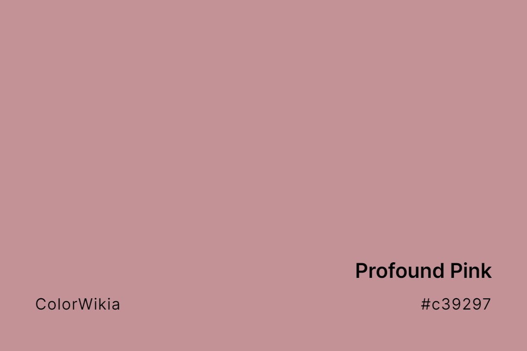
#c39297
Profound Pink
#40243d
Profound Mauve
#393540
Professor Plum
#a2c0b9
Prized Celadon
#cc9dc6
Prize Winning Orchid
#f3ead7
Privileged
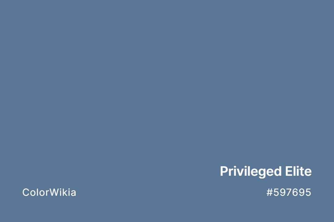
#597695
Privileged Elite
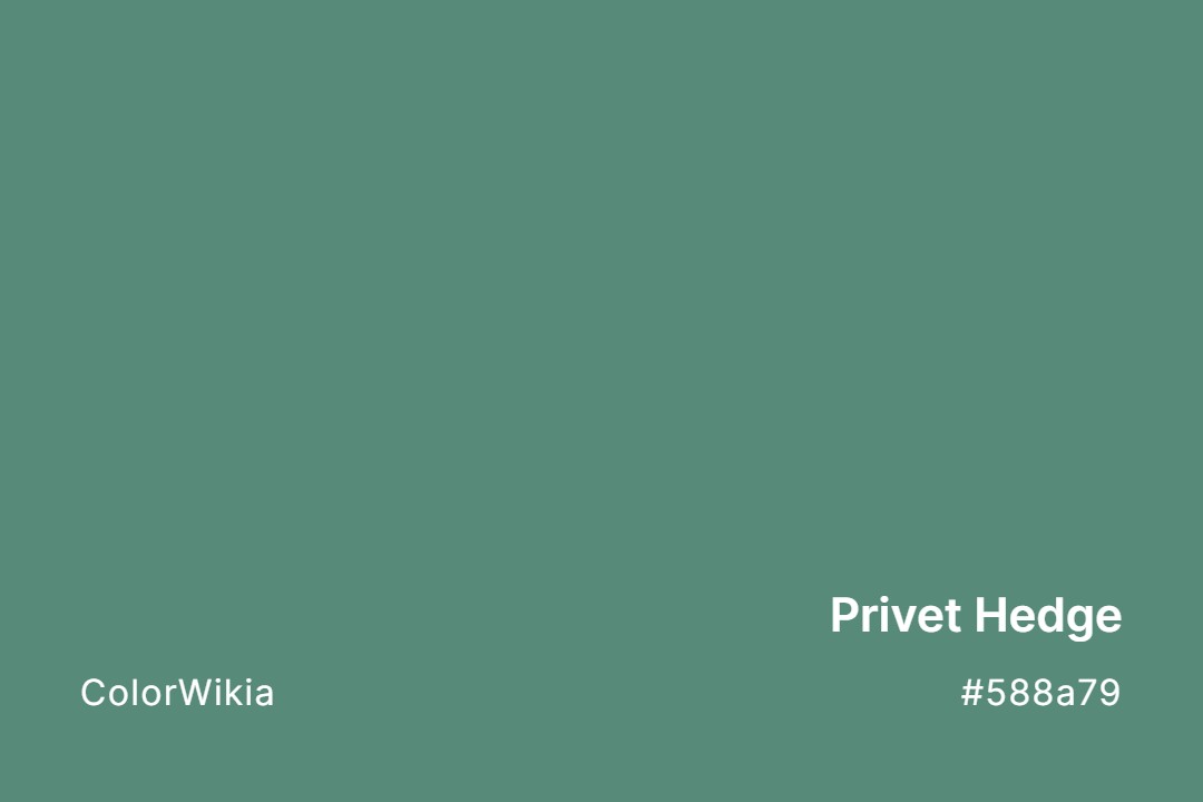
#588a79
Privet Hedge
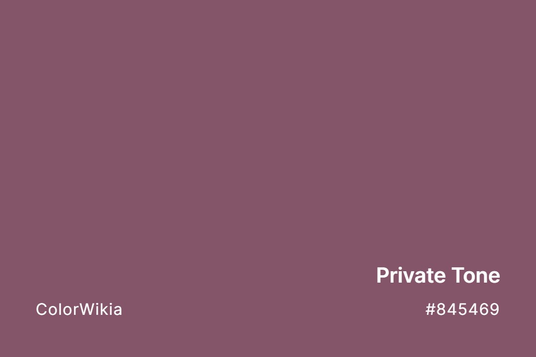
#845469
Private Tone
#889db2
Private Jet
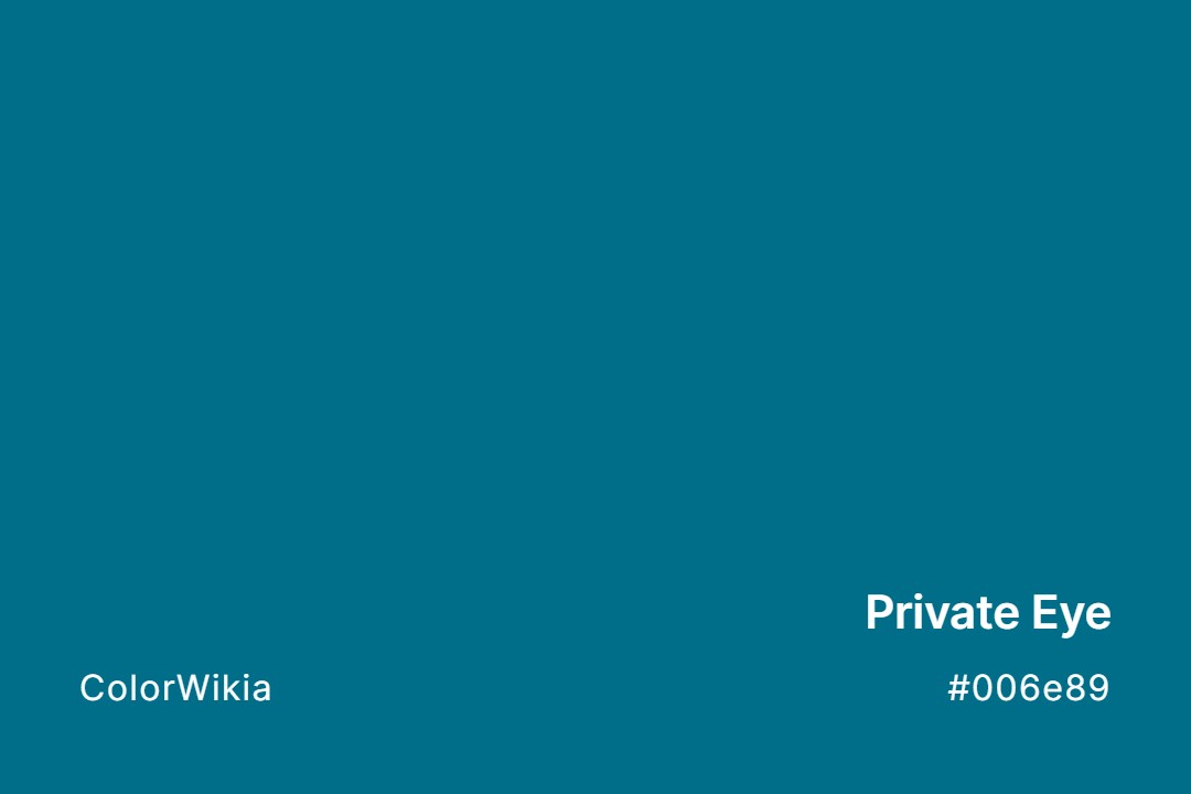
#006e89
Private Eye
#f2e8da
Pristine
#007799
Pristine Seas
#d5e1e0
Pristine Petal



































The language of color can become confusing because everyday speech and color theory do not always use the word shade in exactly the same way. A page about color shades may describe a whole group of related colors, while the technical definition of a shade refers specifically to a hue made darker with black.
That difference matters when you compare taupe color shades, rust shades, or any other color family. The names people use are practical labels, while color systems provide more precise ways to describe the underlying values.
Understanding the difference between shade, tint, tone, and hue makes it easier to talk about color accurately. It also explains why one named color can have several related variations.
What Is a Color Shade?
In strict color theory, a shade is a hue with black added. Adding black lowers the lightness and produces a darker version of the starting color. A red can move toward burgundy, for example, while a blue can move toward navy.
In everyday language, people use shade more broadly. A search for “different shades of blue” may include lighter, darker, muted, and named variations that are not technically shades under the narrow definition.
That broader usage is common in design, retail, fashion, and online color references. It is also why color shade pages usually cover a family of related colors rather than only mixtures created by adding black.
The distinction is useful because it separates technical color terminology from the way people normally describe color families.
Shade, Tint, Tone, and Hue
These four terms describe different relationships between colors.
- Hue refers to the pure color position itself, such as red, blue, green, or yellow.
- Tint is a hue with white added, producing a lighter version such as pink from red.
- Shade is a hue with black added, producing a darker version such as burgundy from red.
- Tone is a hue with gray added, reducing saturation and muting the color.
The distinctions become useful when you need to describe why two colors look different. A pale blue may be a tint, while a dusty blue may be a tone and a navy blue may be a shade.
These terms can also be used together when discussing a larger color family. A named color may be lighter than the base color, darker than it, or more muted without fitting neatly into one everyday category.
How Digital Color Systems Describe Shades
Digital color systems make these relationships easier to quantify. RGB describes a color by the amount of red, green, and blue light used to create it, while HSL separates the color into hue, saturation, and lightness.
Hex codes provide a compact representation of RGB values. A six-character code such as #DC143C can identify crimson in a digital interface, but the number does not tell you where the color name originally came from or whether a physical pigment uses the same formulation.
In HSL, reducing lightness while holding hue and saturation constant moves a color toward a darker digital version. Raising lightness moves it toward a lighter version, while reducing saturation creates a more muted result.
This distinction is important when working with digital color. A color name can provide a useful visual reference, but a hex code gives you a specific digital value.
How Color Shade Names Develop
Color names often come from things people recognize. Taupe refers to the mole, while rust takes its name from corroded iron. Other names come from materials or places, including copper, terracotta, mahogany, sienna, and umber.
Language can preserve those histories even after a color becomes a digital swatch. Khaki color shades provide another example because the word traces back to a Hindustani term connected with dust and earth.
Commercial color naming adds another layer. Paint makers, textile companies, standards groups, and digital platforms may assign different names to closely related colors, so one shade does not always have one universal label.
This is one reason color names can feel inconsistent. A name can describe a recognizable visual family without pointing to one universal digital value.
Color Standards and Shade Codes
Professional color systems exist because names alone are too vague for precise reproduction. The Pantone Matching System assigns numbered references to color formulations, while systems such as Munsell describe colors using hue, value, and chroma.
The Natural Color System uses a different framework based on color perception. These systems serve different purposes, but they share the same practical goal. A numeric reference can communicate more precisely than a word such as “blue” or “green.”
That is also why a page listing color codes should distinguish between a named color, a standardized reference, and an ordinary digital hex value.
A hex code is useful for digital work, but it should not automatically be treated as a universal definition of a named color. The context behind the color reference matters.
Major Color Families and Their Shades
Every broad color family branches into many named variations. The examples below show how familiar shade names sit within larger groups.
| Color Family | Popular Shade | Hex Code |
| Red | Crimson | #DC143C |
| Blue | Navy | #000080 |
| Green | Forest Green | #228B22 |
| Yellow | Gold | #FFD700 |
| Purple | Indigo | #4B0082 |
| Orange | Coral | #FF7F50 |
| Brown | Tan | #D2B48C |
Warm families such as orange and brown include earthy variations such as rust, terracotta, and chocolate. Blue and green branch into names such as navy, teal, forest, and olive.
Neutral families work differently because their boundaries are less obvious. Beige, gray, taupe, and related colors can overlap substantially depending on saturation, lightness, and undertone.
Why named colors can overlap
A useful color family is not always a strict technical category. Two colors can look very similar while carrying different names because the names come from different materials, places, industries, or traditions.
For practical design work, it is often more useful to compare the actual color values than to rely on the name alone.
Frequently Asked Questions
What is the difference between a shade and a tint?
A shade is a darker version created by adding black, while a tint is a lighter version created by adding white.
Is a tone the same as a shade?
No. A tone adds gray and reduces saturation, while a shade adds black and darkens the original hue.
Why does one color have so many shade names?
Different industries, standards groups, companies, and cultures develop names independently. Closely related colors can therefore receive several labels.
How many shades of a color are there?
There is no fixed limit. Digital systems can generate very large numbers of distinct values, while named shades depend on the terms that become widely recognized or useful.