That nickname (Turquoise Panic) isn’t official, but it sticks. Because this hue walks a weird line. It looks cool but feels charged. Like something fresh just sparked. So, let’s talk about what makes this color tick, and when you should (or definitely shouldn’t) use it.
Who This Is For
This guide is for graphic designers, UX/UI folks, artists, and digital creators who work with color daily. Whether you’re building brand palettes or painting digital murals, this shade has uses, and landmine you’ll want to know.
No fancy jargon here, just practical knowledge with a touch of style.
The Turquoise Panic Color Breakdown: What Is #30d5c8?
Here’s what’s inside:
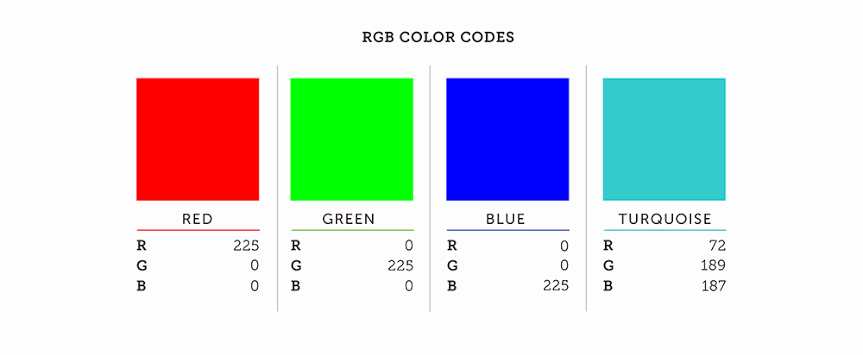
- Hex: #30d5c8
- RGB: 48, 213, 200
- HSL: 175°, 70%, 51%
- WCAG Contrast on White: 2.1:1 (Not accessible)
- WCAG Contrast on Black: 5.1:1 (Good)
The color falls smack in the cyan-to-aqua zone of the visible spectrum, and it’s bright—very bright. With low red, dominant green and blue, and a 70% saturation level, it radiates clarity. There’s no muddiness here. Just clean, clinical brilliance.
Color Psychology of Turquoise Panic Color
Turquoise Panic carries a mixed emotional charge.
- On one hand, it feels clean, techy, and fast. Think of hospital scrubs, pool water, smart home apps. There’s a sterile calm about it.
- On the other, it flares with energy. A lot of highlighter pens live near this shade. It can buzz like caffeine if used in large patches.
This duality creates tension. It’s cool in tone but hot in behavior. Like a glass of mint water spiked with jalapeño.
The emotional impact shifts depending on the surroundings. Used on a dark background, it glows like neon. On white, it almost disappears. So placement matters—a lot.
When to Use It
Turquoise Panic works well when you want attention without aggression. Here are some sweet spots:
- Call to Action Buttons: Especially in healthcare, fintech, or clean tech. Pairs well with navy or dark gray for contrast.
- Branding: For startups in biotech, AI, or climate. It says fresh thinking and science without being stuffy.
- Digital Art: Use for highlights and glow effects. It lifts a composition without overwhelming the eye.
- Data Visualizations: Stands out without screaming. Ideal for line charts or KPIs where clarity beats noise.
When to Avoid It
Okay, here’s where things go sideways.
- Accessibility: On light backgrounds, it fails basic contrast tests. Don’t use this for body text or anything users need to read clearly.
- Emotionally Intense Designs: It doesn’t feel warm, nostalgic, or grounded. Not a good fit for mental health platforms, heritage brands, or emotional storytelling.
- Too Much: In large doses, the color looks synthetic. It can feel too digital, too detached. Balance with natural textures or warmer tones.
Cultural Notes
In Middle Eastern cultures, turquoise carries protection and strength—linked to talismans and ancient ceramics. In South America, it’s tied to water spirits and sky myths. Meanwhile, in the West, the color mostly signals clarity, modernity, and freshness. But with this sharper tone, some of those meanings blur.
That’s the thing with color. Context rewrites the rules.
Digital Behavior
Let’s get nerdy for a sec. The color behaves best in sRGB, the standard color space for screens. On wide-gamut displays (like Apple’s Display P3), the brightness jumps. So always test your layout across multiple screens.
Also, beware of banding in gradients. When used in digital backgrounds, #30d5c8 can look streaky if not handled with dithering or noise. Photoshop’s default gradient tool? Still guilty of this in 2025. Try a custom blend or use SVG filters for smoother transitions.
Creative Tip: Pair with Purpose
Here’s a quick rule of thumb. If you use Turquoise Panic, give it something to lean on.
- Dark Neutrals: Deep gray, navy, or charcoal help ground the color.
- Warm Neutrals: Sand, camel, or blush bring warmth.
- Muted Greens: Sage or olive make it feel less artificial.
- Soft Golds: Add a human touch.
Avoid pairing it with bright purple or red, unless you’re designing for rave posters or intergalactic apps.
Final Thoughts
Turquoise Panic is not your everyday aqua. It’s too smart. Too punchy. Too… visible. But that’s what makes it work in the right context. Use it when clarity matters. Use it when you want your interface to feel sharp and intelligent. Just don’t expect it to whisper.
As the color theorist Josef Albers once said, “Color deceives continually.” That’s part of the fun.
So use #30d5c8 like you’d use wasabi. A little kick goes a long way.