37 Shades of Dusty Color
Explore different types of Dusty colors for your website, brand or any project.
#e16d4f

Dusty Orange Color
Faded canvas awnings on a Marrakech medina, terracotta baked flat by sun. Dusty orange color (#e16d4f) lands earthy and vintage. Teal and cream turn it into a proper North African palette.
#598a8f

Dusty Turquoise Color
Standard turquoise has a saturation problem. Turn the dial down about 20% and the Dusty Turquoise color (#598a8f) is what you get. Polished enough for a boardroom, editorial enough for fashion, and the smartest teal pick for designers who don’t want their work to look dated.
#8093a4

Dusty Blue Color
Muted and understated, Dusty Blue (#8093a4) softens classic blue with grey undertones. This desaturated, cool-toned shade works best against dark backgrounds, offering designers a calm, weathered aesthetic for minimalist palettes, interiors, or relaxed branding that avoids the intensity of primary blue.
#b56f76
Dusty Rose Color
Dusty Rose is a timeless, romantic neutral. This muted pink feels mature and sophisticated, avoiding the childishness of brighter pinks. It is a versatile color for weddings, beauty brands, and any design that needs a touch of gentle elegance.
#4c9085
Dusty Teal Color
Standard turquoise with about 20% of the brightness pulled out. The Dusty Teal color code (#4c9085) looks polished in a boardroom, rich on velvet, and editorial in fashion. Cream linen and warm wood seal the deal.
#d58a94
Dusty Pink Color
Soft romance meets grounded restraint in Dusty Pink (#d58a94). This muted, warm pink tones down sweetness with grey, creating a sophisticated accent for beauty, wellness, or lifestyle brands. Pair it with dark backgrounds or charcoal text for readable, elegant designs that feel inviting but never saccharine.
#b9484e
Dusty Red Color
The red that knows when to stop talking. Dusty Red (#b9484e) is a muted brick shade, closer to a confident grandmother’s cardigan than a fire engine. It plays well with mustard, sage, and cream, and it doesn’t clash with skin tones in fashion photography.
#71af98
Dusty Jade Green Color
Well-handled jade beads pick up an almost chalky finish, and dusty jade green color (#71af98) captures that muted glow perfectly. In China, jade has meant virtue and status for four thousand years, second only to gold and diamonds in the West. Rooms painted this shade calm a heart rate.
#825f87
Dusty Purple Color
Dusty Purple carries the regal history of purple but with a muted, vintage twist. This subdued shade feels nostalgic and romantic, avoiding the brightness of modern violets. It is a great choice for designs that aim for a classic, slightly weathered look.
#d7b999
Dusty Gold Color
Dusty gold is a soft, warm tan with a golden glow, like sand at sunset or aged parchment. An earthy, gentle neutral, the dusty gold color pairs beautifully with muted greens and creams for a natural, warm palette.


#e16d4f
Dusty Orange
#71af98
Dusty Jade Green
#cfc88f
Dusty Yellow
#d7b999
Dusty Gold
#676658
Dusty Olive
#8093a4
Dusty Blue
#d58a94
Dusty Pink
#b9484e
Dusty Red
#b56f76
Dusty Rose
#c0aa9f
Dusty Rosewood
#bdbaae
Dusty Sand
#95a3a6
Dusty Sky
#4c9085
Dusty Teal
#c9bba3
Dusty Trail
#598a8f
Dusty Turquoise
#bab7b3
Dusty Warrior
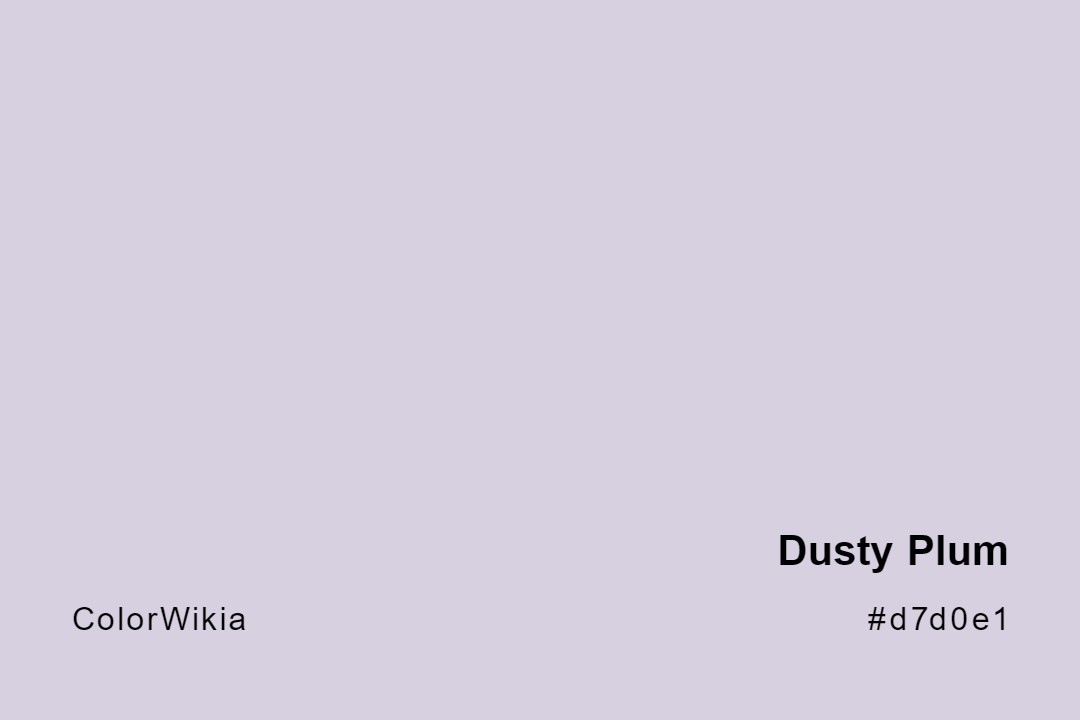
#d7d0e1
Dusty Plum
#825f87
Dusty Purple
#b18377
Dusty Duchess
#76a973
Dusty Green
#cdccd0
Dusty Grey
#8990a3
Dusty Heather
#f1ddbe
Dusty Ivory
#ac86a8
Dusty Lavender
#d3cacd
Dusty Lilac
#716d63
Dusty Mountain
#8c7763
Dusty Path
#847163
Dusty Chestnut
#888899
Dusty Chimney
#d29b83
Dusty Coral
#97a2a0
Dusty Dream
#c3b9a6
Dusty Trail Rider
#bddaca
Dusty Aqua
#bfb6a3

Dusty Attic
#f3c090
Dusty Boots
#9a7e68
Dusty Canyon
#dd9592
Dusty Cedar