15 Shades of Maroon Color
Maroon, inspired by the deep reds of aged wine, instantly adds a touch of luxury to any palette. This guide compiles every maroon color shade, complete with hex codes, RGB values and practical tips for using the hue effectively.
#800000

Maroon Color
Old leather-bound books and university crest colors. Maroon color (#800000) is dark red with the vibrancy dialed down, which is what makes it feel dignified instead of theatrical. Cream, gold, and deep green all work.
#3c0008
Dark Maroon Color
Dark maroon is a near-black oxblood, the color of dried blood or a very old leather-bound book. It’s about as deep as red gets before it disappears. The dark maroon color brings gravity and warmth to a masculine, vintage palette.
#420303
Burnt Maroon Color
Burnt maroon is a deep, smoldering brown-red, the color of dried chili or charred cherry wood. The burnt maroon color sits at the darkest edge of the red family. Burnt maroon color hex code #420303 adds warmth and depth to an autumnal or masculine palette.
#c32148
Bright Maroon Color
Crayola has sold a crayon called “Maroon” in this exact vivid red-purple since 1949. Bright maroon color (#c32148) hits richer and more alive than plain brick red, thanks to the berry tilt. Weddings, letterpress wine labels, and lipstick tubes have all made a home here.
#543938
Royal Maroon Color
Somewhere between dried oxblood and a leather-bound library. Royal maroon color (#543938) has the hush of a velvet theater curtain right before house lights come up. Heritage brands (universities, whiskey houses, old-guard law firms) pick shades exactly like this.
#623f45

Deep Maroon Color
Dried rose petals pressed between pages, wine-brown at the edges. Deep maroon color (#623f45) sits at the contemplative end of the red family, more dignified than loud. Heritage labels and dim, candlelit interiors both feel richer for it.
#b0306a
Rich Maroon Color
Split a pomegranate and the seeds bleed exactly this berry-red-purple. Rich maroon color (#b0306a) hits more vivid than a classic brick maroon, thanks to the pink lean. Wine labels, beauty packaging, and holiday campaigns pull it hard in October.
#bf3160
Maroon Light Color
Crushed raspberries pushed through a sieve, sweet-tart and vivid. Maroon light color (#bf3160) delivers the brighter, more youthful cousin of a deep maroon. Fashion campaigns and beauty launches lean on it when they want warmth with a jolt.


#bf3160
Maroon Light
#b0306a
Rich Maroon
#623f45
Deep Maroon
#543938
Royal Maroon
#c32148
Bright Maroon
#420303
Burnt Maroon
#3c0008
Dark Maroon
#7b1113
UP Maroon
#cc7733
Ochre Maroon
#ad4379
Mystic Maroon
#e5dbda
Minified Maroon
#520c17
Maroon Oak
#800000
Maroon
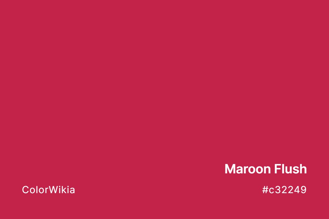
#c32249
Maroon Flush
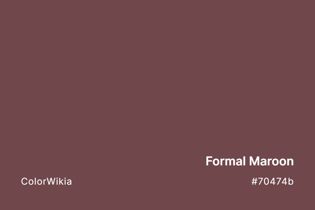
#70474b
Formal Maroon