32 Shades of Delicate Color
Explore different types of Delicate colors for your website, brand or any project.
#bcdfe8
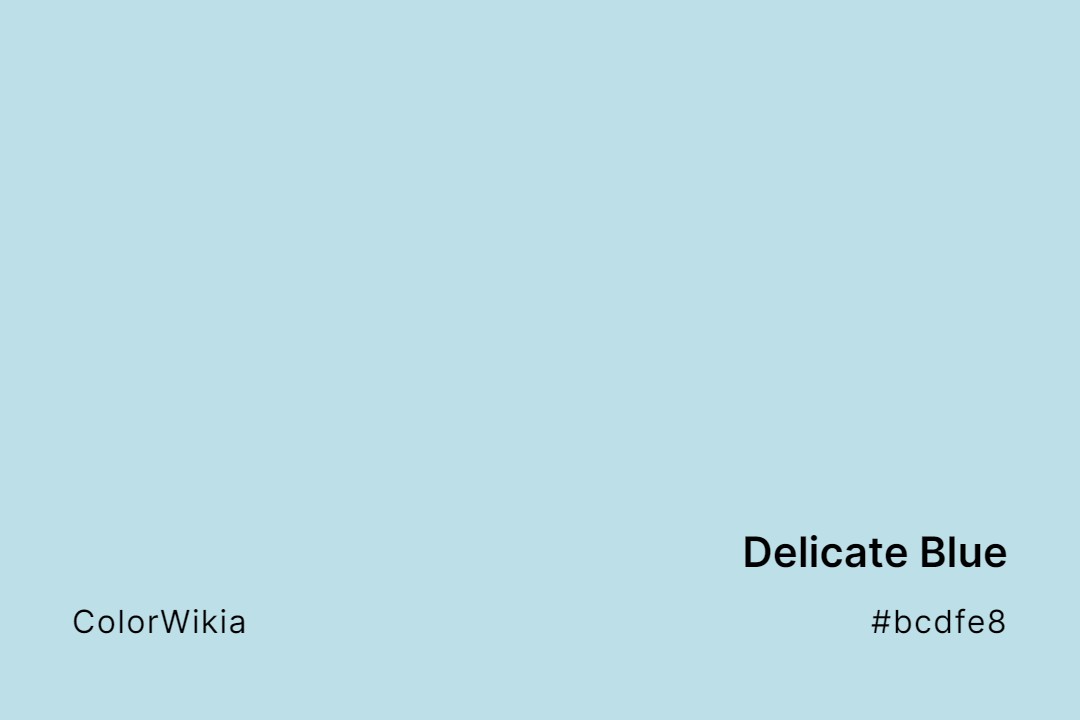
Delicate Blue Color
Delicate Blue lives up to its name, a whisper-soft powder blue like a faded chambray shirt. It cools a room gently. Brush the Delicate Blue color onto beadboard for an easy cottage feel.
#e4cfd3
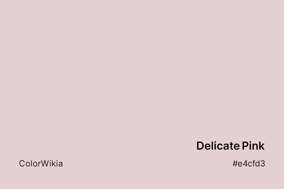
Delicate Pink Color
Soft and cool, this pink has a gray-lilac touch that makes it feel quiet and refined. Delicate Pink color is a pale dusty rose, close to Pink Pail but lighter, like faded tissue paper.
#f1f2ee

Delicate White Color
Museum conservators keep walls a barely-there off-white so a painting’s own colors stay honest. Delicate White color follows that same restraint with a soft grey haze that refuses to fight the art beside it. A faint warmth keeps rooms from feeling clinical.
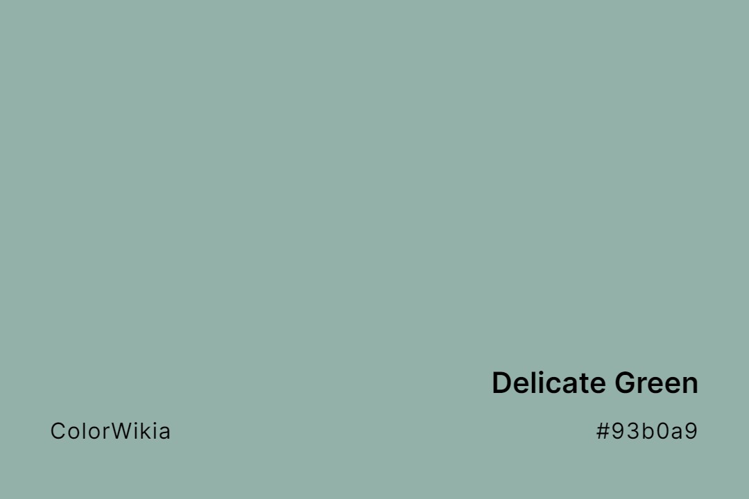
#93b0a9
Delicate Green Color
Delicate Green is a soft sage aqua with green at 176 and blue at 169. It resembles frosted sea glass tumbled on a Cornish beach. Warm light makes it greener, and cool light turns it nearly gray.

#e4cfd3
Delicate Pink
#93b0a9
Delicate Green
#bcdfe8
Delicate Blue
#f1f2ee
Delicate White
#aa9c8b
Delicate Truffle
#c0dfe2
Delicate Turquoise
#d7d6dc
Delicate Viola
#8c8da8
Delicate Violet
#f7e0d6
Delicate Rose
#d7f3dd
Delicate Sapling
#ffefdd
Delicate Seashell
#f3e6d4
Delicate Lace
#eedd77
Delicate Lemon
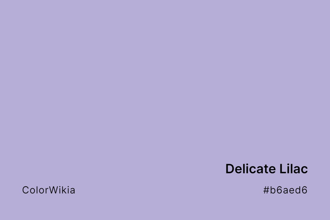
#b6aed6
Delicate Lilac
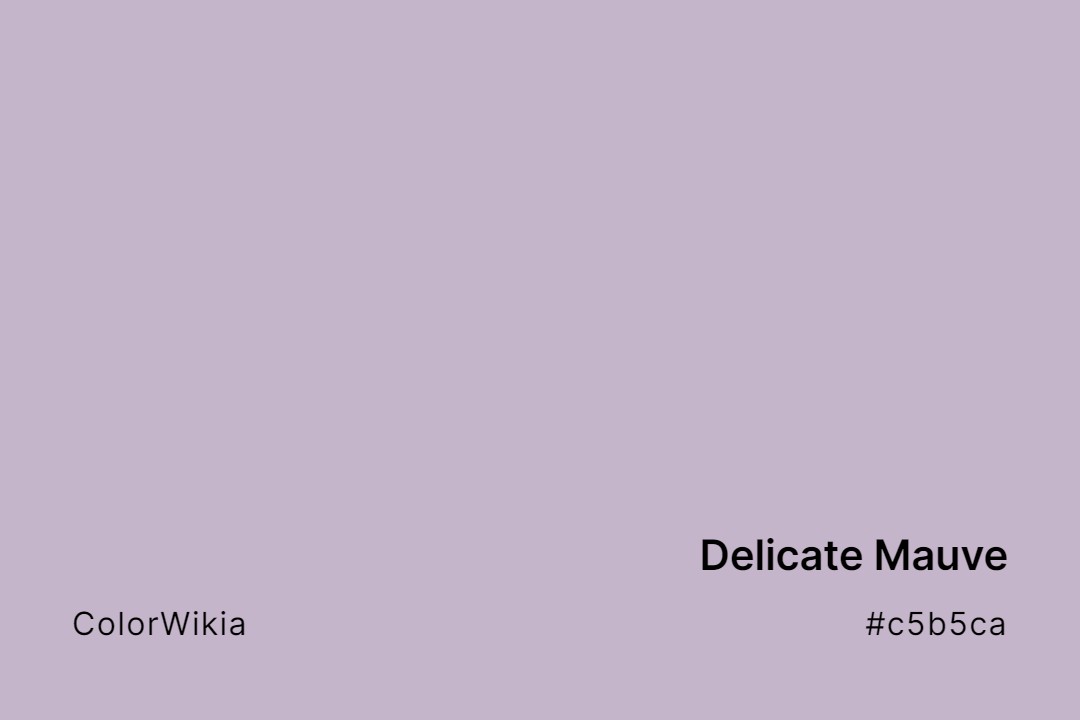
#c5b5ca
Delicate Mauve
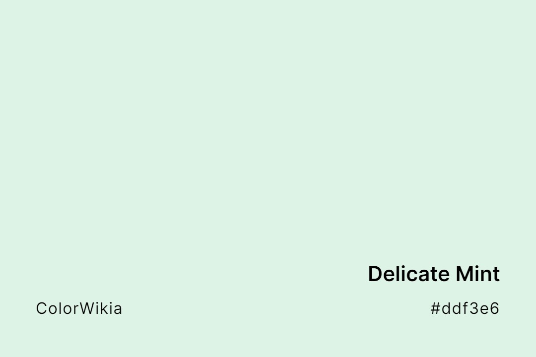
#ddf3e6
Delicate Mint
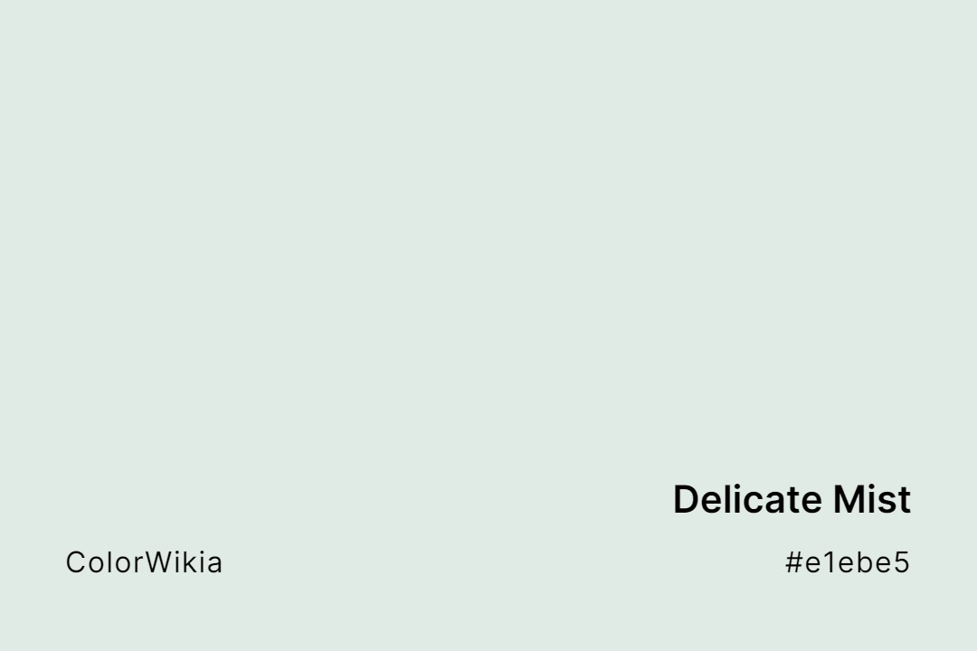
#e1ebe5
Delicate Mist
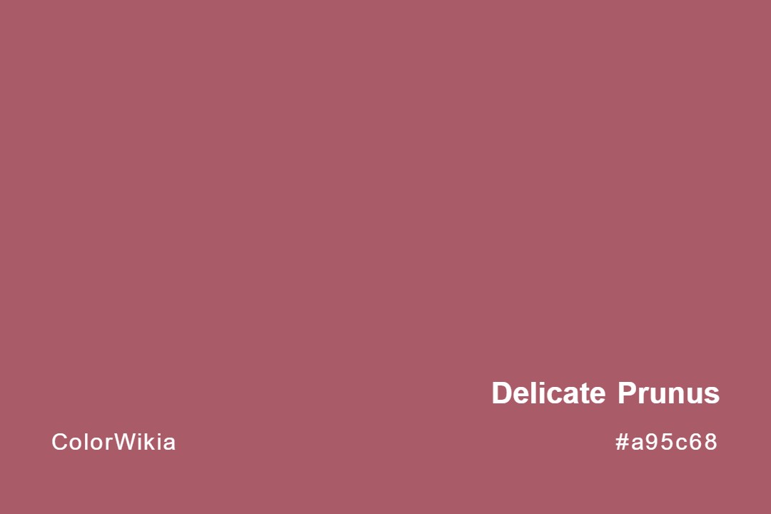
#a95c68
Delicate Prunus
#e9edc0
Delicate Daisy
#fed9bc
Delicate Dawn
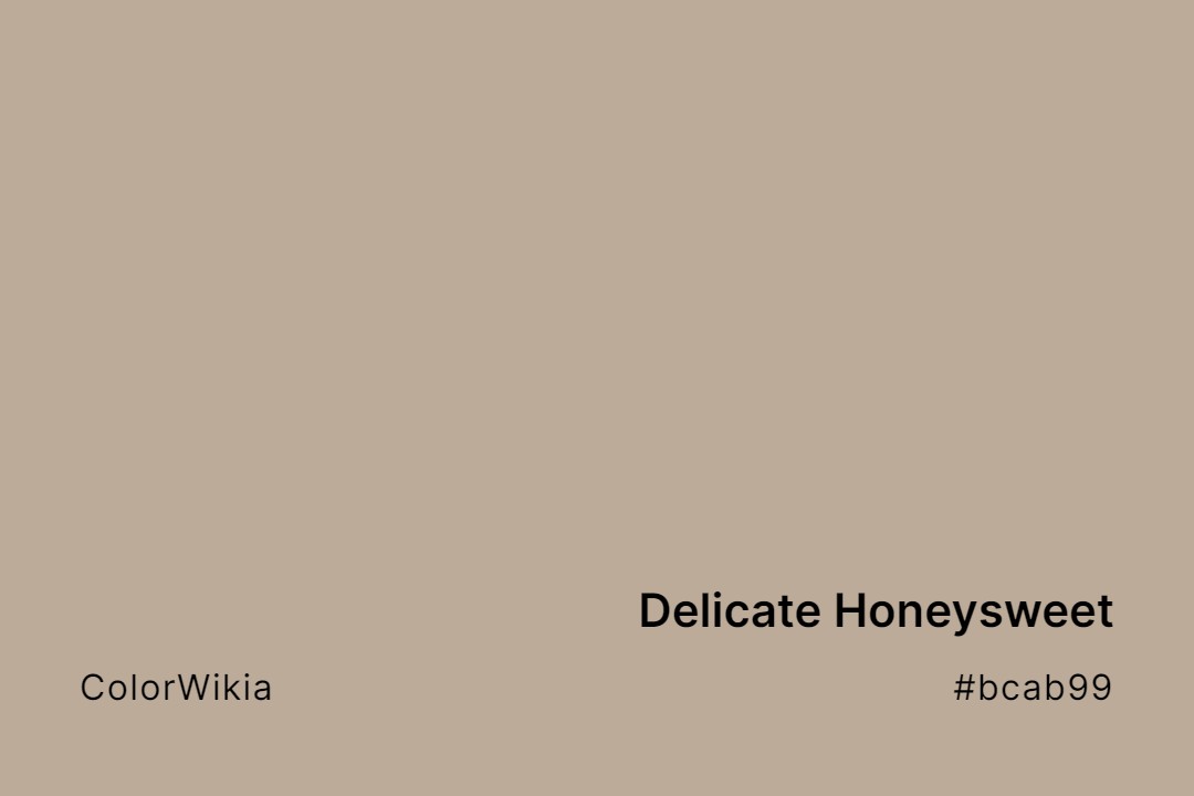
#bcab99
Delicate Honeysweet
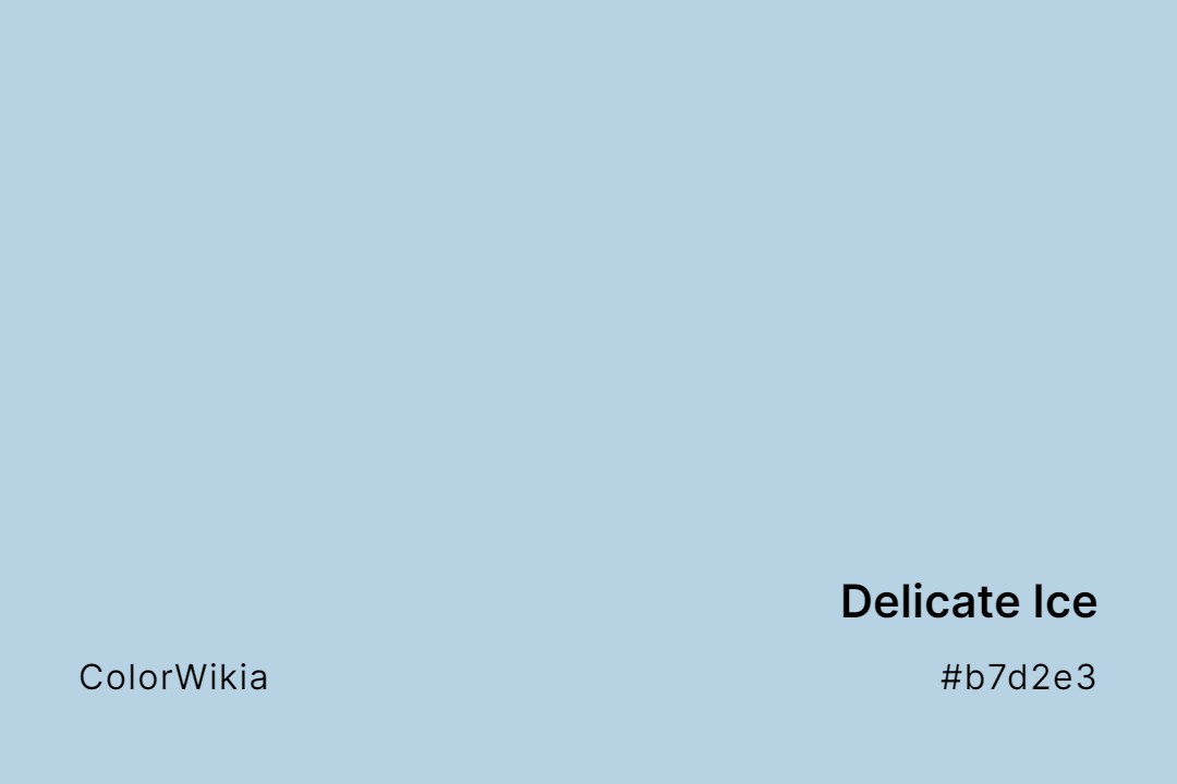
#b7d2e3
Delicate Ice
#efd7d1
Delicate Blush
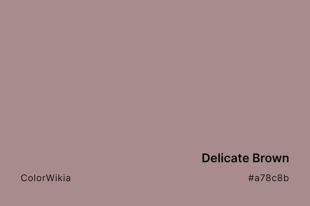
#a78c8b
Delicate Brown
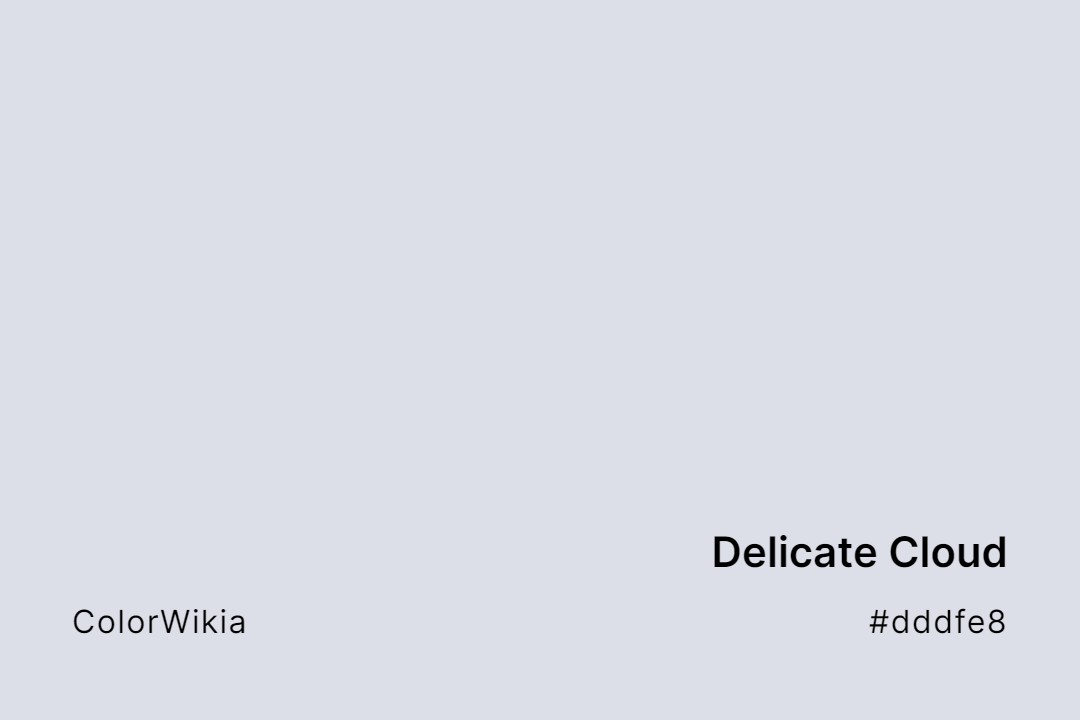
#dddfe8
Delicate Cloud
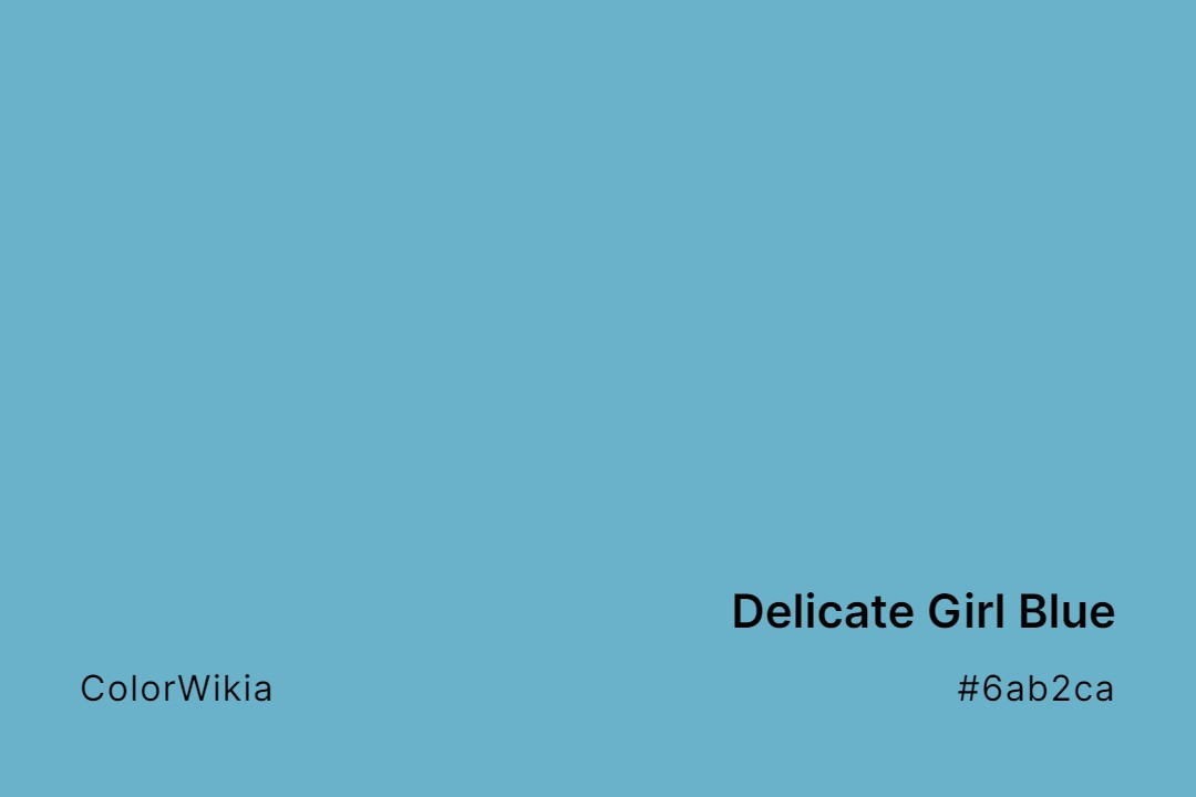
#6ab2ca
Delicate Girl Blue
#d7d2e2
Delicate Lilac Crystal
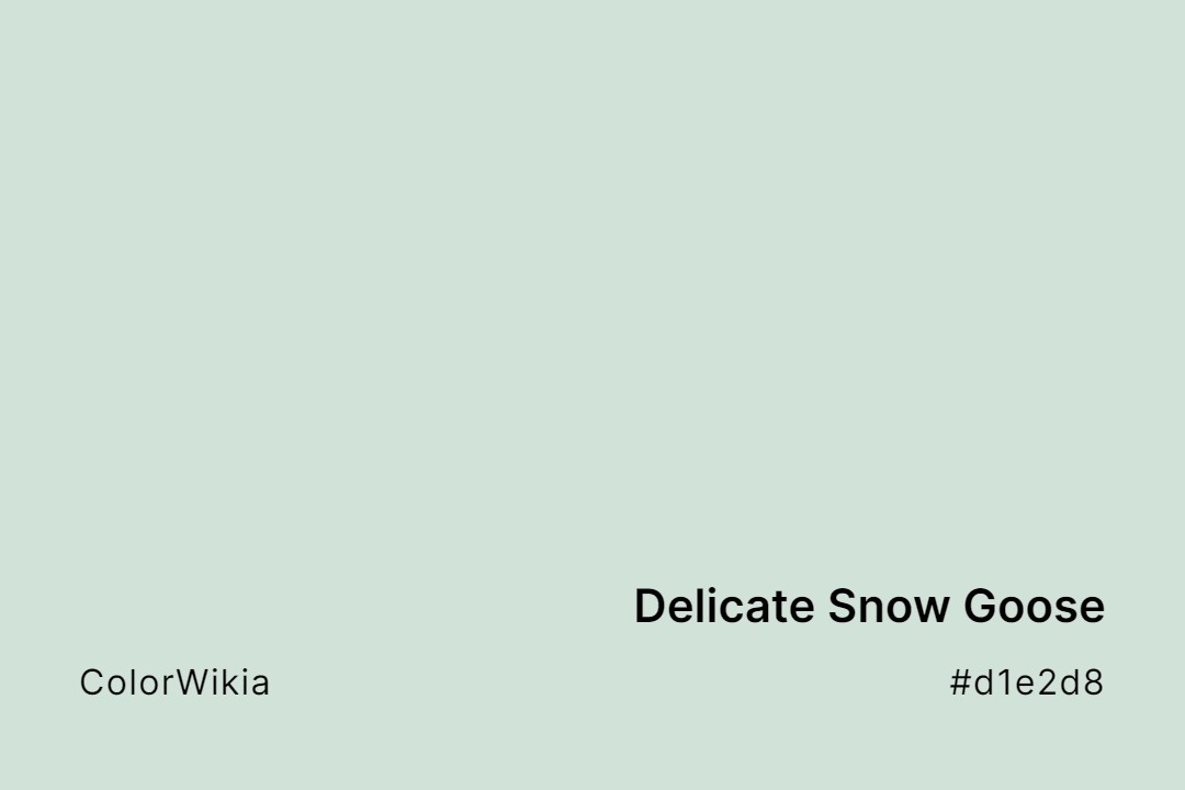
#d1e2d8
Delicate Snow Goose
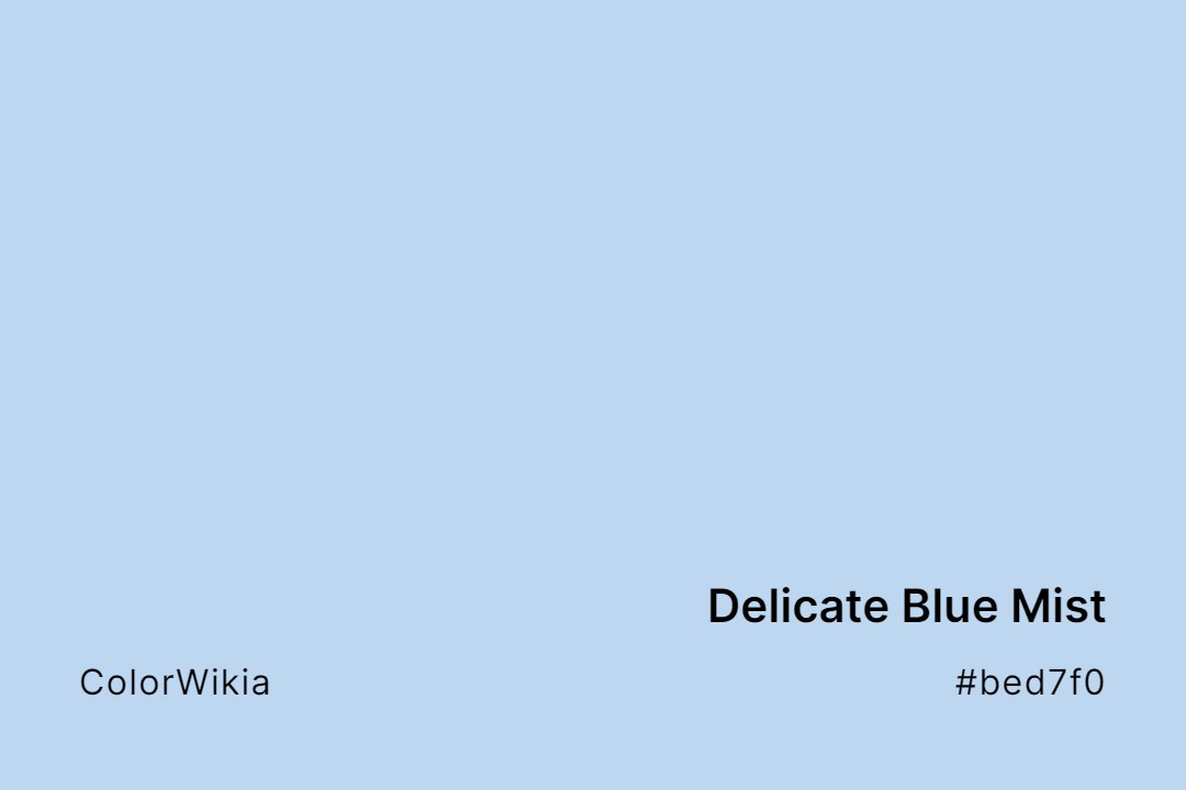
#bed7f0
Delicate Blue Mist
#dbbfce
Delicate Bloom
#fdcdbd
Delicate Sweet Apricot
#c2d1e2
Delicate Ballet Blue