149 Shades of Lavender Color
Lavender color shades blend purple’s depth with white’s light. This guide features soothing variations with hex codes, perfect for brands seeking tranquility, refinement, and natural serenity in their visual identity.
#b56edc

Lavender Color
A soft purple with real vibrancy behind it, closer to the actual lavender flower than most paint samples labeled the same. Lavender color (#b56edc) appears in bath products, wedding decor, and spring fashion collections. Try it with cream and forest green.
#fff0f5

Lavender Blush Color
Barely-there pink with the faintest hint of purple. Lavender blush color (#fff0f5) is the classic CSS pink for the definitely-feminine-but-not-aggressive category, useful for wedding stationery and baby product packaging. Fights with any warm neutral.
#967bb6
Lavender Purple Color
Provence lavender fields at midday, when the rows blur into a dusty violet haze. Lavender purple color (#967bb6) carries a calming, faintly herbal mood. Skincare packaging (Lavanila, Lavande) and sleep apps circle this exact zone.
#e1e2eb
White Lavender Color
Lavender’s palest buds cool toward grey-blue before the purple deepens through July. White Lavender color takes that soft herbal tint from a Provencal field. Bedrooms facing morning sun gain calm here.
#ccccff
Lavender Blue Color
Lavender Blue is a pale, cool periwinkle straight out of the nursery rhyme “Lavender’s Blue, dilly dilly,” which dates to 17th-century England. It’s the soft blue-violet of a lavender field seen from a distance. The Lavender Blue color hex brings gentle, old-fashioned sweetness to a room.
#bdbbd7
Lavender Grey Color
Lavender grey is lilac with the saturation turned nearly all the way down. There’s just enough purple left to keep it from reading as plain grey, but not enough to feel like a statement. Think of it as grey’s quiet apology for being boring.



#bdbbd7
Lavender Grey
#ccccff
Lavender Blue
#e1e2eb
White Lavender
#967bb6
Lavender Purple
#d8a1c4
Pastel Lavender
#a47fa3
Wild Lavender
#8a496b
Twilight Lavender
#7e89c8
True Lavender
#8e8db9
Sweet Lavender
#eeccff
Sparkling Lavender
#888cba
Soft Blue Lavender
#f6e5f6
Soft Lavender
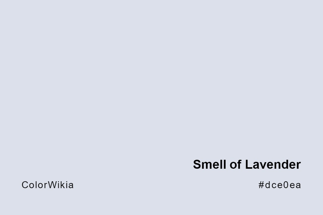
#dce0ea
Smell of Lavender
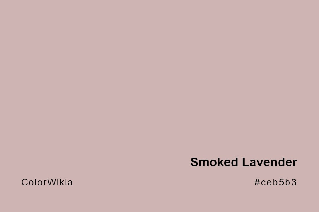
#ceb5b3
Smoked Lavender
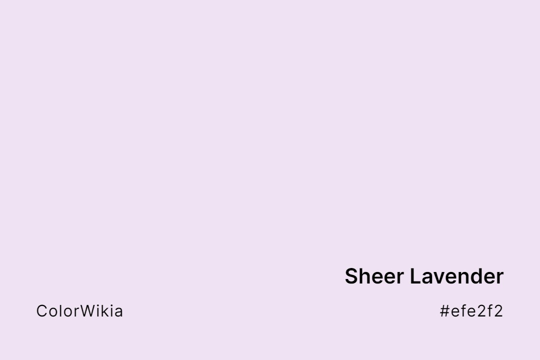
#efe2f2
Sheer Lavender
#cfb1d8
Sea Lavender
#7851a9
Royal Lavender
#d7c7d0
Rosy Lavender
#f1a7fe
Rich Brilliant Lavender
#a76bcf
Rich Lavender
#d9afca
Pink Lavender
#dcd0ff
Pale Lavender
#796878
Old Lavender
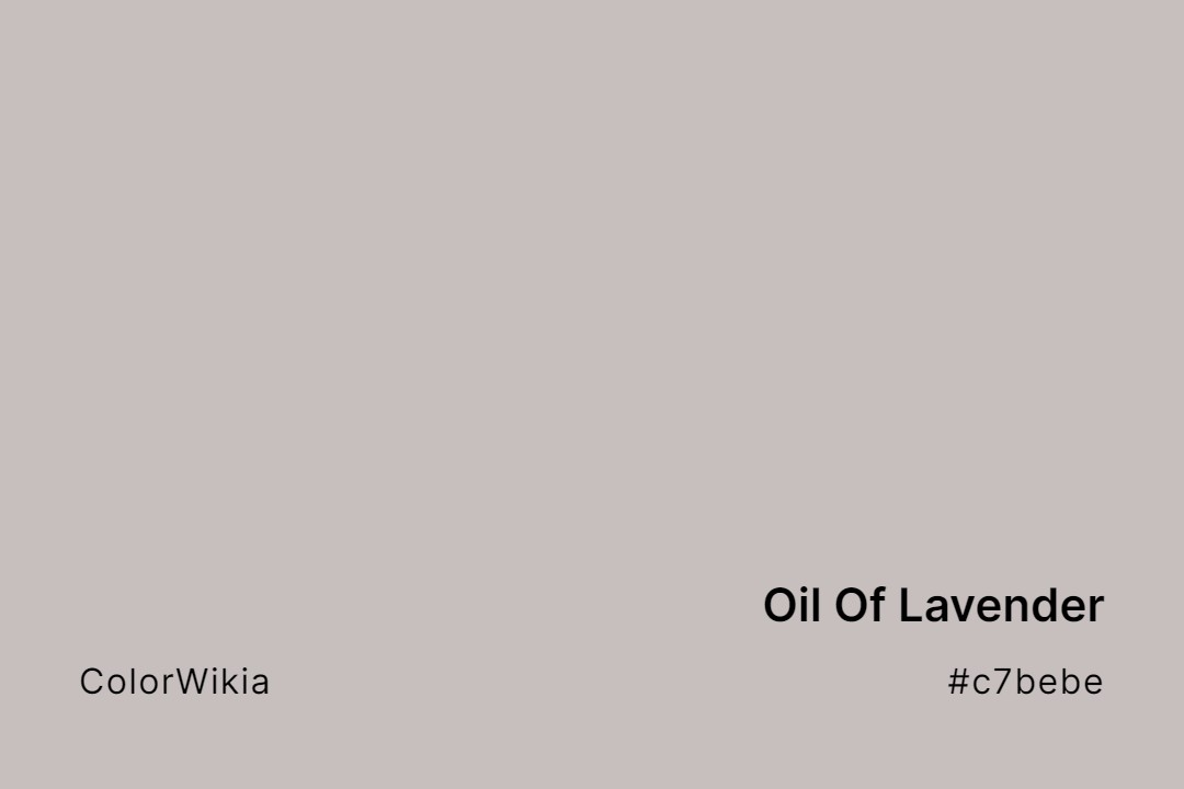
#c7bebe
Oil Of Lavender
#3b5698
Muted Lavender
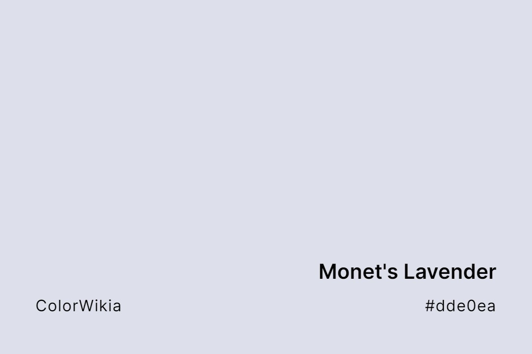
#dde0ea
Monet’s Lavender
#dbd9e1
Misty Lavender
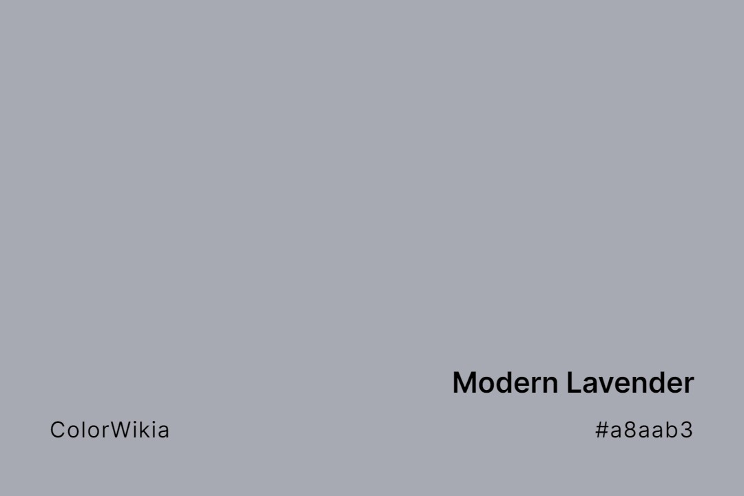
#a8aab3
Modern Lavender
#aea3d0
Milky Lavender
#dda0fd
Medium Lavender Magenta
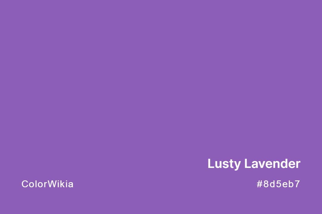
#8d5eb7
Lusty Lavender
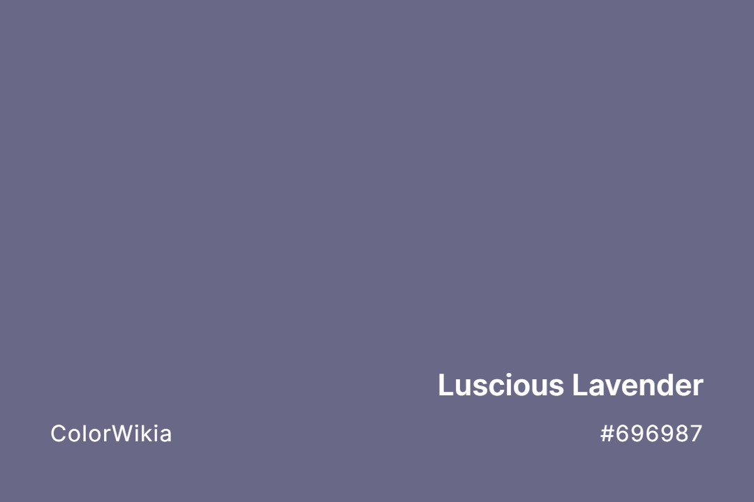
#696987
Luscious Lavender
#dcdfef
Lower Lavender
#d6d2dd
Lovely Lavender
#8d828c
Lost Lavender Somewhere
#816f7a
Lively Lavender
#e0dadf
Lite Lavender
#e6e6e8
Lily Lavender
#efc0fe
Light Lavender
#ddd6e7
Light Lavender Water
#d0d4e3
Light Iced Lavender
#dccfce
Light Hint Of Lavender
#e3d2cf
Light Lavender Blush
#c2aec3
Lavish Lavender
#a3a0b3
Lazy Lavender
#9d61d4
Legendary Lavender
#cec3dd
Lavender Bliss
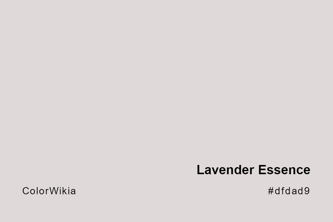
#dfdad9
Lavender Essence
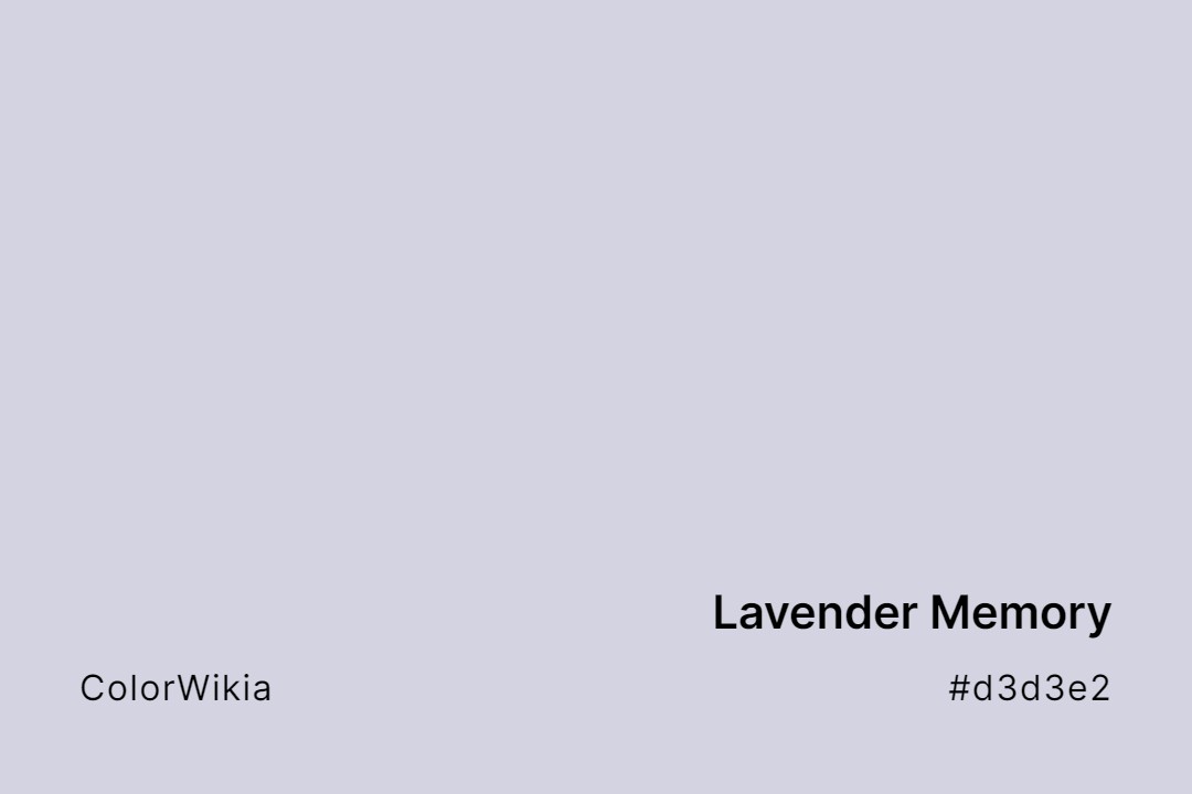
#d3d3e2
Lavender Memory
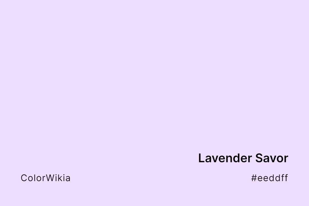
#eeddff
Lavender Savor
#aab0d4
Lavender Wash
#b57edc
Lavender Blossom
#c5b5cc
Lavender Fog
#e5e5fa
Lavender Mist
#bfacb1
Lavender Scent
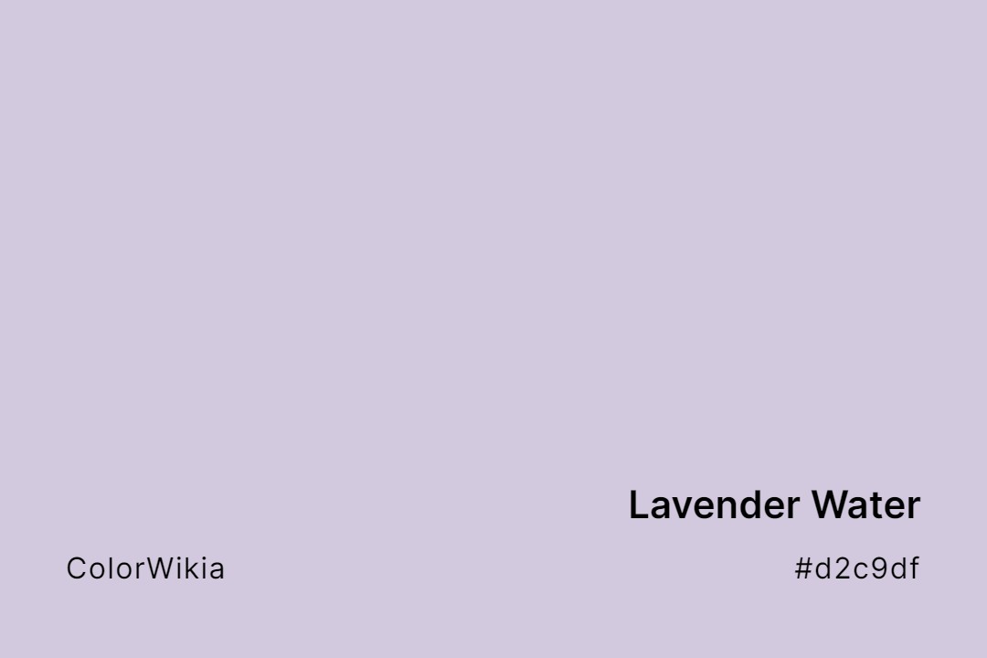
#d2c9df
Lavender Water
#ddbbff
Lavender Fragrance
#67636e
Lavender Moor
#dbd7f2
Lavender Sky
#b56edc
Lavender
#fff0f5
Lavender Blush
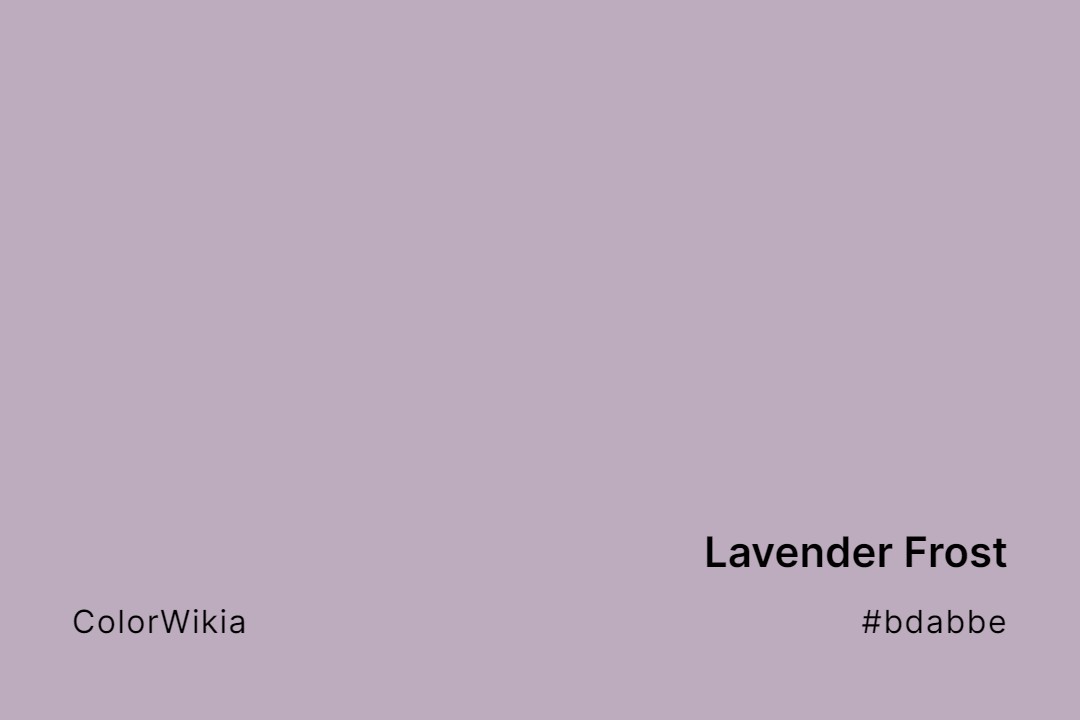
#bdabbe
Lavender Frost
#857e86
Lavender Mosaic
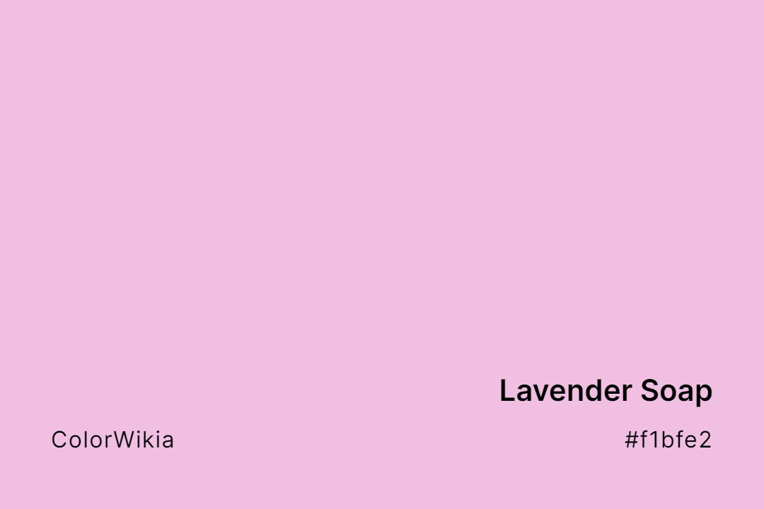
#f1bfe2
Lavender Soap
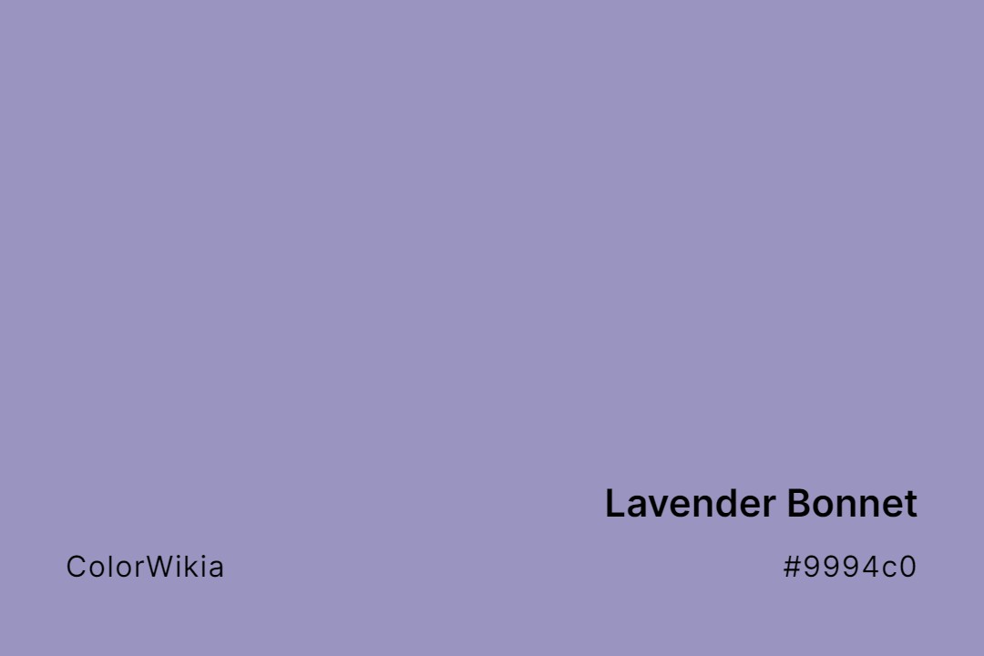
#9994c0
Lavender Bonnet
#c0c0ca
Lavender Oil
#cfcedc
Lavender Sparkle
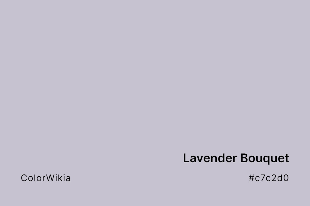
#c7c2d0
Lavender Bouquet
#d3d0dd
Lavender Haze
#ede5e8
Lavender Pearl
#9392ad
Lavender Spectacle
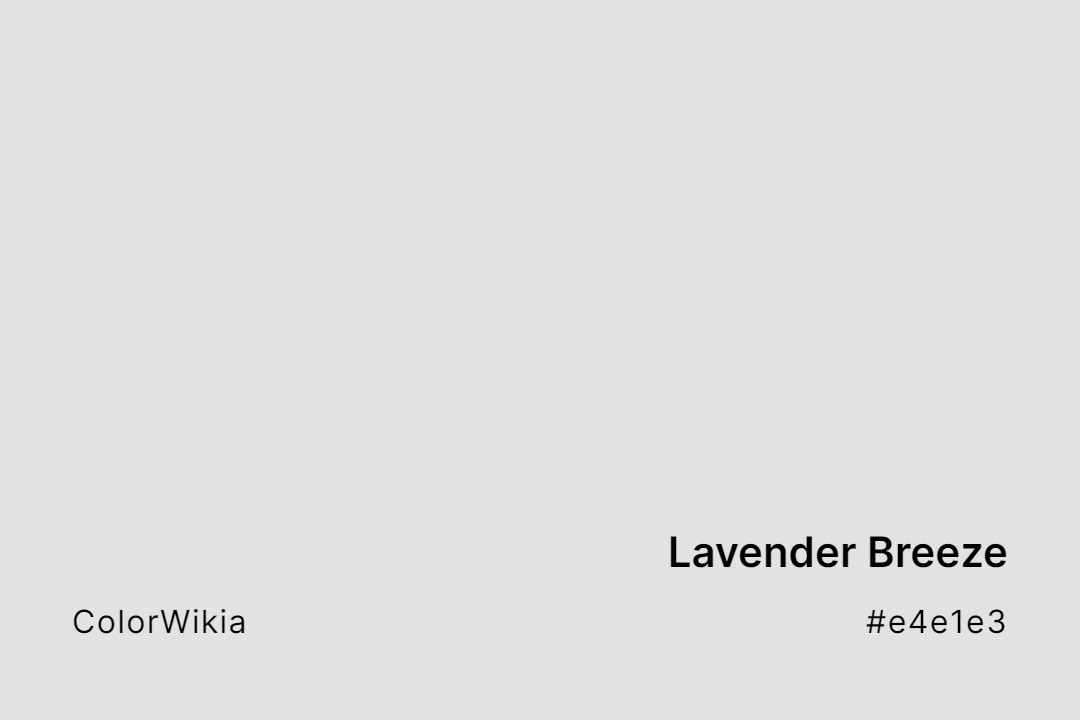
#e4e1e3
Lavender Breeze
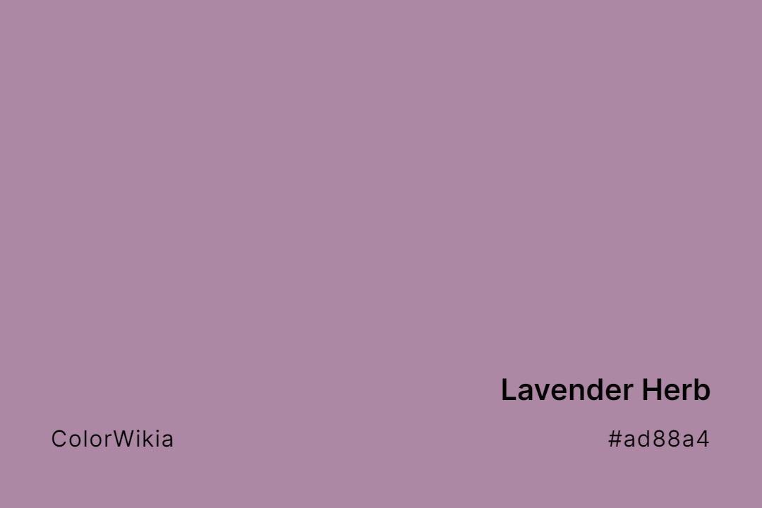
#ad88a4
Lavender Herb
#cb82e3
Lavender Perceptions
#c6cbdb
Lavender Steel
#fcb4d5
Lavender Candy
#c0c2d2
Lavender Honor
#a6badf
Lavender Phlox
#b4a5a0
Lavender Suede
#caadd8
Lavender Field Dreamer
#b8abb1
Lavender Cloud
#a99ba7
Lavender Illusion
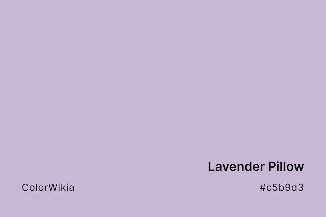
#c5b9d3
Lavender Pillow
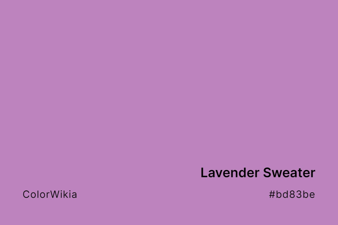
#bd83be
Lavender Sweater
#8c9180
Lavender Leaf Green
#c79fef
Lavender Cream
#9457eb
Lavender Indigo
#dd85d7
Lavender Pink
#e6e6f1
Lavender Syrup
#8c8da1
Lavender Blossom Grey
#956d9a
Lavender Crystal
#dfdde0
Lavender Lace
#e9e2e5
Lavender Pizzazz
#d783ff
Lavender Tea
#8b88f8
Lavender Blue Shadow
#b4aecc
Lavender Dream
#a198a2
Lavender Lake
#e9d2ef
Lavender Princess
#ccbbff
Lavender Tonic
#9998a7
Lavender Ash