39 Shades of Pastel Color
Explore different types of Pastel colors for your website, brand or any project.
#a2bffe

Pastel Blue Color
A soft, slightly saturated pale blue with a lavender undertone. Pastel blue color (#a2bffe) is the color of baby books, ice cream shop signage, and 1980s Easter dresses. Cheerful without going childish.
#cfcfc4
Pastel Grey Color
A light warm grey with a whisper of green. Pastel grey color (#cfcfc4) is what dusty museum walls and mid-century pottery both aim for. Soft without going flat.
#77dd77
Pastel Green Color
Pastel green is the mild mint of a mid-century diner counter, soft and sweet without being neon. It’s one of the classic pastel shades that reads instantly as friendly. The pastel green color works well for a kids’ app or a spring campaign that wants to feel light.
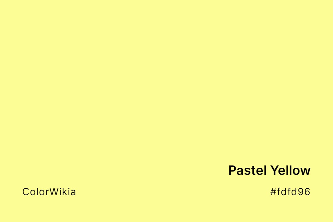
#fdfd96
Pastel Yellow Color
Pastel yellow is a soft, buttery lemon, the color of a baby chick or a stick of butter. Sunny without any glare, the pastel yellow color makes a cheerful, gentle background for a kids’ or spring-themed design.
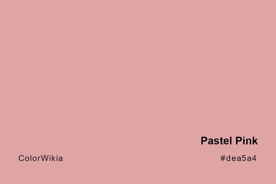
#dea5a4
Pastel Pink Color
Pastel pink here is a warm, dusty rose rather than a candy pink, closer to a faded ballet slipper. Soft and a little vintage, the pastel pink color makes a tender, understated accent for a romantic palette.
#b39eb5
Pastel Purple Color
Pastel purple is a soft, greyed lilac, gentle and a little dusty. The pastel purple color is the shade of a faded hydrangea. Use pastel purple #b39eb5 as a calm, romantic accent in a soft palette.
#ff6961
Pastel Red Color
Pastel red is really a soft coral-salmon, warm and gentle rather than fiery. The name is a contradiction, since true red resists going pastel. The pastel red color makes a friendly, approachable accent for a warm, playful brand.
#836953
Pastel Brown Color
Ignore the “pastel” label. Pastel brown color (#836953) carries the weight of a strong latte or a well-oiled leather satchel. Where black would flatten a design, this warm mid-brown grounds it without turning the whole thing heavy.
#f49ac2
Pastel Magenta Color
Bubblegum softened with cream, the kind of pink that lived on skating rinks and Trapper Keepers in 1985. Pastel magenta color (#f49ac2) stays sweet without going harsh. Candy brands and indie beauty labels pull this hex more than they let on.
#add0b3

Pastel Mint Green Color
A crushed spearmint leaf stirred into whipped cream. Pastel mint green color (#add0b3) carries the fresh calm the wellness industry lives on. Set the shade against white and the whole layout turns clinical in the best way.




#ff964f
Pastel Orange
#add0b3
Pastel Mint Green
#f49ac2
Pastel Magenta
#836953
Pastel Brown
#ff6961
Pastel Red
#b39eb5
Pastel Purple
#dea5a4
Pastel Pink
#fdfd96
Pastel Yellow
#77dd77
Pastel Green
#d8a1c4
Pastel Lavender
#edf5e7
Verde Pastel
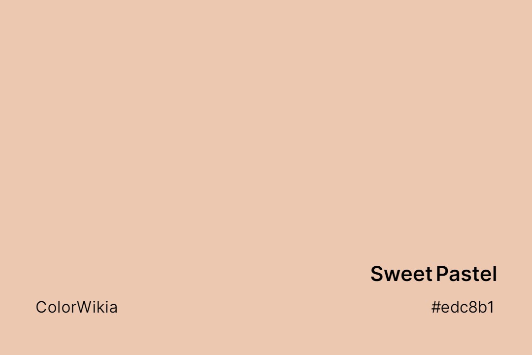
#edc8b1
Sweet Pastel
#aa9499
Persian Pastel
#e4c5b0
Pastel Rose Tan
#bee7a5
Pastel Pea
#a2bffe
Pastel Blue
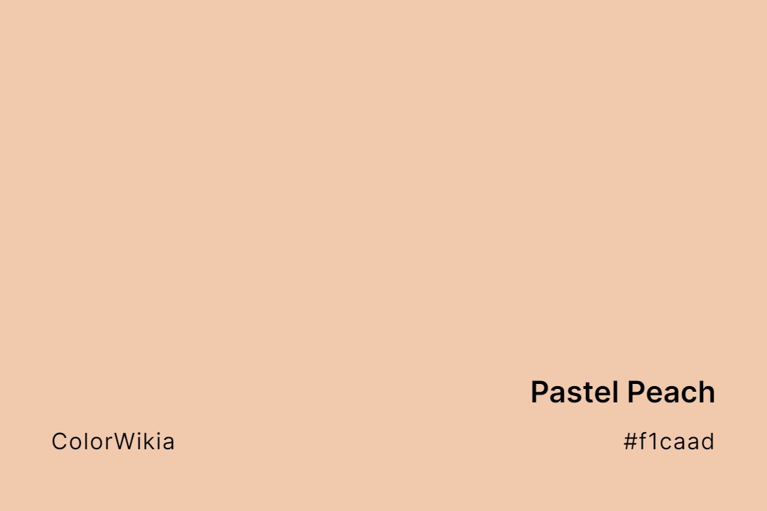
#f1caad
Pastel Peach
#f0e4e0
Pastel China
#dfd8e1
Pastel Day
#d5c6b4
Pastel Sand
#cfcfc4
Pastel Grey
#deece1
Pastel Smirk
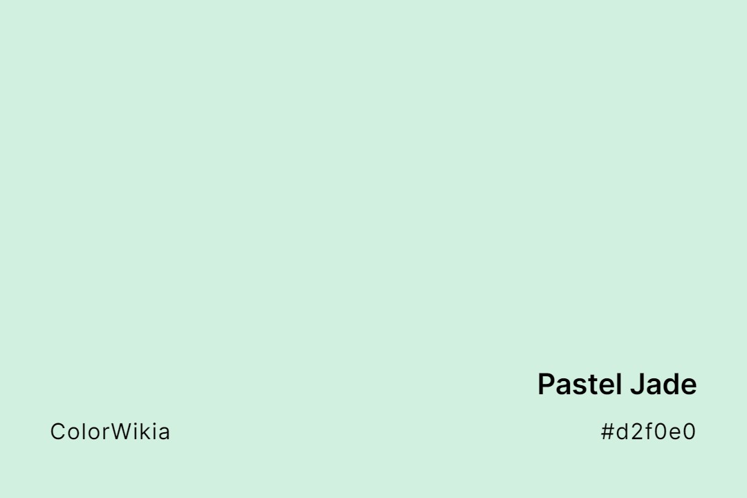
#d2f0e0
Pastel Jade
#ef4f4c
Pastel Strawberry
#99c5c4
Pastel Turquoise
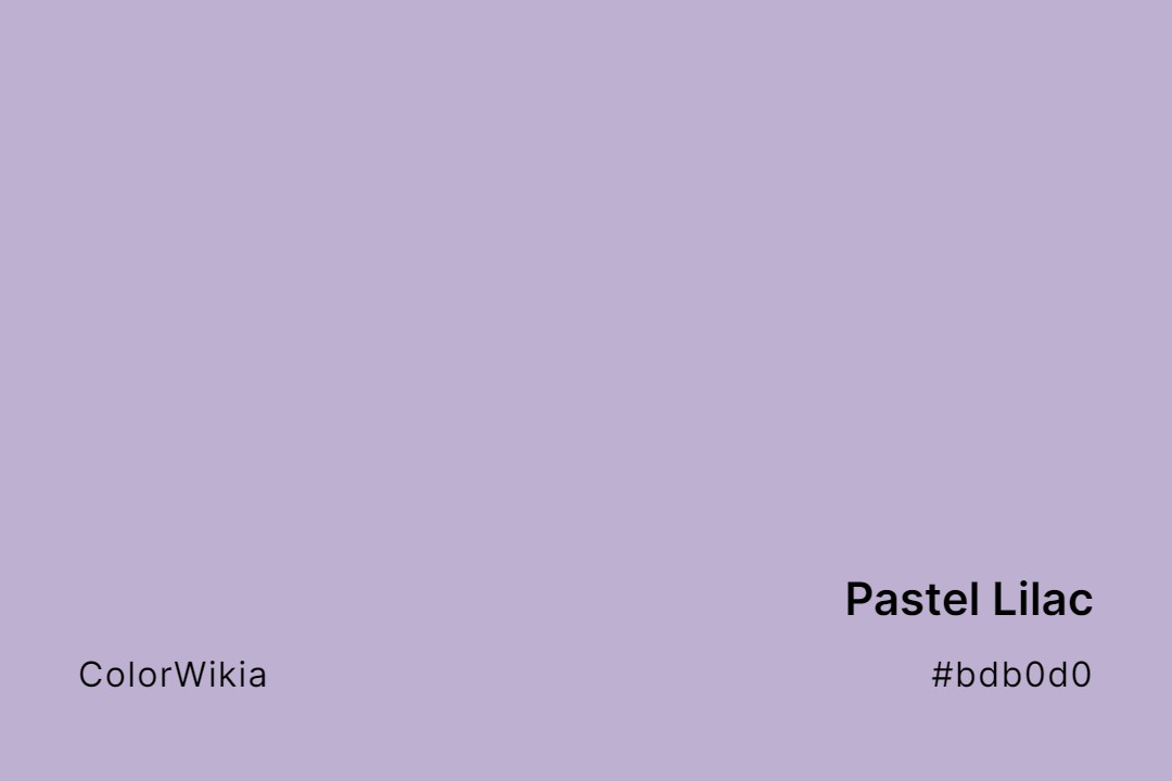
#bdb0d0
Pastel Lilac
#cb99c9
Pastel Violet
#b9d786
Pastel Lime
#a9c9af
Pastel Meadow
#cef0cc
Pastel Mint
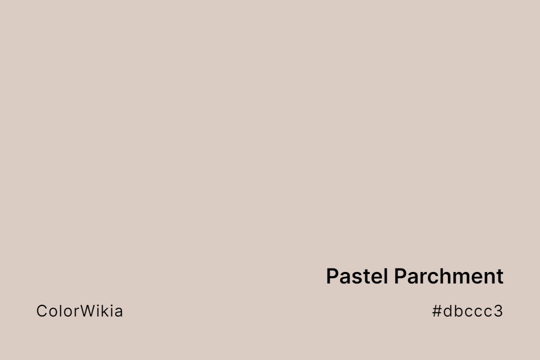
#dbccc3
Pastel Parchment
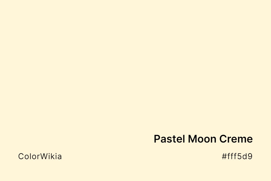
#fff5d9
Pastel Moon Creme
#bccbb9
Pastel Grey Green
#f2c975
Pastel de Nata
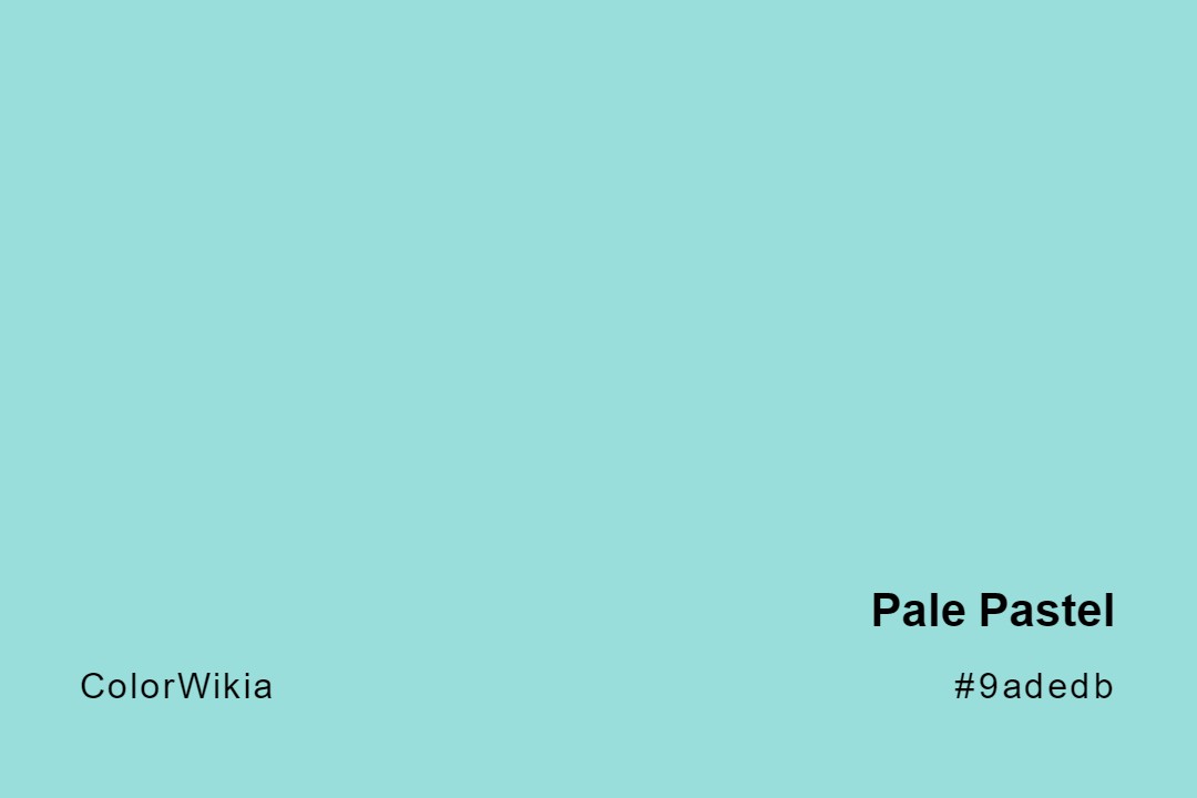
#9adedb
Pale Pastel
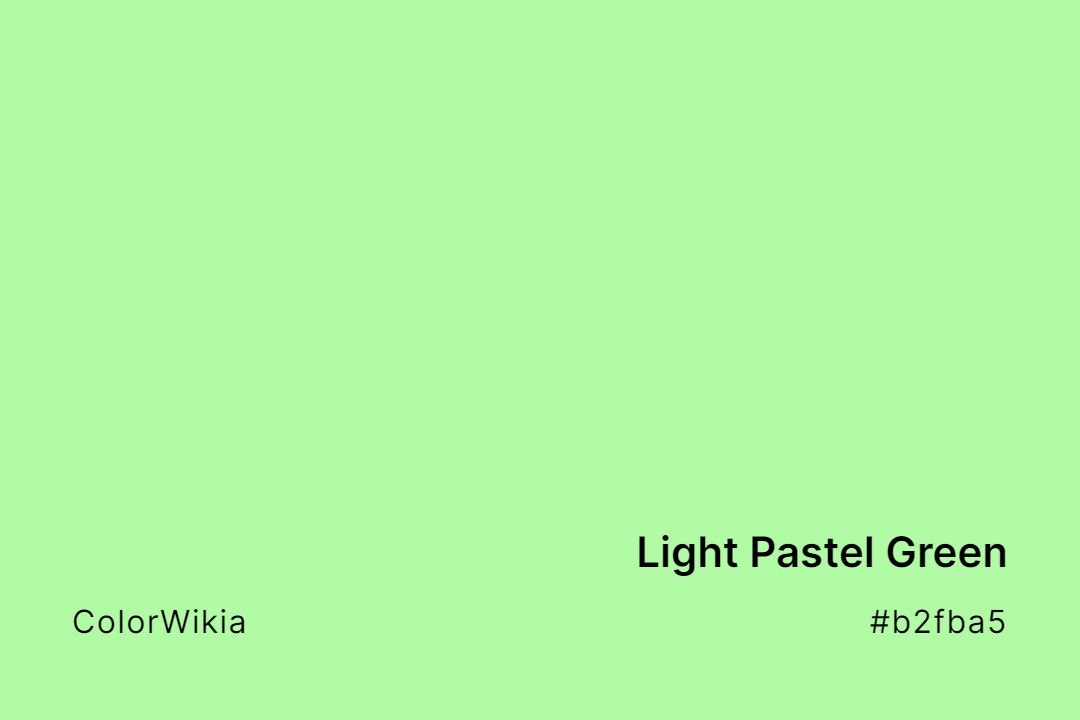
#b2fba5
Light Pastel Green
#f4d9b9
Golden Pastel
#ddf3c2
Envious Pastel
#fffbb0
Creamy Sunshine Pastel