
55 Shades of Powder Color
Explore different types of Powder colors for your website, brand or any project.
#b0e0e6

Powder Blue Color
Sky reflected in a glass of milk. Powder blue color (#b0e0e6) has been the default nursery shade for at least sixty years because it calms the eye without going saccharine, and it flatters most skin tones. Every spring, sweater brands roll it out again like it’s a new idea.
#c4d9ef

Light Powder Blue Color
Light powder blue is a soft, pale sky-blue with a cool, airy feel, like a baby blanket or a summer haze. Gentle and clean, the light powder blue color makes a calming background for a nursery or a meditation app.
#b9c9d7

Powder Soft Blue Color
Powder blue took its name from smalt, a powdered cobalt glass once used to tint laundry starch, and this shade is a greyer take on it. Powder Soft Blue color #b9c9d7 is a pale, dusty blue-grey, like a work shirt after 100 washes.
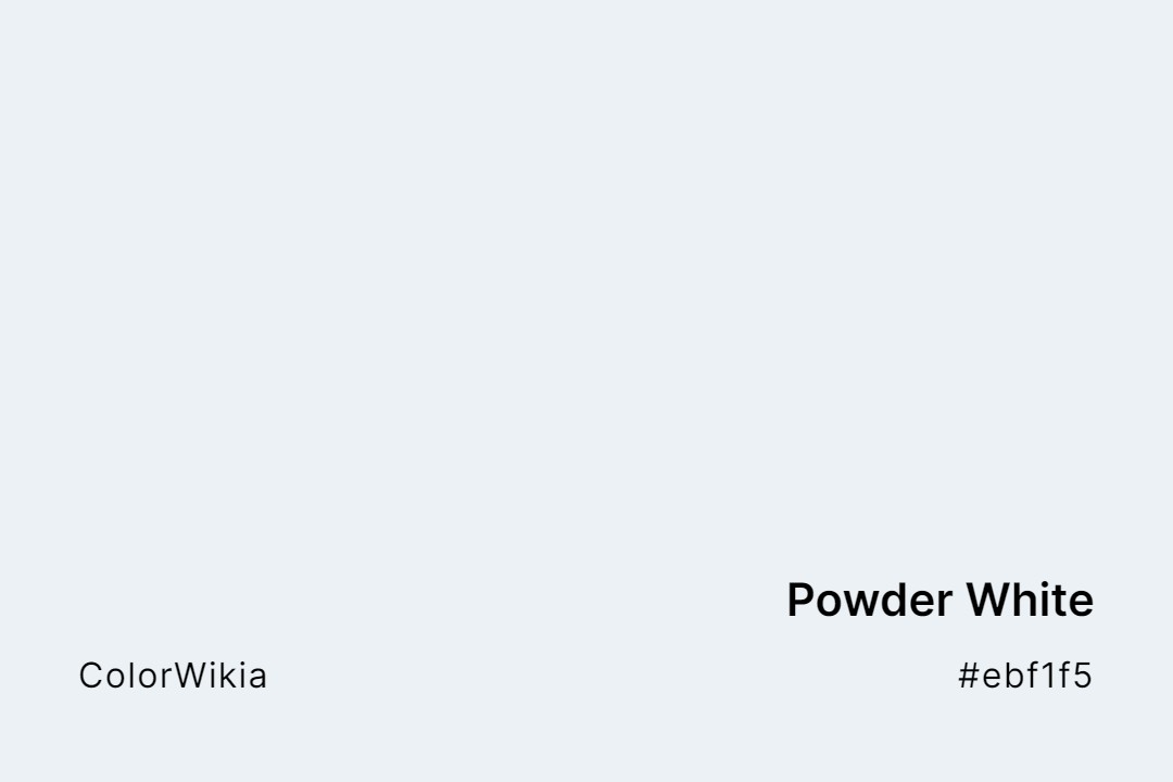
#ebf1f5
Powder White Color
A pale, cool blue-white that reads as fresh snow rather than paper. Powder white color (#ebf1f5) belongs in ski resort branding, athletic wear packaging, and dental interiors. The blue undertone keeps it bright even in low light.
#c2dce3
Washing Powder White Color
Mrs. Stewart’s Bluing, a Prussian blue laundry rinse first sold in Minneapolis in 1883, has made whites look whiter for well over a century, and Washing Powder White is that trick in a swatch. The name says white, but #c2dce3 is plainly a pale icy blue.
#fdd6e5
Powder Pink Color
A pale, cool pink with a barely-there purple undertone. Powder pink color (#fdd6e5) is the classic ballerina pink, useful for children’s products, wedding decor, and cosmetics packaging. Sweet without going sugary.
#d9d3e5
Powder Viola White Color
Violas are the smaller, hardier cousins of pansies, and their petals often fade to near-white at the edges. Powder Viola White color takes that palest lilac edge, a soft off-white carrying the faintest cool violet.
#95396a

Powder Red Color
Powder red is misnamed; the powder red color is really a rich magenta-berry, closer to a raspberry coulis than any red. There’s a lot of blue in it, which pushes it toward purple. It’s a punchy, feminine accent for a beauty or fashion brand.
#fcfd74
Yellow Powder Color
Pollen dusted across a car hood on a spring morning. Yellow powder color (#fcfd74) sits so high on the brightness scale that dark type snaps against it. Playful packaging (children’s books, popsicle wrappers, festival flyers) thrives with the shade.
#34342c
Black Powder Color
A very dark khaki-brown that reads as black in dim light. Black powder color (#34342c) sits between forest green and true black, with a warmth that keeps it from feeling cold. Sherwin-Williams and Farrow & Ball have both used variations of this for high-end interior paint.



#b9c9d7
Powder Soft Blue
#c2dce3
Washing Powder White
#d9d3e5
Powder Viola White
#fcfd74
Yellow Powder
#c4d9ef
Light Powder Blue
#95396a
Powder Red
#e6c8ff
Wisteria Powder
#bdb38f
Wasabi Powder
#c3d8e4
Washing Powder Soft Blue
#c7ccd8
Violet Powder
#faf3dd
Vanilla Powder
#e2d4d4
Theatre Powder Rose
#001133
Squid Ink Powder
#ebf1f5
Powder White
#b0e0e6
Powder Blue
#d8948b
Powder Blush
#dfd7ca
Powder Cake
#b7b7bc
Powder Dust
#bfc2ce
Powder Lilac
#9cb3b5
Powder Mill
#fdd6e5
Powder Pink
#ffeff3
Powder Puff
#a14d52
Powder Room
#f5b3bc
Powder Rose
#f7f1dd
Powder Sand
#cbc2d3
Powder Viola
#ffcebe
Powder Puff Pink
#bcc9c2
Powder Ash
#fbd187
Pollen Powder
#391285
Pixie Powder
#c5cbe1
Periwinkle Powder
#faffed
Pearl Powder
#e2bdb3
Peach Powder
#ece2d4
Onion Powder
#e3c8b1
Mesquite Powder
#a0d404
Matcha Powder
#b7b17a
Leek Powder
#2baf6a
Jade Powder
#484753
Gun Powder
#e7ece8
Dusting Powder
#9da073
Dill Powder
#fbefda
Desert Powder
#f8dcaa
Custard Powder
#cc6600
Curry Powder
#ba9c75
Coriander Powder
#766a5f
Cocoa Powder
#a58c7b
Chocolate Powder
#ffe4be
Cheese Powder
#c5bda5
Celery Powder
#eebb99
Caramel Powder
#c3b3b9
Blossom Powder
#34342c
Black Powder
#d0c101
Banana Powder
#fefefa
Baby Powder
#a9a0a9
Aluminium Powder


