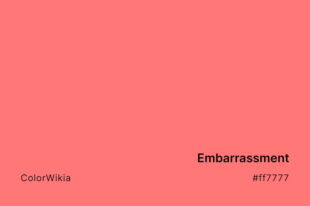
Embarrassment Color – #ff7777: Codes and Complete Breakdown
By
Published on
The Embarrassment color hex code is #ff7777, and it is composed of 100% red, 47% green and 47% blue.
Embarrassment is a light, muted, and warm color at 53% saturation. It has a contrast ratio of 2.57:1 against a white background, which fails WCAG AA (Web Content Accessibility Guidelines, Level AA) compliance.
For better visibility, it is recommended to use the Embarrassment color (#ff7777) against dark backgrounds.
Embarrassment Color Shades
Complementary colors
Triadic colors
Tints or lighter colors
Darker colors
Analogous colors
Monochromatic colors
#ff7777
Embarrassment Color Codes and Information
Here’s a complete breakdown of the color Embarrassment, including its HEX, RGB, HSL, and CMYK values, as well as other information about the color.
| Data Type | Values/Details |
|---|---|
| Hex | #ff7777 |
| RGB | rgb(255,119,119) |
| HSL | hsl(0,100%,73.3%) |
| CMYK | 0, 53, 53, 0 |
| HSV | 0, 53, 100 |
| RGB % | 100, 47, 47 |
| XYZ | 51.2, 35.8, 21.7 |
| LAB | 66.4, 51.8, 25.2 |
| Color Category | Light |
| Color Family | Red |
| Saturation | 53% |
| Temperature | Warm |
| Contrast Ratio Againt White (#ffffff) | 2.57 (fails WCAG AA) |
| Contrast Ratio Againt Black (#000000) | 8.16 (passes WCAG AA) |
Similar Colors to Embarrassment Color
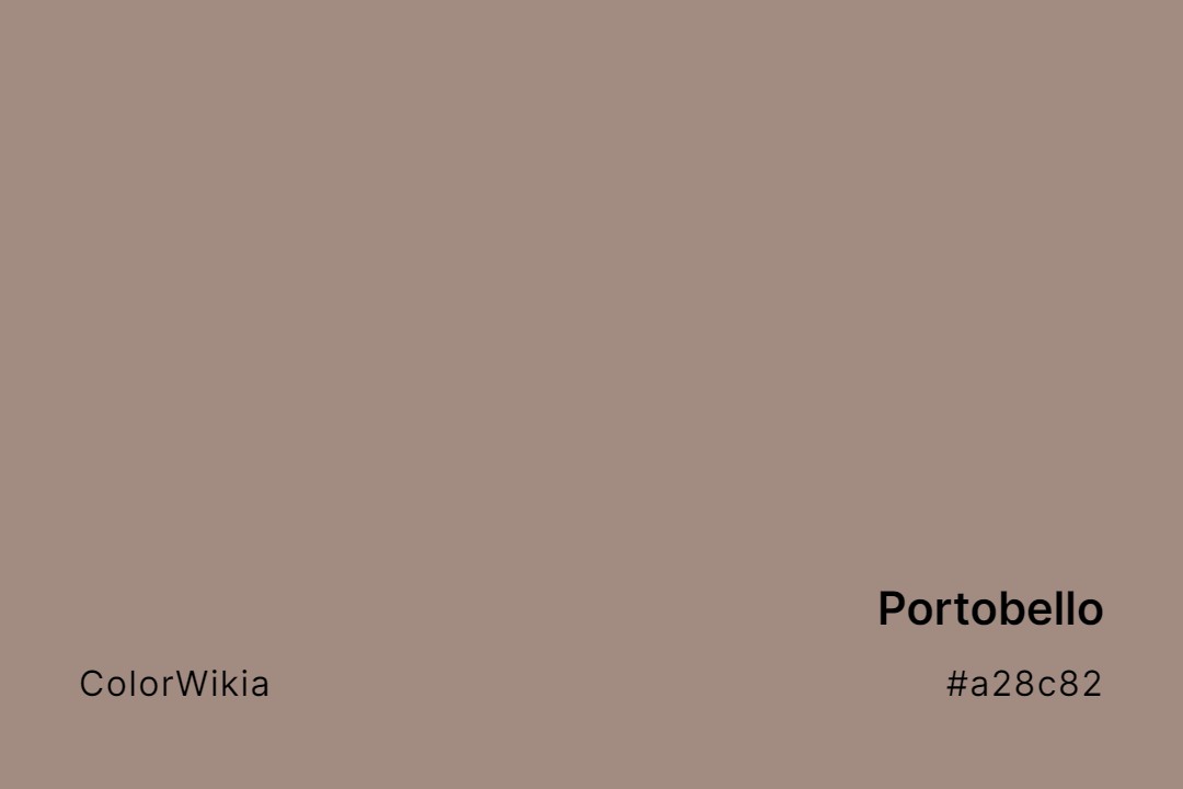
#a28c82

Portobello
#f6ecde
A La Mode
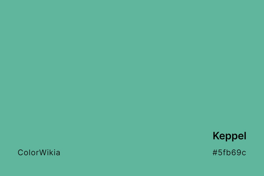
#5fb69c
Keppel
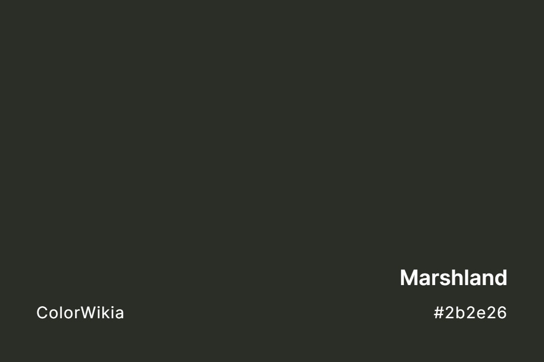
#2b2e26
Marshland
#816c5e
Caribou
#dd3366
1989 Miami Hotline
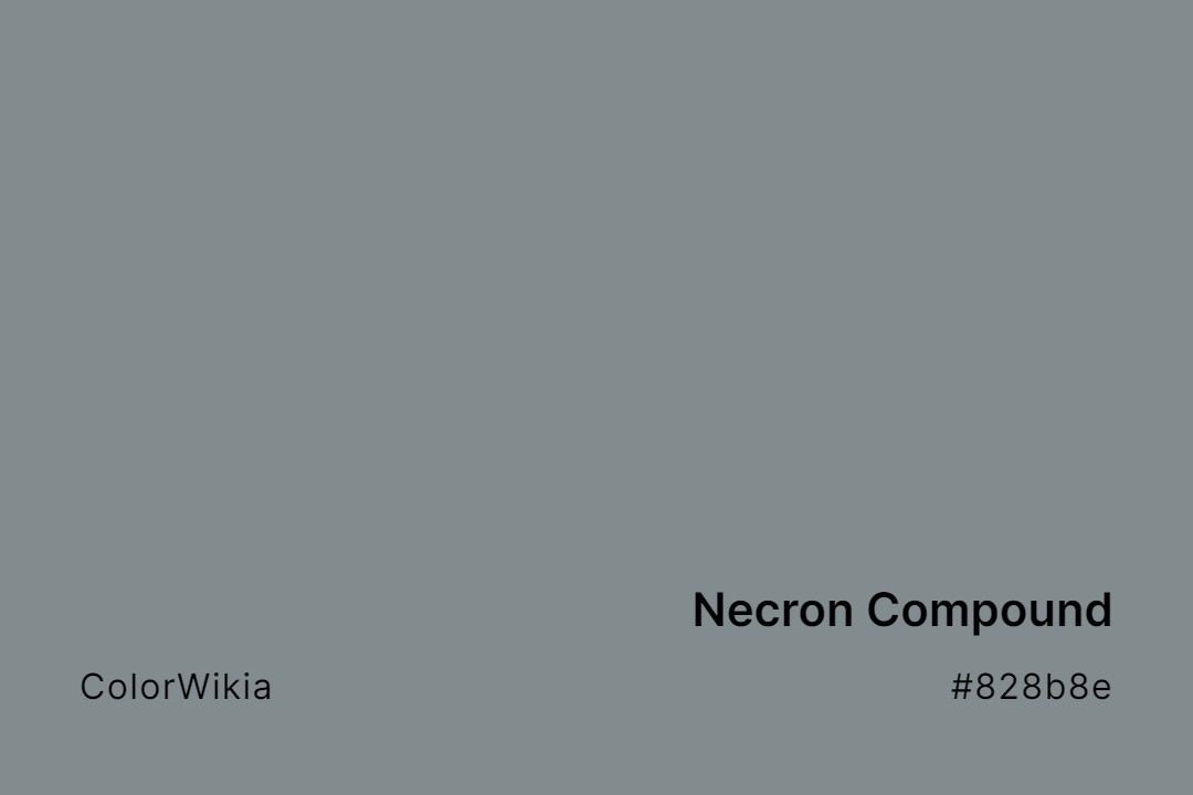
#828b8e
Necron Compound
#e093ab
Kobi