A Look at Kraft Paper Color – #d5b59c
This color doesn’t compete. It supports. It’s the backdrop that lets texture and material shine. Designers use it when they want to say, “We’re not here to show off, we’re here to be real.”
Let’s break it down:
- Hex:
#d5b59c - RGB:
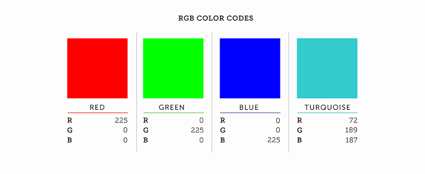
213, 181, 156 - HSL:
27°, 43%, 72%
This is a warm, soft color with low contrast. The hue leans orange-brown, the saturation is gentle, and the lightness is above the midpoint. All of that gives it a natural, human quality. It doesn’t scream for attention; it blends in a good way.
What Brown Can Do
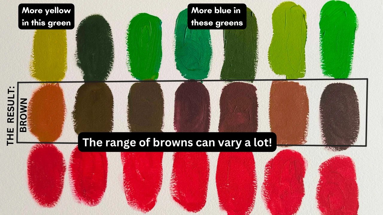
Brown often gets written off as boring. But dig a little deeper and you’ll find it’s one of the most grounded, dependable colors we’ve got. In color psychology, brown is tied to comfort, stability, and reliability. Things we crave when the world gets a little too polished.
The kraft version of brown brings extra meaning. It’s linked to recycled materials, sustainability, and handmade goods. That’s why brands like Aesop and Everlane lean on kraft tones, they want to signal care and transparency. And it works. We trust what feels unfiltered.
What This Color Means Around the World
Context shifts meaning. In different cultures, brown plays different roles.
- In Japan, it’s tied to nature and wabi-sabi. The idea that beauty is imperfect and temporary.
- In the West, kraft brown often says “eco-conscious,” whether or not the product behind it really is.
- In South Asia, browns are seen in everyday life spices, textiles, soil—but they rarely lead in festive color palettes.
Kraft brown doesn’t shout identity. It supports it.
Kraft Paper Color (#d5b59c) Accessibility Standards?
Not always. #d5b59c looks nice, but it doesn’t offer much contrast with light-colored text. That means it might fail accessibility checks, especially for smaller fonts.
To stay readable, pair this color with dark text like charcoal, navy, or black. And avoid thin typefaces. A chunky serif or bold sans-serif holds up better.
Real-World Use
Here’s where you’ve probably seen kraft brown doing its thing:
- Packaging: Think cardboard boxes or wrappers on small-batch chocolates. Kraft paper says “sustainable” without needing to print it.
- Web Design: Backgrounds that feel like paper, journals, or parchment often use kraft tones to bring warmth.
- Print: Menus, invitations, and flyers lean on this shade to feel handmade or artisanal—especially when printed on textured paper.
Kraft doesn’t steal the show. It gives other elements a place to shine.
Good Color Matches for #d5b59c
Kraft brown is a team player. It pairs well with both strong and subtle colors.
Reliable Pairings:
- Charcoal Gray (#333333) – Balanced and modern.
- Olive Green (#6e7756) – Earthy and relaxed.
- Rust Red (#aa2704) – Bold but still organic.
- Creamy White (#f0e9d6) – Soft and cohesive.
Surprising Combos:
- Slate Blue (#5b7c99) – A cool contrast.
- Blush Pink (#ff6fff) – Gentle but layered.
- Saffron Yellow (#d09b2c) – Bright, but grounded by brown.
If the mix feels like it belongs in a market stall or a picnic basket, you’re on the right track.
When to Use Kraft Brown Color, and When to Skip It
Use #d5b59c when you want your design to feel:
- Thoughtful
- Down-to-earth
- Simple
- Organic
Skip it if your brand is sleek, high-tech, or built on neon. Unless you’re trying to add a touch of softness to balance things out.
Kraft brown isn’t the main act. It’s the reliable rhythm in the background.
Final Take
Kraft paper color, #d5b59c, isn’t about flash. It’s about feeling real. It reminds us of handmade things, thoughtful packaging, and slow design. It doesn’t push; it supports. And sometimes, that’s exactly what a design needs.
In a time when everything wants to grab your attention, kraft brown offers a quiet place to land.